Recommended concept Recommended logo concept A
Concept A
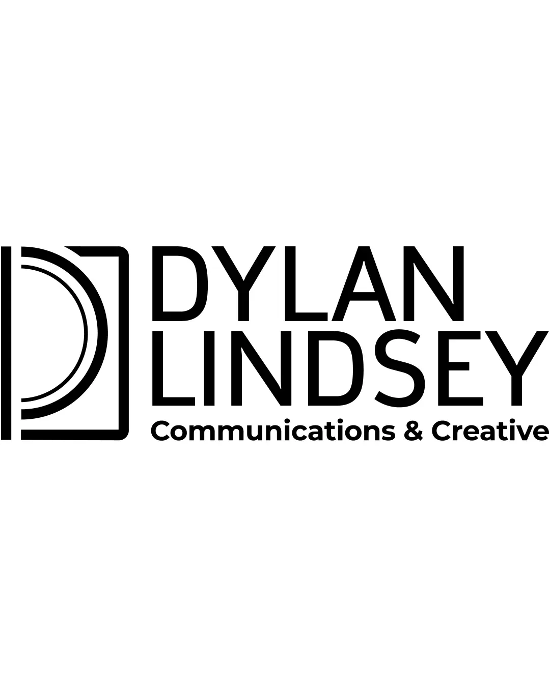
Logo concept A
4.5/5 Concept A
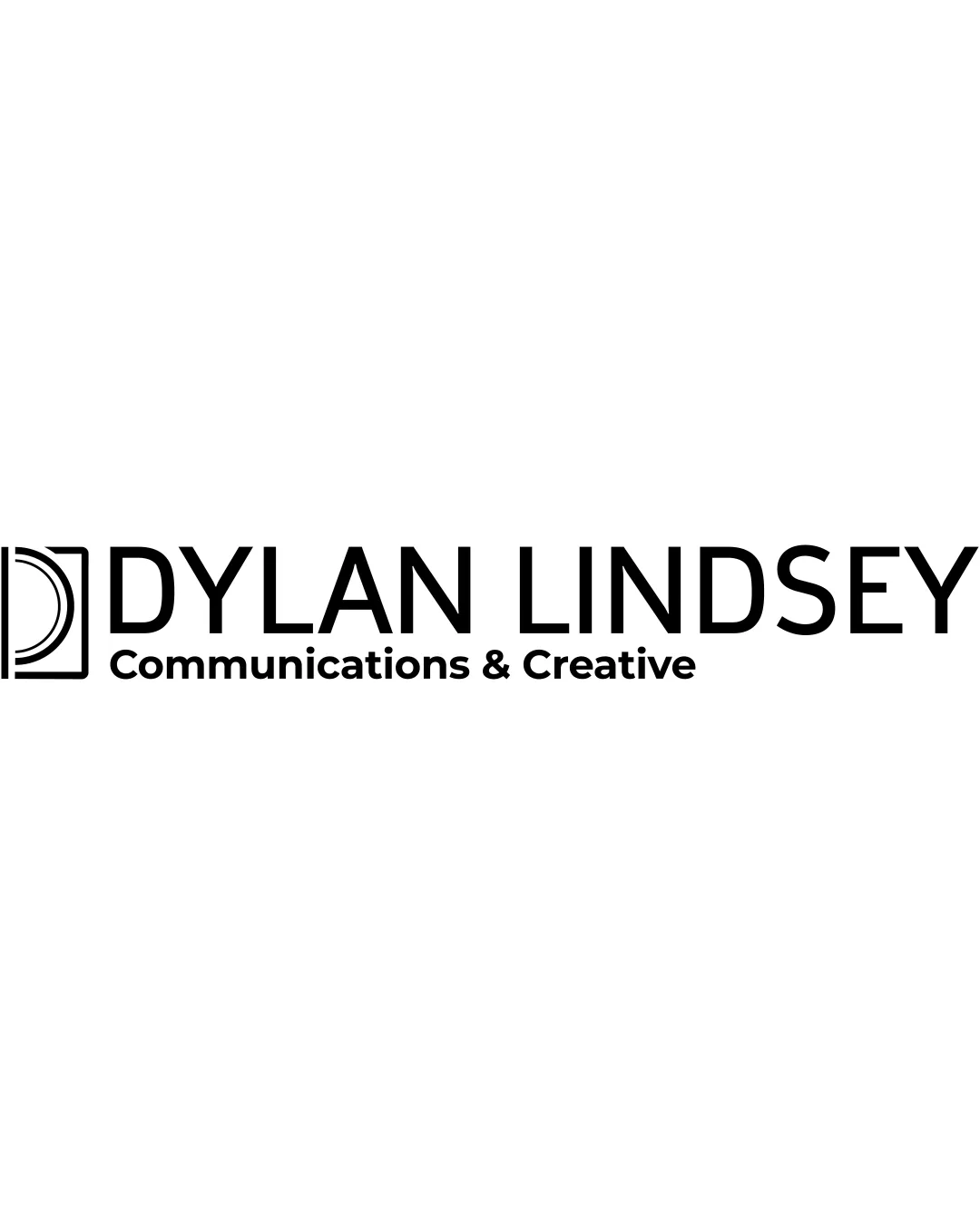
Logo concept B
3.0/5 Concept B
4.5/5
Winner score
Logo comparison

Logo Concept Comparison for General Audience Use

Concept A offers greater visual presence and memorability than Concept B, mainly due to its increased weight and prominence of the logomark. Both concepts are clear and legible, but B's smaller logomark risks being overlooked, diminishing brand recall.

AI comparison. Your final decision.

Medium confidence
Winner concept details
Best for
Situations needing strong visual branding and memorability.
Main strength
Prominent, clear, and distinctive mark next to text; good scalability.
Main risk
May be slightly heavy for very minimal or overly refined brand needs.
AI note
Recommended as the primary direction for broad use.
Why concept A won

Concept A's larger and more dominant logomark establishes a stronger brand identity and is more scalable and recognizable at varying sizes. Although both are professional, Concept B's minimized mark becomes less distinctive and easy to miss, reducing its effectiveness.
Decision factors
  • Concept A's mark is bold and clearly separated, aiding recognition.
  • Concept B loses mark impact at small sizes or from a distance.
  • Both have strong legibility in typography, but A feels more cohesive and intentional.
  • Neither presents high risk or inappropriate readings.
Brief used

No brief was added, so AI compared general clarity, memorability, scalability, visual risk, and presentation readiness.

Next step Test Concept A at smaller sizes and in single-color applications to confirm legibility and visual balance. Ensure the mark remains clear in practical use.

Concept breakdown

Each uploaded direction is scored and explained so you can see why the winner stood out.

Logo concept A Recommended
4.5/5

Concept A

Best for
Situations needing strong visual branding and memorability.
Main strength
Prominent, clear, and distinctive mark next to text; good scalability.
Main risk
May be slightly heavy for very minimal or overly refined brand needs.

Recommended as the primary direction for broad use.

Logo concept B
3.0/5

Concept B

Best for
Highly minimalist applications where mark subtlety is preferred.
Main strength
Clean, restrained layout with more negative space.
Main risk
Mark is too subtle and can easily be overlooked, reducing memorability.

Not recommended unless understated presence is required.