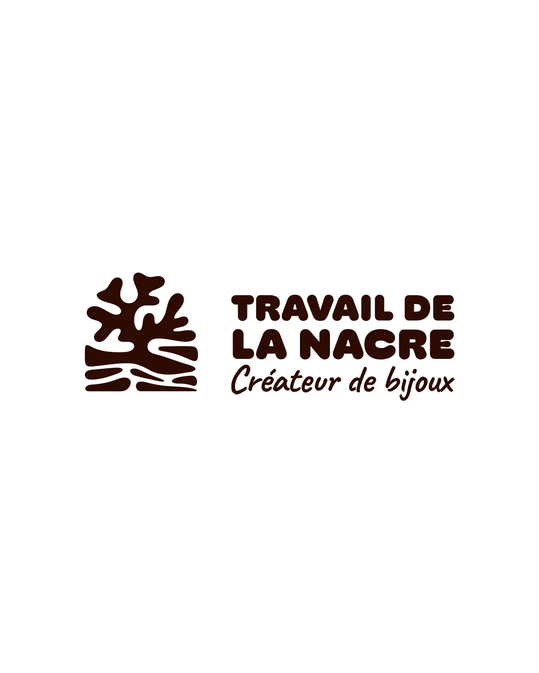
Concept A
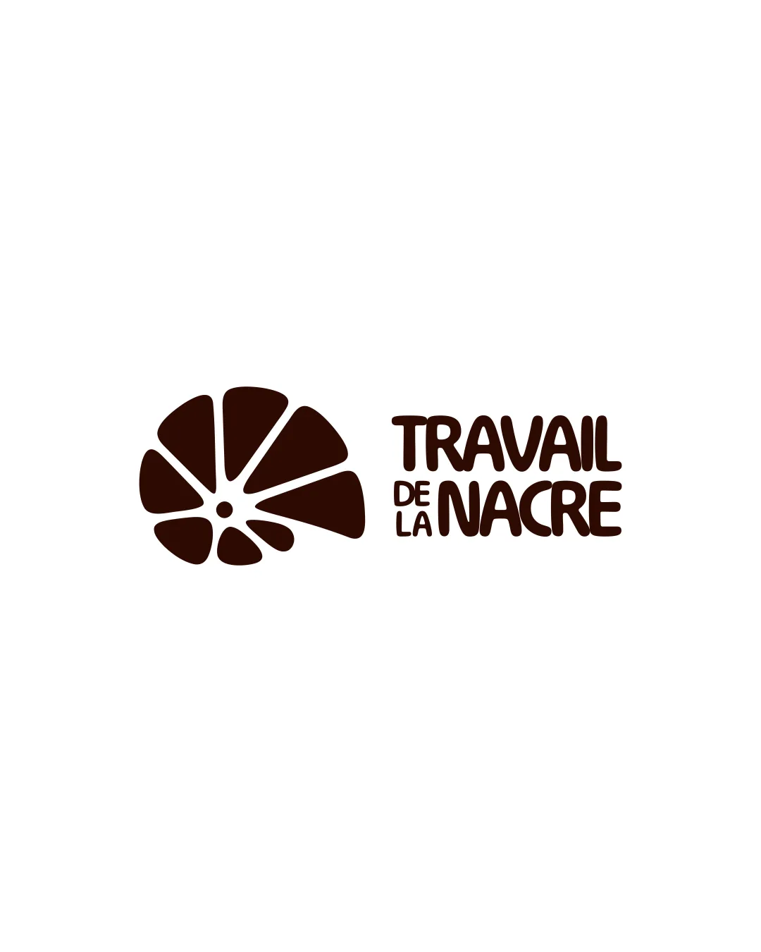
Concept A is stronger overall due to its distinctive and relevant icon, which improves memorability and suggests a potential connection to nature or craftsmanship. Concept B is clear and simple but less unique and risks being interpreted as a citrus slice rather than something related to jewelry or nacre.
AI comparison. Your final decision.
Concept A features a visually distinctive motif reminiscent of coral or organic forms, which aligns better with artisanal or jewelry-related themes and stands out more. It is scalable and highly legible. The main risk is that the abstract form could be misinterpreted, but it remains more memorable. Concept B is more generic and may be confused with non-related industries (like food or citrus), diminishing its brand d
No brief was added, so AI compared general clarity, memorability, scalability, visual risk, and presentation readiness.
Each uploaded direction is scored and explained so you can see why the winner stood out.
Recommended
Standout icon for jewelry/craft positioning, with medium risk of misinterpretation but high brand potential.
Safe and clear, but lacks distinctiveness for jewelry or nacre brands; not recommended unless minimalism is prioritized.
More credits needed
Add credits to continue without losing your work.