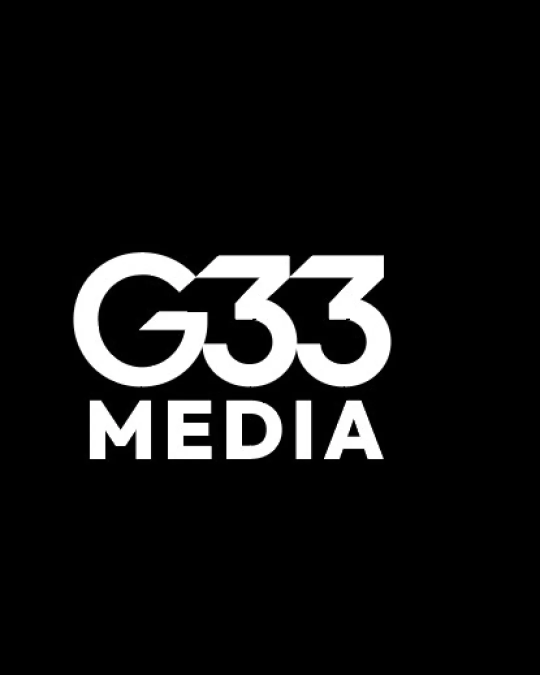
G33 Media Logo Concepts A vs B
Concept B offers a more cohesive, scalable, and visually balanced logo design for a videography business, with better usability across media types.
AI comparison. Your final decision.
- Best for
- Main brand logo for digital, video, and professional collateral.
- Main strength
- Balanced lines, clear letterforms, strong presence at multiple sizes.
- Main risk
- Could be seen as a bit generic; consider a minor custom touch in future.
- AI note
- Strongly recommended, with minor refinement possible for distinctiveness.
Concept B's consistent line weights and tighter design make the logo feel bolder and more modern, which is suitable for a video media brand. It avoids the awkward negative space and legibility issues of Concept A, and will reproduce better at small sizes. The mark appears stronger and more professional, increasing trust for small and medium business clients.
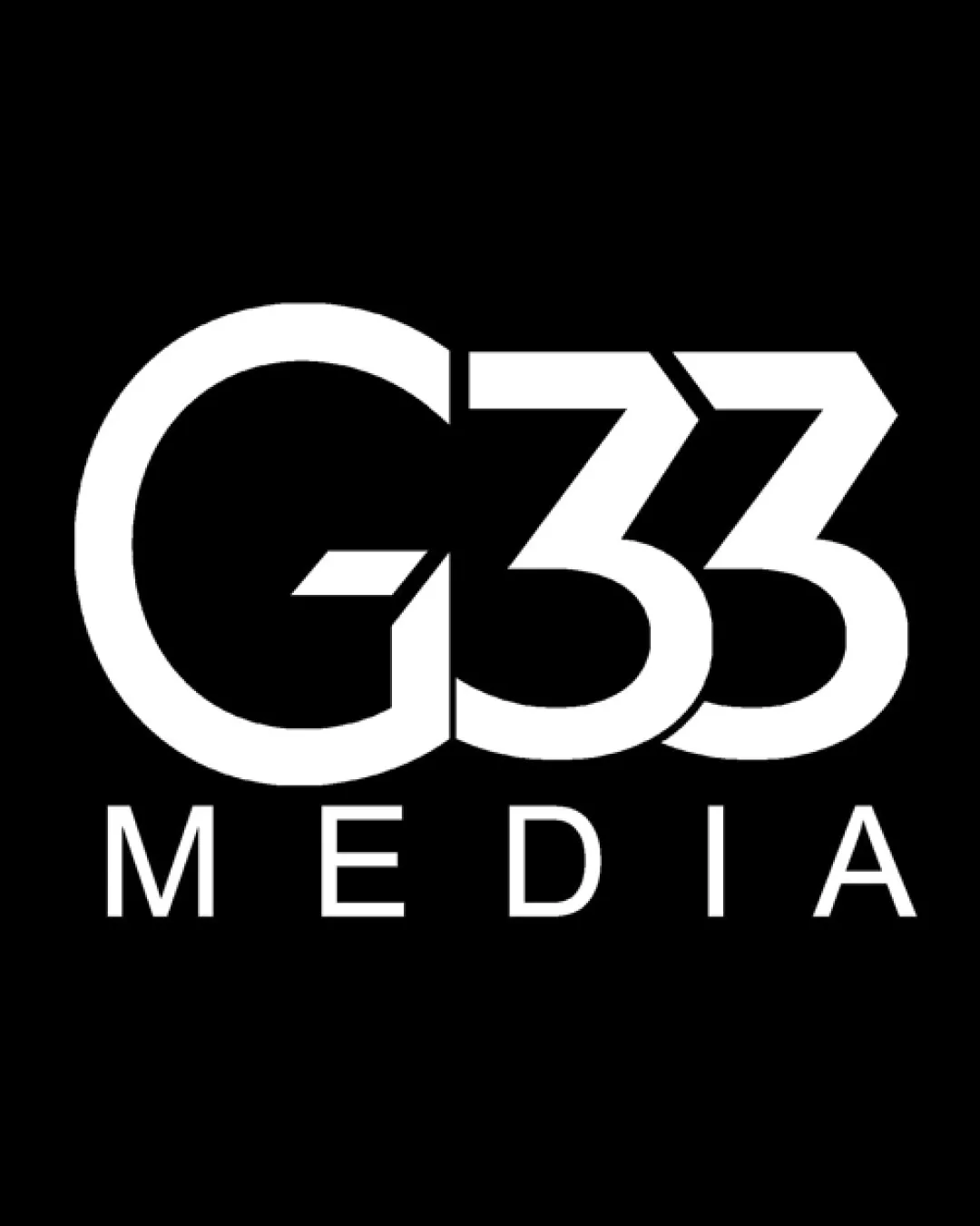
- Legibility: Concept B is clearer, especially at smaller sizes. Concept A's spacing causes misreads.
- Scalability: Concept B will perform better across digital/video thumbnails and business collateral.
- Professionalism: The even weights and alignment in Concept B signal precision and reliability—qualities valued by business customers.
- Distinctiveness: Both are similar, but Concept A's execution could come off as unfinished due to inconsistent letter styling.
Videographer who offers video services to small to meduim businesses.
Concept breakdown
Each uploaded direction is scored and explained so you can see why the winner stood out.
Concept A
- Best for
- Experimental branding or scenarios where a looser feel is desired.
- Main strength
- Attempts to create a unique, stylized 'G33' lockup.
- Main risk
- Inconsistent spacing and letter styling harm legibility, especially with the '33,' and may cause confusion.
Not recommended due to legibility and execution issues.
Recommended
Concept B
- Best for
- Main brand logo for digital, video, and professional collateral.
- Main strength
- Balanced lines, clear letterforms, strong presence at multiple sizes.
- Main risk
- Could be seen as a bit generic; consider a minor custom touch in future.
Strongly recommended, with minor refinement possible for distinctiveness.