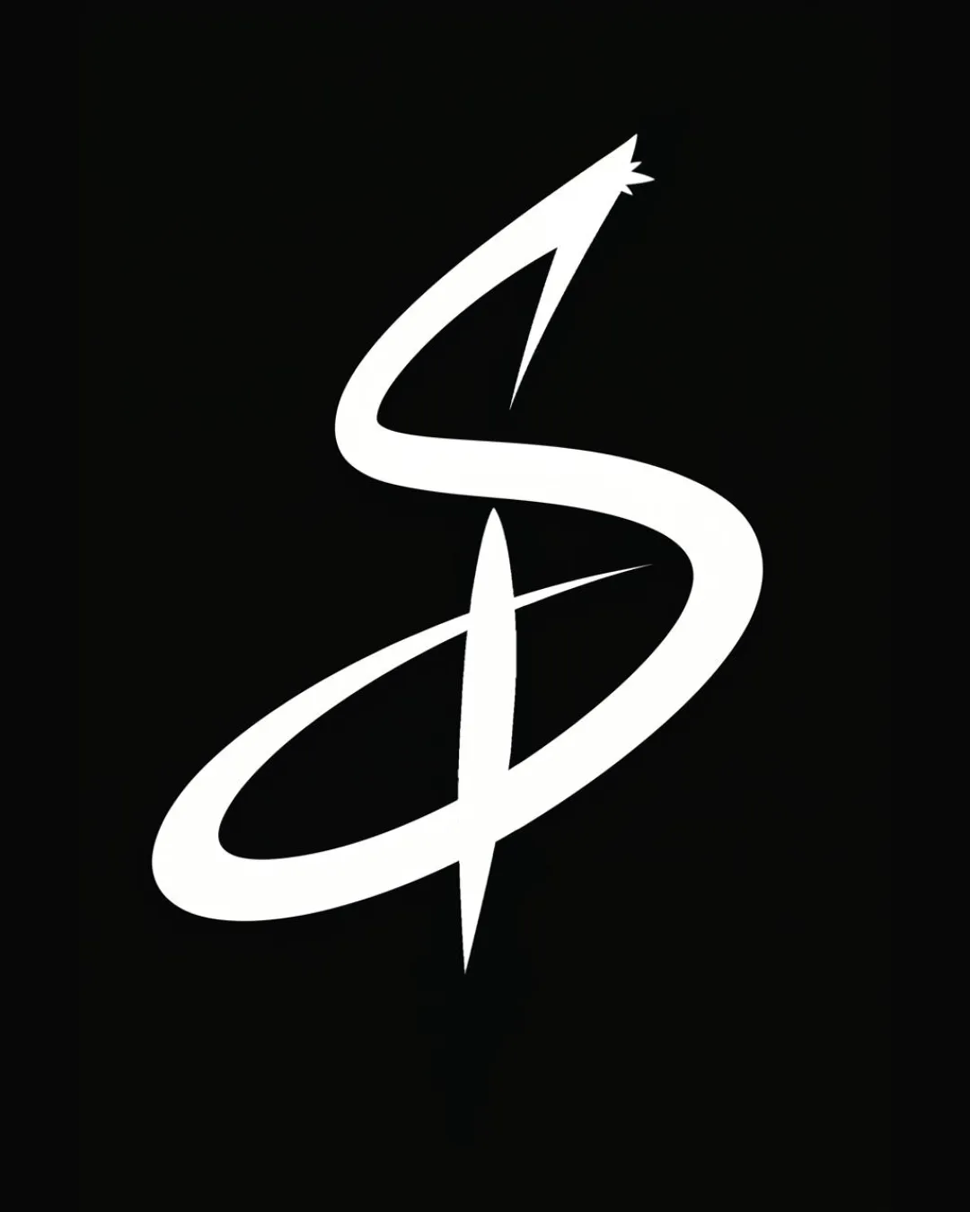
Recommended concept Recommended logo concept B
Concept B
Logo concept A
2.5/5 Concept A
Logo concept B
4.0/5 Concept B
4.0/5
Winner score
Logo comparison

Immersive & Interactive Experiences Logo Direction

Concept B is stronger for the immersive and interactive experience brief due to greater legibility, clearer symbolism, and overall bolder presence.

AI comparison. Your final decision.

Medium confidence
Winner concept details
Best for
Tech-forward or entertainment brands focused on digital interactivity and bold presence.
Main strength
Striking, clear, and energetic symbol suitable for immersive experiences.
Main risk
Slight risk of sharpness feeling aggressive if not balanced with other brand elements.
AI note
Recommended with refinement for digital-forward, interactive brand applications.
Why concept B won

Concept B maintains the swooping, dynamic shape but with improved contrast, line clarity, and a more confident 'S' form. The addition of a path-like vertical reinforces the idea of movement and interaction. While Concept A has a fluid style, its thin stroke and lower clarity may limit scalability and impact, particularly on digital or small formats—both key for interactive brands.

Decision factors
  • Legibility and scalability are better in Concept B.
  • Both feature dynamic lines, but B is clearer and more visually assertive.
  • Concept B's symbol better communicates an active, forward motion, aligning with 'immersive and interactive'.
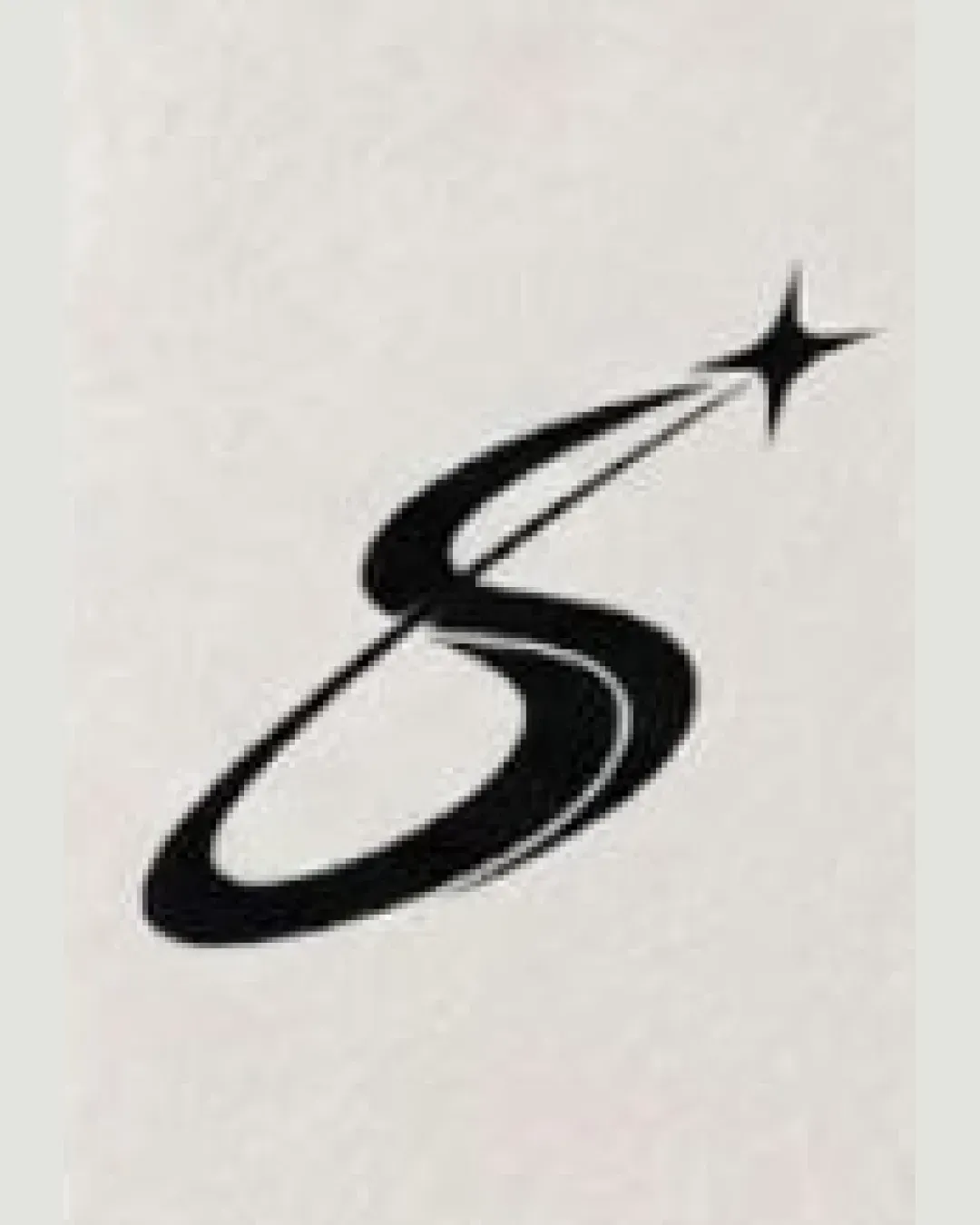
  • Concept A risks being too delicate and potentially overlooked, especially in digital formats.
Brief used

Immersive and interactive experiences

Next step Refine Concept B: test at small sizes, explore alternative colorways, and assess symbol-to-type lockup for multi-use brand applications.

Concept breakdown

Each uploaded direction is scored and explained so you can see why the winner stood out.

Logo concept A
2.5/5

Concept A

Best for
Brands prioritizing artistic or elegant impressions in large formats.
Main strength
Elegant, fluid shape hints at creativity and imagination.
Main risk
Thin stroke and lack of contrast reduce legibility and impact; poor scalability.

Not recommended unless prioritizing a soft, artistic direction over impact and clarity.
Logo concept B Recommended
4.0/5

Concept B

Best for
Tech-forward or entertainment brands focused on digital interactivity and bold presence.
Main strength
Striking, clear, and energetic symbol suitable for immersive experiences.
Main risk
Slight risk of sharpness feeling aggressive if not balanced with other brand elements.

Recommended with refinement for digital-forward, interactive brand applications.