Recommended concept Recommended logo concept A
Concept A
Logo concept A
4.0/5 Concept A
Logo concept B
2.5/5 Concept B
4.0/5
Winner score
Logo comparison

IWL vs. WPFL Logo Concepts

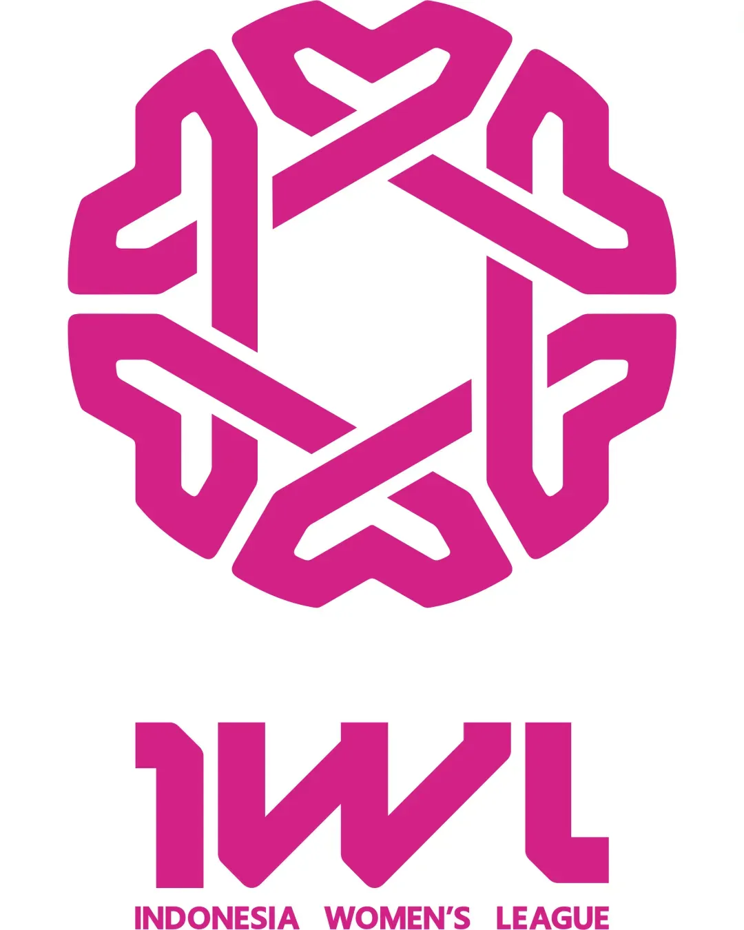
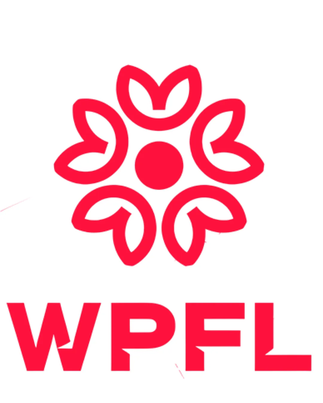
Concept A is more visually distinctive and memorable, using sharp shapes and a unified emblem that is easier to recall. Concept B, while visually pleasant, risks generic floral associations and less clarity for sports or league contexts.

Medium confidence
Winner concept details
Best for
Branding for sports leagues targeting modern audiences.
Main strength
Geometric unity, distinctiveness, and strong league category cues.
Main risk
Potential minor legibility issues at very small sizes due to shape complexity.
AI note
Best direction but refine for small-scale clarity.
Why concept A won

Concept A has better visual distinctiveness and memorability for a league branding context. Its geometric, interlocking shapes give a stronger sense of unity and professionalism. Although both concepts use similar color schemes and monogram approaches, Concept B's soft petal and circle motif leans floral, straying from category cues expected of sports organizations and risking weaker association. Both scale reasonabl

Decision factors
  • Memorability: A is bolder and more unusual.
  • Category Fit: A better supports a sports/league brand, B risks a floral/non-sports interpretation.
  • Scalability: Both are scalable but A remains more legible when reduced.
  • Distinctiveness: A is more unique; B is more generic.
Brief used

No brief was added, so AI compared general clarity, memorability, scalability, visual risk, and presentation readiness.

Next step Explore possible refinements for A to further enhance scalability and ensure the emblem remains legible in small formats. Consider subtle tweaks to maximize both impact and uniqueness.

Concept breakdown

Each uploaded direction is scored and explained so you can see why the winner stood out.

Logo concept A Recommended
4.0/5

Concept A

Best for
Branding for sports leagues targeting modern audiences.
Main strength
Geometric unity, distinctiveness, and strong league category cues.
Main risk
Potential minor legibility issues at very small sizes due to shape complexity.

Best direction but refine for small-scale clarity.

Logo concept B
2.5/5

Concept B

Best for
Lifestyle or community organizations; less ideal for a major league.
Main strength
Friendly, harmonious look.
Main risk
Generic floral appearance; weak visual association with sports or competitiveness.

Not recommended – risks category confusion.