Recommended concept Recommended logo concept A
Concept A
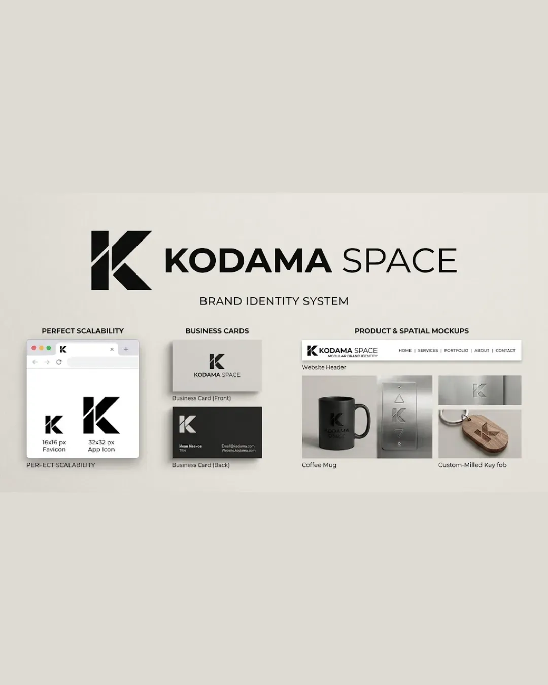
Logo concept A
4.5/5 Concept A
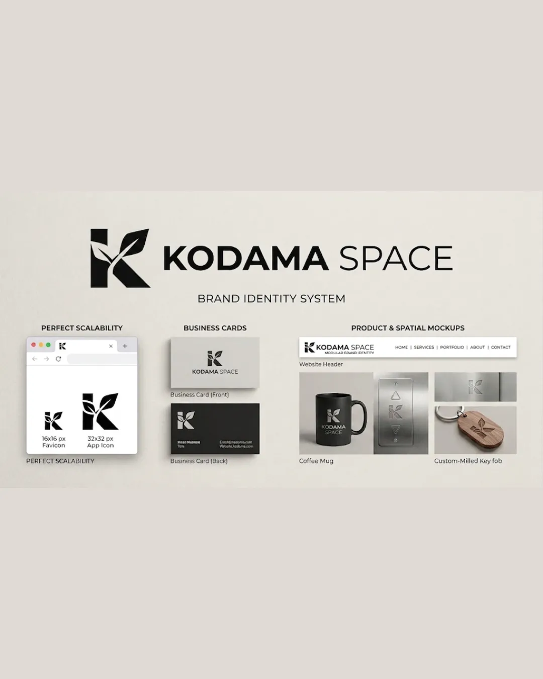
Logo concept B
3.0/5 Concept B
4.5/5
Winner score
Logo comparison

Kodama Space Logo Concept Comparison

Concept A is stronger due to its higher clarity, simplicity, and scalability, which are important without a specific brief. Concept B is a bit more complex and less instantly readable at smaller sizes.

AI comparison. Your final decision.

Medium confidence
Winner concept details
Best for
General audience, broad brand applications, digital and print.
Main strength
Exceptional legibility, simplicity, and strong scalability.
Main risk
May risk being slightly generic without additional storytelling.
AI note
Best choice for a versatile and professional identity with room for future character additions.
Why concept A won

Concept A's bold and clean 'K' mark is highly legible and simple, making it more memorable and distinctive for general audiences. It carries less risk of confusion or muddiness when scaled down. Concept B introduces leaf-like elements, which adds a unique twist but reduces instant recognition and complicates the silhouette, leading to potential legibility issues at smaller sizes. Without a category-specific brief, cl
Decision factors
  • Concept A is clearer and more recognizable at multiple scales.
  • Concept B's decorative elements hinder simplicity and scalability.
  • Both concepts have solid application mockups, but A is more versatile.
  • Neither concept carries high risk, but B is weaker on instant legibility.
Brief used

No brief was added, so AI compared general clarity, memorability, scalability, visual risk, and presentation readiness.

Next step Select Concept A as the base, then develop alternate versions exploring subtle thematic cues or unique elements if more brand personality is needed—while maintaining clarity and scalability.

Concept breakdown

Each uploaded direction is scored and explained so you can see why the winner stood out.

Logo concept A Recommended
4.5/5

Concept A

Best for
General audience, broad brand applications, digital and print.
Main strength
Exceptional legibility, simplicity, and strong scalability.
Main risk
May risk being slightly generic without additional storytelling.

Best choice for a versatile and professional identity with room for future character additions.

Logo concept B
3.0/5

Concept B

Best for
Brands wanting an organic, nature-inspired look, but only if the brief calls for it.
Main strength
Unique with subtle organic elements suggesting growth or nature.
Main risk
Lower legibility and risk of clutter at small sizes.

Not recommended unless brief clarifies a need for organic/nature theming over clarity and usability.