Recommended concept Recommended logo concept B
Concept B
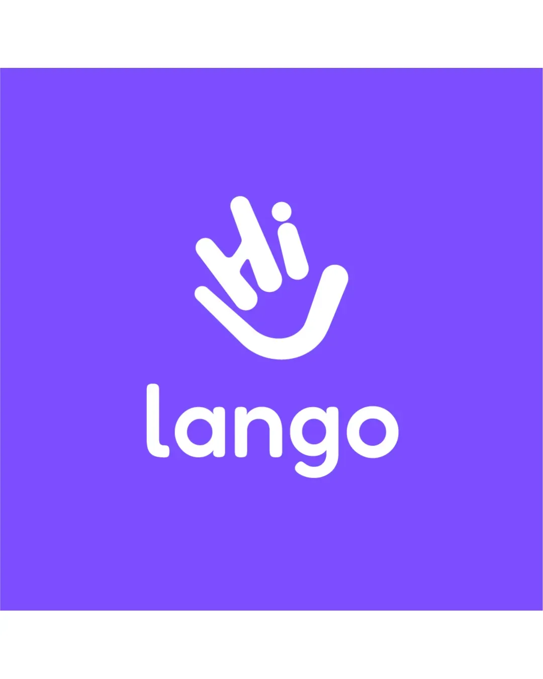
Logo concept A
3.5/5 Concept A
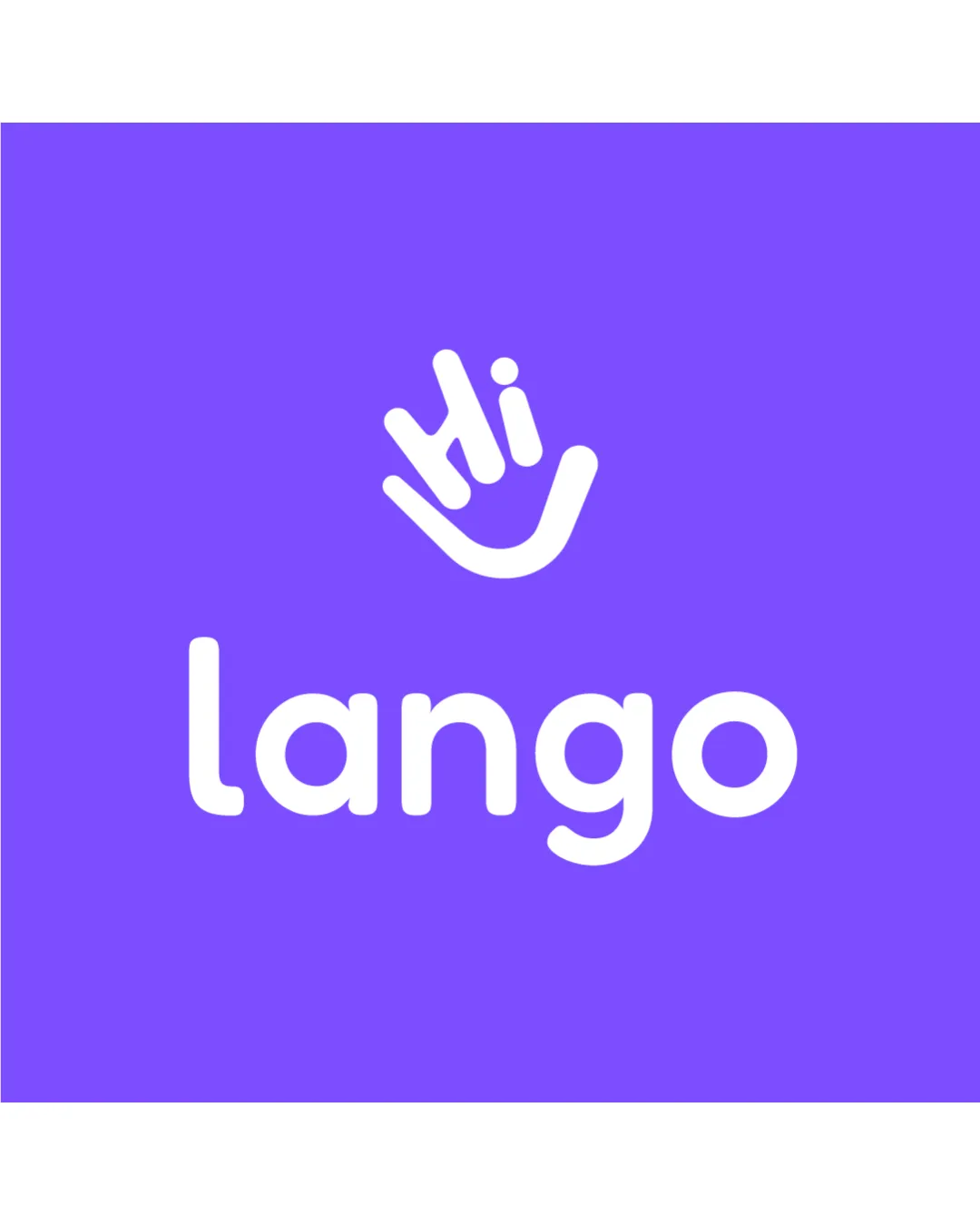
Logo concept B
4.0/5 Concept B
4.0/5
Winner score
Logo comparison

Lango Language Learning App: Logo Concept Comparison

Concept B is slightly stronger due to its more balanced use of whitespace and improved visual hierarchy between the 'Hi' hand icon and the word 'lango.' Both options feature playful, friendly typography suitable for an educational app, but B has a more cohesive vertical alignment and a slightly more inviting composition.

AI comparison. Your final decision.

Medium confidence
Winner concept details
Best for
Digital app interfaces and compact branding (app store, mobile, web).
Main strength
Stronger compositional unity and approachability, creates a clear brand mark.
Main risk
Slight risk of crowding if further spacing is not carefully managed at very small sizes.
AI note
Best option for primary branding, pending minor refinements.
Why concept B won

Concept B places the 'lango' name closer to the icon, making the wordmark and icon feel like a single unit, which enhances brand memorability and scalability across app platforms. It feels slightly more modern and approachable, aligning well with a language learning application's needs.
Decision factors
  • Playful and friendly iconography aligns with language learning.
  • Spacing and hierarchy are crucial for scalability and app usage.
  • Concept B has better vertical balance and unity.
  • No major legibility or appropriateness issues in either.
Brief used

languages learning application

Next step Test Concept B at small scale for app icon clarity and ensure accessibility in monochrome and on various backgrounds. Explore subtle refinements to spacing and potential animation of the 'Hi' hand for app launch.

Concept breakdown

Each uploaded direction is scored and explained so you can see why the winner stood out.

Logo concept A
3.5/5

Concept A

Best for
Print or large-scale educational campaign.
Main strength
Very clear separation of icon and wordmark, which may help recognition at larger scale.
Main risk
Some disconnection between icon and text can feel less cohesive for digital-first applications.

Could be considered if distinct separation of icon and name is prioritized.

Logo concept B Recommended
4.0/5

Concept B

Best for
Digital app interfaces and compact branding (app store, mobile, web).
Main strength
Stronger compositional unity and approachability, creates a clear brand mark.
Main risk
Slight risk of crowding if further spacing is not carefully managed at very small sizes.

Best option for primary branding, pending minor refinements.