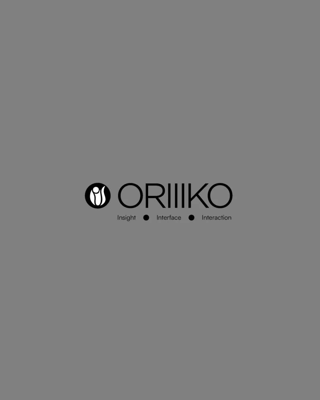
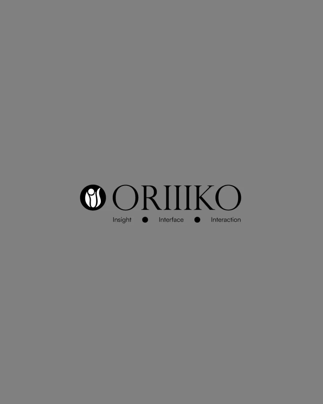
Logo comparison

ORIIIKO

Concept B

Original artwork

Probable first impression

Identical geometric and typographic structure as the first, with abstract monoline symbol and three tall 'I's.

Logo score

Strength

Brings strong geometric rhythm and clear brand recall.

Watch out for

Repetition could be mistaken for typographic error; can be hard to read in small formats.

Clarity
Distinctiveness
Small sizes
Brief fit
Best suited to
Same minimalist-focused, symbol-driven applications.
Refine next
This concept offers the same merits and weaknesses, resulting in a visual tie.
Put it in context

Same setting. Different directions.

Original logo colors. Matching placements and sample contact details.
Small-size scores are estimates; inspect the previews below.

01Social profile

Concept A
9:41
oriiiko
Concept A profile image
128Posts24.8KFollowers312Following
ORIIIKOOfficial profile

News, ideas, and updates from the team.

oriiiko.example
Standalone mark recommended

This preview uses your full logo lockup. Prepare a separate mark for small profile pictures.

Concept B
9:41
oriiiko
Concept B profile image
128Posts24.8KFollowers312Following
ORIIIKOOfficial profile

News, ideas, and updates from the team.

oriiiko.example
Standalone mark recommended

This preview uses your full logo lockup. Prepare a separate mark for small profile pictures.

02Website header

Concept A
ORIIIKO

Built for what
comes next.

Thoughtful work for people who expect more.

Concept B
ORIIIKO

Built for what
comes next.

Thoughtful work for people who expect more.

03Business card

Concept A
Concept A business card reverse
Jordan LeeORIIIKO
hello@oriiiko.example+1 202 555 0148
Concept B
Concept B business card reverse
Jordan LeeORIIIKO
hello@oriiiko.example+1 202 555 0148

04Favicon & small sizes

Concept A
Concept A in a 16 pixel square 16 px
Concept A in a 32 pixel square 32 px
Concept A in a 48 pixel square 48 px
Concept A in a 96 pixel square 96 px

Actual CSS sizes, at your current browser zoom.

Standalone mark recommended

This preview uses your full logo lockup. Prepare a separate mark for favicons and compact placements.

Concept B
Concept B in a 16 pixel square 16 px
Concept B in a 32 pixel square 32 px
Concept B in a 48 pixel square 48 px
Concept B in a 96 pixel square 96 px

Actual CSS sizes, at your current browser zoom.

Standalone mark recommended

This preview uses your full logo lockup. Prepare a separate mark for favicons and compact placements.

Comparison summary

Each direction at a glance

The designer makes the final choice.

Logo concept A

Concept A

AI recommended
Clarity
Distinctiveness
Small sizes
Brief fit
Best for
Brand seeking minimalist, modern presence.
Strength
Bold repetition in letterforms enhances memorability.
Watch out for
Three stacked 'I's risk legibility at distance or small size.
Refine next
This concept is distinct and clear within this set, though refinement could boost legibility further.
Logo concept B

Concept B

Clarity
Distinctiveness
Small sizes
Brief fit
Best for
Same minimalist-focused, symbol-driven applications.
Strength
Brings strong geometric rhythm and clear brand recall.
Watch out for
Repetition could be mistaken for typographic error; can be hard to read in small formats.
Refine next
This concept offers the same merits and weaknesses, resulting in a visual tie.

Logo concept