Recommended concept Recommended logo concept A
Concept A
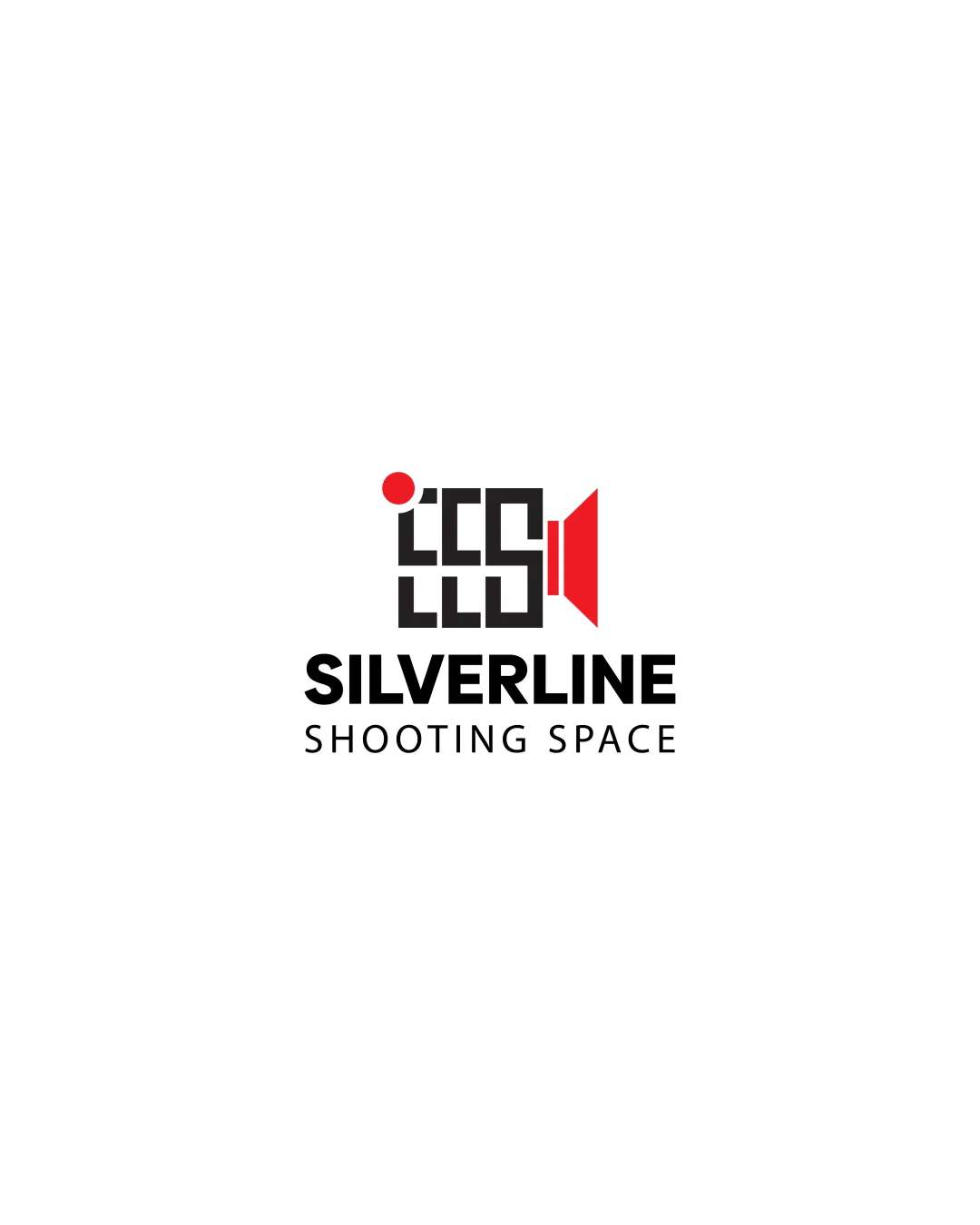
Logo concept A
4.0/5 Concept A
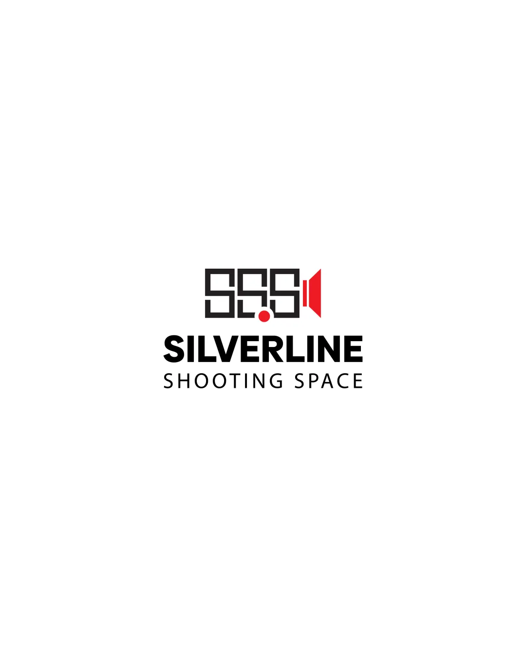
Logo concept B
2.5/5 Concept B
4.0/5
Winner score

Logo comparisonSilverline Shooting Space Logo Concept Comparison

Concept A is more immediately readable and distinct, while Concept B risks excessive abstraction and legibility loss at small sizes.

Medium confidence Public
Winner concept details
Best for
General branding and digital/print applications.
Main strength
Strong visual metaphor and clear integration of camera and brand.
Main risk
Minor risk of small-scale detail loss, but less severe than B.
AI note
Best direction; minor refinement needed for universal legibility.
Why concept A won

Concept A successfully integrates a camera icon with an abstract, visually interesting mark that supports easy recognition. The use of negative space and the red accent communicates the camera theme clearly and memorably. Concept B, while creative, becomes too abstract—the repetition of shapes makes the 'camera' less discernible, and the logomark risks blending into an unreadable form especially at small sizes. For g
Decision factors
  • Concept A has higher immediate recognizability and visual impact.
  • Concept B risks confusion due to abstraction and weak letter/mark relationships.
  • Both concepts include a red accent, but only A leverages it to enhance the camera motif.
  • Concept A scales down better due to simpler geometry; B's dense lines may blur or merge.
Brief used

No brief was added, so AI compared general clarity, memorability, scalability, visual risk, and presentation readiness.

Next step Refine Concept A with slight tweaks for optimal legibility at small sizes and ensure consistency in various applications.
Compare next

Concept breakdown

Each uploaded direction is scored and explained so you can see why the winner stood out.

Logo concept A Recommended
4.0/5

Concept A

Best for
General branding and digital/print applications.
Main strength
Strong visual metaphor and clear integration of camera and brand.
Main risk
Minor risk of small-scale detail loss, but less severe than B.

Best direction; minor refinement needed for universal legibility.

Logo concept B
2.5/5

Concept B

Best for
Experimental or use cases where abstract marks are valued.
Main strength
Ambitious geometric play and pattern-based interest.
Main risk
Excessive abstraction leads to legibility loss and diminished brand recall.

Not recommended due to scalability and clarity issues.