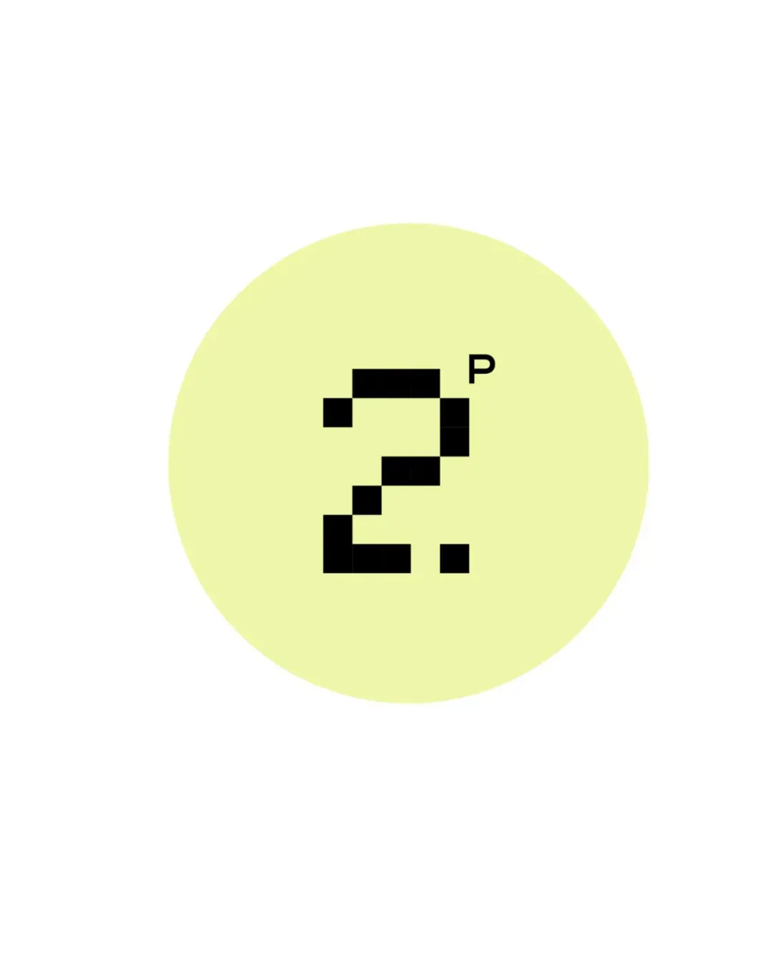
Concept A
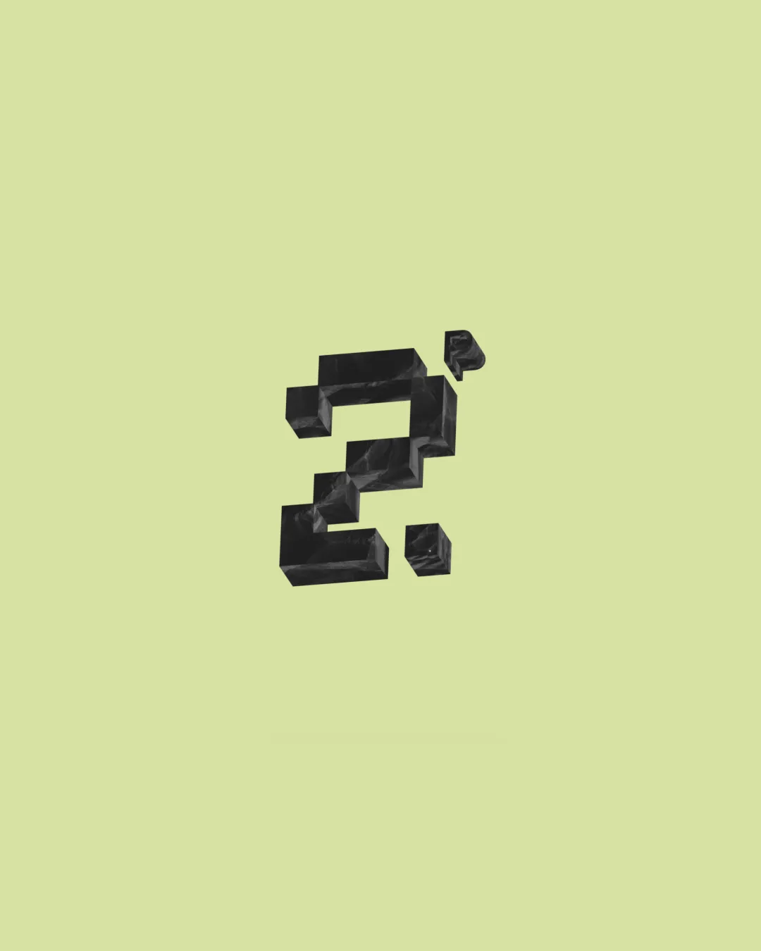
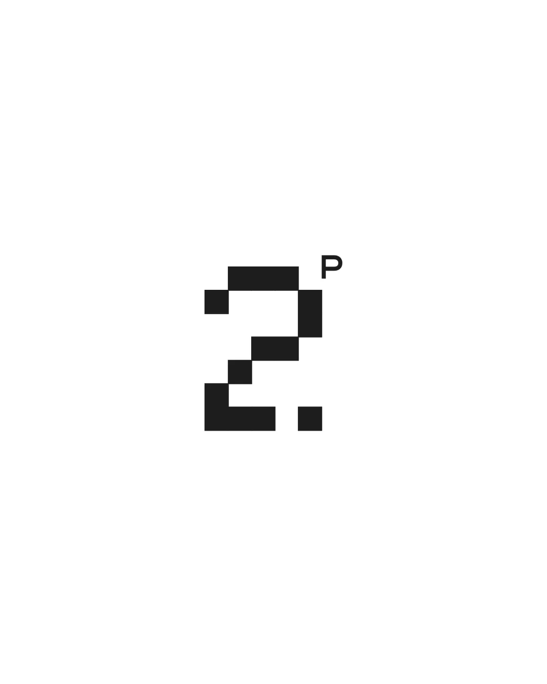
Concept A is the strongest choice for TwoPixels. It balances digital pixel-art, clear identity, and minimalist professionalism, matching the brief precisely. Concept B has scalability and legibility issues, while Concept C lacks the distinct brand color and visual punch described in the brief.
AI comparison. Your final decision.
Concept A delivers all key requirements: a clear, pixelated '2', a small, clean 'P', and the specified pale yellow circle background for immediate brand recognition. It is scalable, legible, and communicates digital expertise effectively. Concepts B and C each miss critical aspects of the brief—B has a fragmented appearance and weak legibility, while C omits the yellow circle that anchors the identity.
TwoPixels is a creative studio specializing in graphic design, AI creation, artistic creation, and consultation. The logo is minimalist, featuring a pale yellow circle background. Inside, there is a bold, black, pixelated number '2' paired with a small, clean letter 'P'. The digital pixel-art style perfectly represents the studio's focus on AI and modern digital creation, while the minimal layout reflects professional graphic design and artistic consultation expertise
Each uploaded direction is scored and explained so you can see why the winner stood out.
Recommended
Highly recommended. Small refinements may maximize small-scale clarity.
Not recommended due to weak readability and digital brand association.
Clean but incomplete—would need brand color added to compete with A.
More credits needed
Add credits to continue without losing your work.
Then $7/month. Cancel anytime.