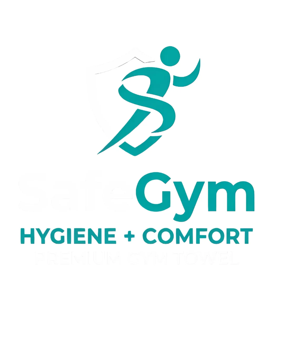
Concept A vs. Concept B – Leadership Gym Brand
Concepts A and B are nearly identical, both featuring an abstract running figure and the same typography. The only notable difference is the slightly stronger color and contrast in Concept A, which gives it a marginally bolder and more professional presence.
AI comparison. Your final decision.
- Best for
- Aspirational, leading fitness or hygiene-focused gym brands.
- Main strength
- Bold, energetic icon with strong color and legible typography.
- Main risk
- Icon may be generic, risking lack of distinctiveness.
- AI note
- Recommended for immediate leadership impression with minor refinement.
Concept A's slightly more saturated and crisp color treatment projects clarity, confidence, and better visibility—key attributes for a leader brand. The recognizable running figure suggests motion and leadership, and the cleaner presentation makes A the stronger fit for the 'leader in the first place' brief.
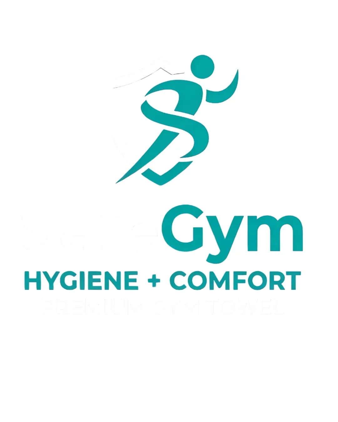
- Clarity and contrast support instant recognition.
- Leadership association achieved by running figure.
- Color saturation and crispness elevate professionalism.
- Both concepts are similar, but A’s execution is marginally better.
I want to be more of a leader in the first place.
Concept breakdown
Each uploaded direction is scored and explained so you can see why the winner stood out.
Recommended
Concept A
- Best for
- Aspirational, leading fitness or hygiene-focused gym brands.
- Main strength
- Bold, energetic icon with strong color and legible typography.
- Main risk
- Icon may be generic, risking lack of distinctiveness.
Recommended for immediate leadership impression with minor refinement.
Concept B
- Best for
- Standard gym branding or internal communications.
- Main strength
- Consistent with A in structure and layout.
- Main risk
- Visually less crisp—could appear less premium next to competitors.
Only choose if a softer impression is desired, but A is better for a leader brand.