Wondering how your logo performs? 🧐
Get professional logo reviews in seconds and catch design issues in time.
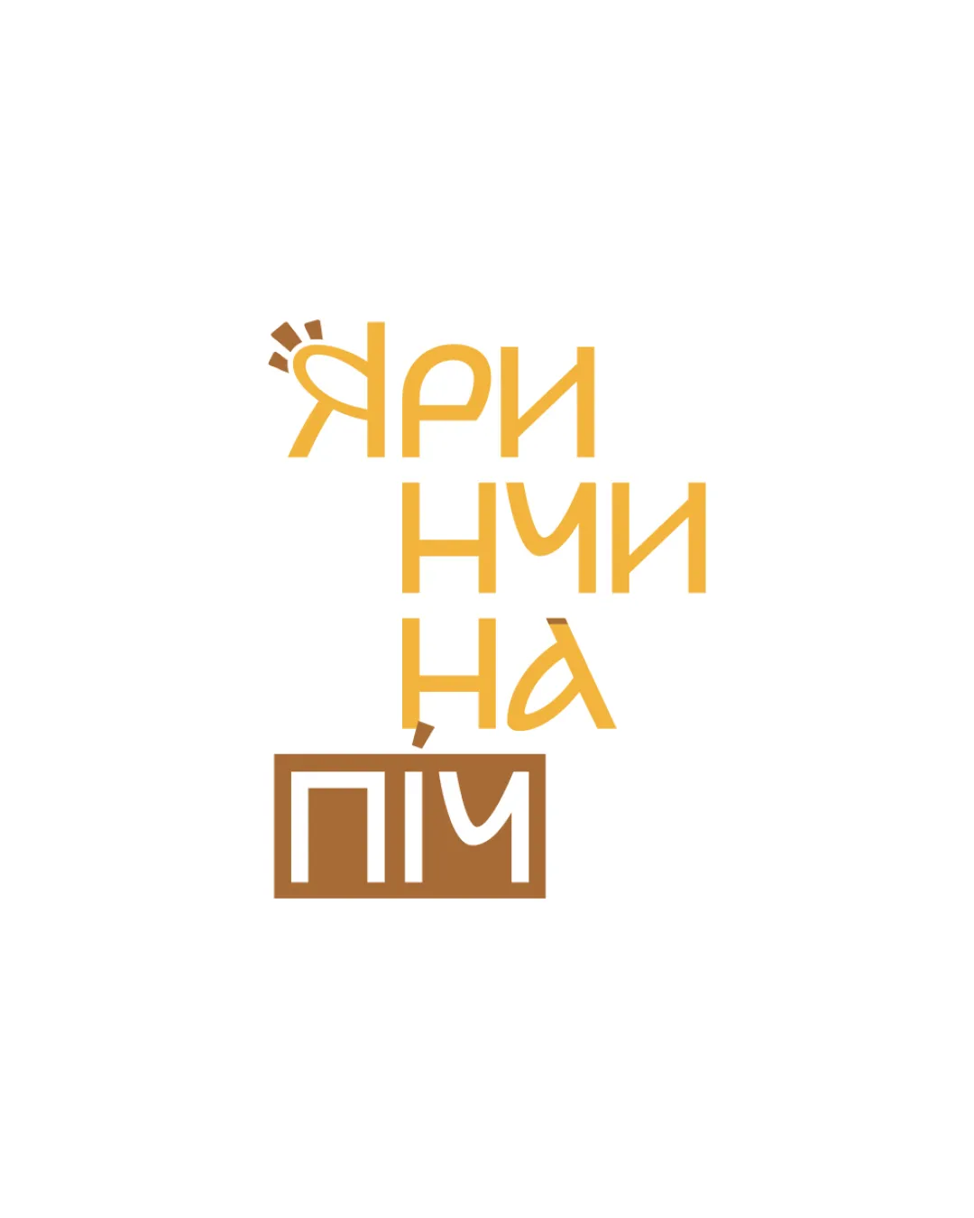
Try it Now!Logo review of Яриччина піч
 Logo analysis by AI
Logo type:
Style:
Detected symbol:
Detected text:
Business industry:
Review requested by Maksym
**If AI can recognize or misinterpret it, so can people.
Structured logo review
Legibility
Text is generally readable for those familiar with Cyrillic script.
Color contrast is adequate between text and background.
Stacked letter arrangement makes it harder to read at a glance.
The stylized form and overlap of the letters make quick comprehension difficult, especially for non-Ukrainian speakers.
Scalability versatility
Simple color palette and clean lines are adaptive for print and web.
Minimalism enhances performance at moderate scales (e.g., menus, signage).
Stacked vertical arrangement may lose clarity at very small sizes (e.g., business cards or favicons).
The icon and block at the bottom may merge visually when scaled down, leading to legibility issues.

200x250 px

100×125 px

50×62 px
Balance alignment
The vertical stacking creates a central focal point.
The boxed area at the bottom adds textual weight.
Letter alignment is irregular, making the composition feel unsteady.
Spacing between lines and blocks is inconsistent, impacting visual harmony.
Decorative mark above the letter feels disconnected from the rest of the structure.


Originality
The integration of a subtle oven/fire motif is conceptually relevant.
The nontraditional letter placement gives a unique, modern vibe.
Overall layout is reminiscent of other modern minimalist wordmarks.
The rectangular block for emphasis is common in modern branding.
Aesthetic look
Color palette is harmonious and suitable for food or bakery themes.
Modern geometric font is visually appealing.
Irregular composition and overlapping typography slightly detract from the overall beauty.
Visual weight at the bottom is much heavier than the top, affecting the flow.
Dual meaning and misinterpretations
No inappropriate or problematic imagery detected.
Abstract icon above the first letter lightly hints at warmth/fire, supporting the industry.
Color harmony
Warm color palette is cohesive and friendly.
Colors fit well with the food/bakery industry.
Goldenrod
#F4B130
Brown
#A86C2C
White
#FFFFFF

