Wondering how your logo performs? 🧐
Get professional logo reviews in seconds and catch design issues in time.
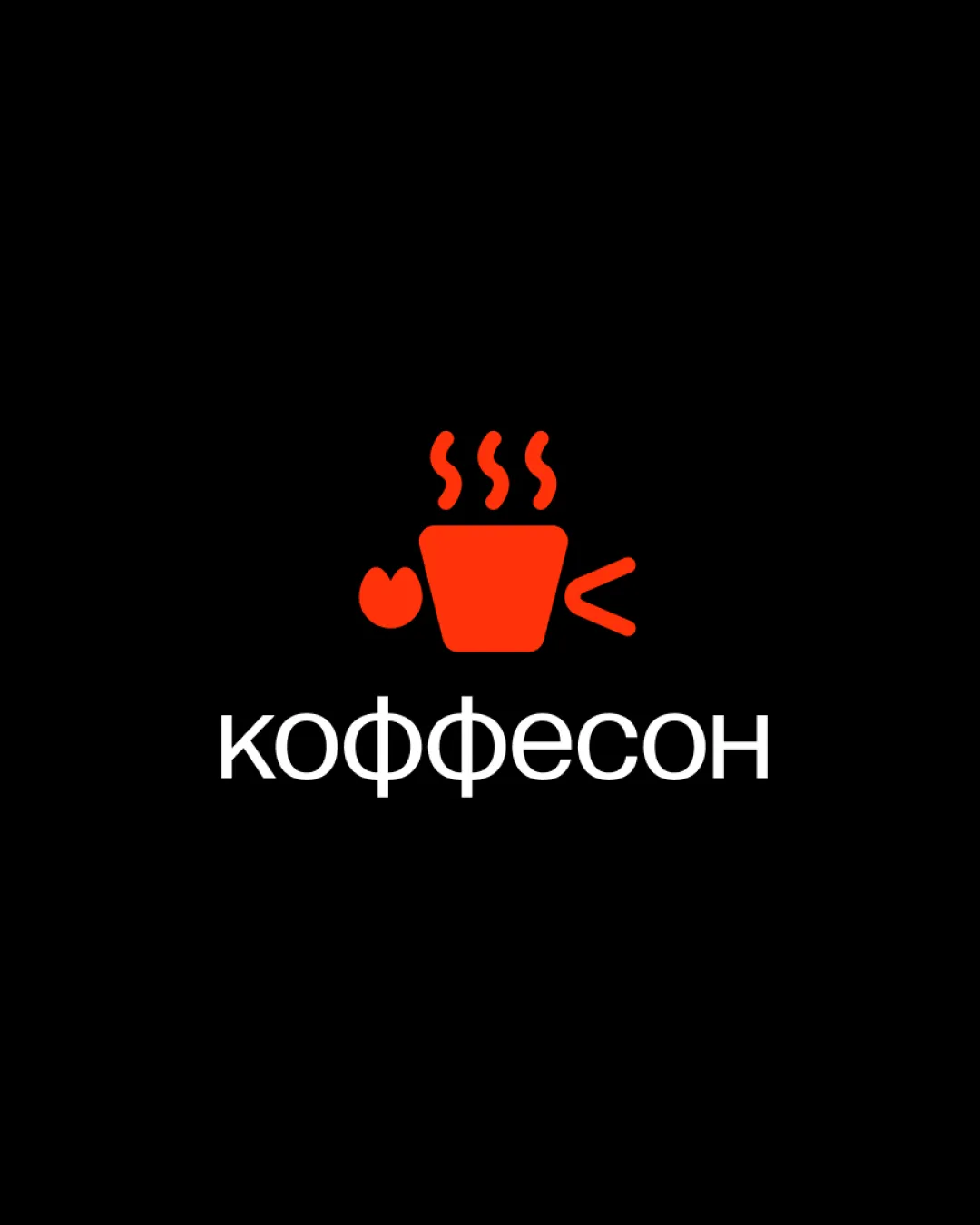
Try it Now!Logo review of Коффесон
 Logo analysis by AI
Logo type:
Style:
Detected symbol:
Detected text:
Business industry:
Review requested by Vova
**If AI can recognize or misinterpret it, so can people.
Structured logo review
Legibility
![]() Text is set in a clean, geometric sans-serif font.
Text is set in a clean, geometric sans-serif font.![]() Contrast between white text and black background ensures high readability.
Contrast between white text and black background ensures high readability.![]() Cyrillic characters are clearly distinguishable.
Cyrillic characters are clearly distinguishable.
Scalability versatility
![]() Minimalistic shapes and bold lines enable good scalability for web and digital use.
Minimalistic shapes and bold lines enable good scalability for web and digital use.![]() Icon is recognizable at small to medium sizes.
Icon is recognizable at small to medium sizes.
![]() The thin details of the steam and smaller side elements might be lost at very small sizes such as favicons or embroidery.
The thin details of the steam and smaller side elements might be lost at very small sizes such as favicons or embroidery.![]() Monochrome red may not stand out on non-black backgrounds.
Monochrome red may not stand out on non-black backgrounds.
200x250 px
100×125 px
50×62 px
Balance alignment
![]() Logo components are generally centered and aligned vertically.
Logo components are generally centered and aligned vertically.![]() Weight of the icon matches the wordmark reasonably well.
Weight of the icon matches the wordmark reasonably well.
![]() The asymmetrical extra shapes to the left and right of the cup create minor visual imbalance, drawing the eye rightward.
The asymmetrical extra shapes to the left and right of the cup create minor visual imbalance, drawing the eye rightward.

Originality
![]() Distinctive attempt at stylizing a coffee cup with abstract side elements.
Distinctive attempt at stylizing a coffee cup with abstract side elements.
![]() The coffee cup and steam motif is very common in the cafe industry.
The coffee cup and steam motif is very common in the cafe industry.![]() Side elements do not contribute a unique twist, feeling arbitrary rather than clever.
Side elements do not contribute a unique twist, feeling arbitrary rather than clever.
Logomark wordmark fit
![]() Logomark and wordmark have compatible contemporary styles.
Logomark and wordmark have compatible contemporary styles.![]() Sizes are proportionally reasonable for most layouts.
Sizes are proportionally reasonable for most layouts.
![]() Icon feels slightly heavier and more vibrant in color than the light weight of the wordmark, causing a minor visual dissonance.
Icon feels slightly heavier and more vibrant in color than the light weight of the wordmark, causing a minor visual dissonance.
Aesthetic look
![]() Modern, flat style feels current and visually appealing.
Modern, flat style feels current and visually appealing.![]() Limited color palette maintains visual simplicity.
Limited color palette maintains visual simplicity.
![]() Side accents adjacent to the cup feel decorative more than purposeful, slightly complicating the design.
Side accents adjacent to the cup feel decorative more than purposeful, slightly complicating the design.
Dual meaning and misinterpretations
![]() No inappropriate secondary imagery detected.
No inappropriate secondary imagery detected.
Color harmony
![]() Red, white, and black palette is bold, professional, and harmonious.
Red, white, and black palette is bold, professional, and harmonious.![]() High contrast supports versatility and impact.
High contrast supports versatility and impact.
Red
#FF2C06
Black
#000000
White
#FFFFFF