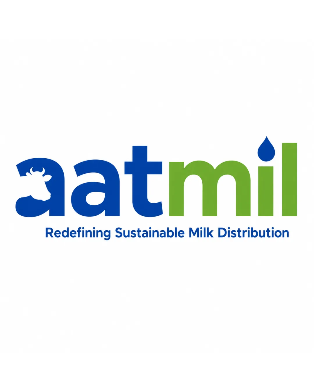
aatmil Redefining Sustainable Milk Distribution logo review
3.7 / 5
Logo score
Logo review of

Aatmil Redefining Sustainable Milk Distribution

A functional, readable logo that fits the industry well, with potential for further distinction and tighter small-size performance.

Combination Mark Modern, Clean Type Dairy/farming
4/5
Legibility
3.5/5
Originality
4.5/5
Misread
4/5
Balance
3/5
Scale
Action plan

What to fix first

The most important fixes to handle before polishing the full presentation.

1

Simplify or thicken cow head and milk drop for better clarity at small sizes

High priority

Current fine details may disappear at reduced sizes.

Impact: Improves Logo Scalability And Versatility · Effort: Medium

2

Explore more distinctive integration of industry elements

Medium priority

Logo is clean but not highly unique in the sector.

Impact: Enhances Originality And Competitive Differentiation · Effort: Medium

Detailed review

Logo performance breakdown

4/5

Legibility

Checkmark icon Text is clear and easy to read
Checkmark icon Distinct separation between 'aat' and 'mil'

Warning icon The cow icon inside the 'a' could marginally impact legibility at small sizes

3.5/5

Originality

Checkmark icon Cow head and drop give moderate differentiation

Warning icon Wordmark structure and added icons are somewhat common in the sector

4/5

Color harmony

Checkmark icon Contrasting blue and green is pleasant and relevant to sustainability/dairy theme

Blue
#196bb3

Green
#73b63c

White
#FFFFFF

Your palette is close. Refine the color roles and combinations before updating the logo.

Build brand colors
4/5

Balance alignment

Checkmark icon Visual balance between blue and green sections
Checkmark icon Tagline is well-aligned and proportional

Warning icon The 'a' feels a bit heavier due to the cow silhouette

logo 200x250 pixels scalability test alignment grid overlay
3/5

Scalability

Checkmark icon Simple color palette and shapes support scalability

Warning icon Fine inner details (cow in 'a', drop) may get lost at very small sizes

logo 200x250 pixels scalability test

200x250 px

logo 100x125 pixels scalability test

100×125 px

logo 50x62 pixels scalability test

50×62 px

4.5/5

Misinterpretations

Checkmark icon No confusing or risky double meanings present

4 / 5

Logo structure & brief match

Checkmark icon Cow head and drop both relate clearly to the industry

Warning icon Visual integration not particularly innovative

Checkmark icon Industry Relevance: Strong alignment with dairy/milk business
Checkmark icon Sustainability Cue: Choice of green and the milk drop suggest an environmentally-minded brand

Try your own review

Wondering how your logo performs?

Get a clear logo score, key risks, and priority fix ideas before your client or audience sees it.

Review my logo