Wondering how your logo performs? 🧐
Get professional logo reviews in seconds and catch design issues in time.
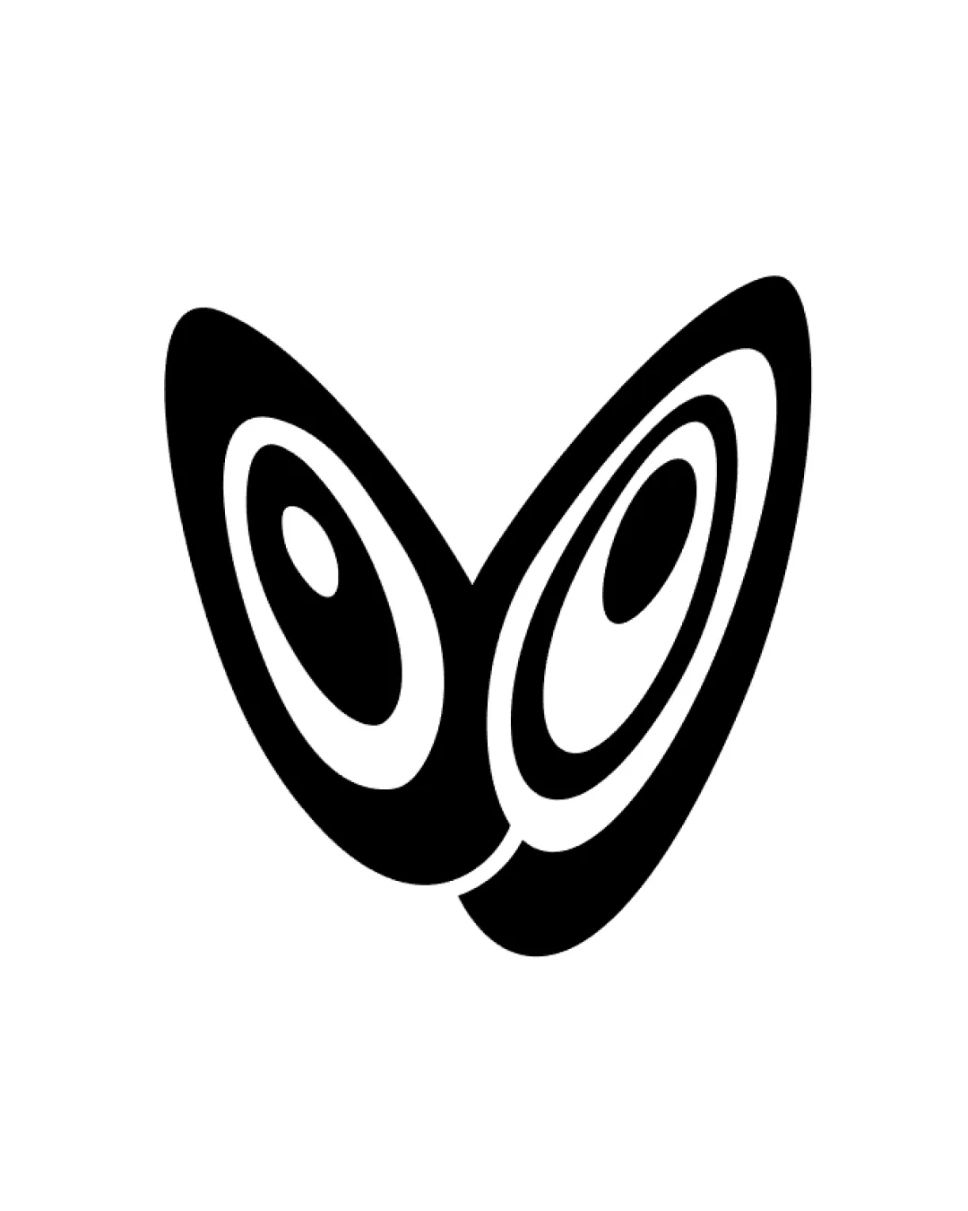
Try it Now!Logo review of abstract butterfly wings or stylized owl eyes
 Logo analysis by AI
Logo type:
Style:
Detected symbol:
Negative space:
Business industry:
Review requested by MysticAndy
**If AI can recognize or misinterpret it, so can people.
Structured logo review
Scalability versatility
![]() Simple, bold lines ensure clarity in both small and large formats.
Simple, bold lines ensure clarity in both small and large formats.![]() Works well on business cards, signage, and digital mediums.
Works well on business cards, signage, and digital mediums.
![]() Small interior details might lose definition at extremely tiny scales such as favicons or embroidery.
Small interior details might lose definition at extremely tiny scales such as favicons or embroidery.
200x250 px
100×125 px
50×62 px
Balance alignment
![]() Symmetrical and visually centered composition.
Symmetrical and visually centered composition.![]() Good balance between the two wing/eye shapes.
Good balance between the two wing/eye shapes.
![]() The overlapping area at the bottom center creates some tension and slight asymmetry.
The overlapping area at the bottom center creates some tension and slight asymmetry.![]() Slight visual imbalance due to uneven thickness in the lower junction.
Slight visual imbalance due to uneven thickness in the lower junction.

Originality
![]() Creative use of shapes that evoke multiple interpretations (wings, eyes).
Creative use of shapes that evoke multiple interpretations (wings, eyes).![]() Abstract and modern, sets it apart from typical butterfly or owl icons.
Abstract and modern, sets it apart from typical butterfly or owl icons.
![]() While unique, abstract eye/wing forms are somewhat common in creative industries and could risk generic associations.
While unique, abstract eye/wing forms are somewhat common in creative industries and could risk generic associations.
Aesthetic look
![]() Minimalist and bold appearance.
Minimalist and bold appearance.![]() Clean execution with strong visual impact.
Clean execution with strong visual impact.
![]() Slightly busy with the use of multiple inner shapes.
Slightly busy with the use of multiple inner shapes.
Dual meaning and misinterpretations
![]() Successfully utilizes dual imagery (wings and eyes) that fits creative or visionary industries.
Successfully utilizes dual imagery (wings and eyes) that fits creative or visionary industries.
![]() Potential for misinterpretation as insect or animal eyes may not fit all industries.
Potential for misinterpretation as insect or animal eyes may not fit all industries.
Color harmony
![]() Simple monochromatic palette ensures high contrast and versatility.
Simple monochromatic palette ensures high contrast and versatility.![]() Will reproduce reliably across all backgrounds.
Will reproduce reliably across all backgrounds.
Black
#000000
White
#FFFFFF


