 View review
Logo score
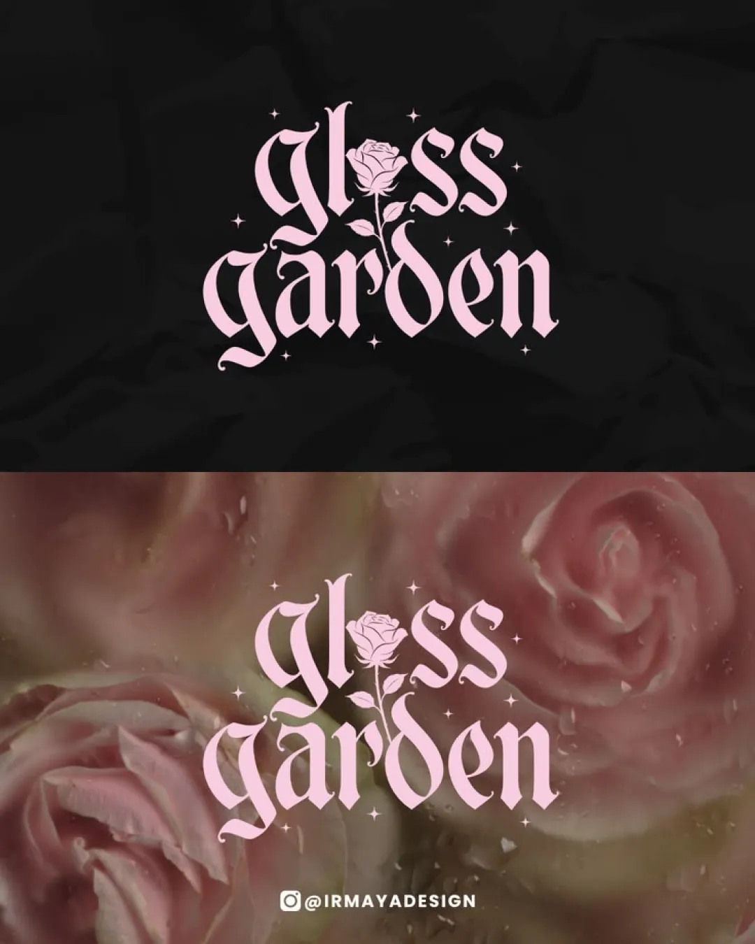
Logo review ofGloss Garden
Review the detailed scores below to see what is working and what should be refined first.
Legibility
Originality
Misread
Balance
Scale
Detailed review
Logo performance breakdown
Legibility
 Text is mostly distinguishable and decorative elements enhance branding Contrasting light pink on black/backgrounds helps with readability
 Ornate Gothic font style slightly hinders quick reading, especially for the word 'garden' Rose illustration merged with 'o' and vertical stem may be confusing at smaller scales
Originality
Creative use of a rose illustration as part of the wordmark demonstrates thoughtful integration Distinctive blend of Gothic typography with feminine floral motif is memorable within the industry
Gothic fonts with floral motifs are trending, so the approach is not fully unique
Color harmony
Palette of light pink on dark/rose backgrounds is harmonious and appropriate for the context No excessive or clashing colors
Pastel Pink
#F3AFCB
Black
#181818
Light Rose
#EAC7D8
Balance alignment
Good vertical and horizontal balance in word arrangement Rose illustration is centrally anchored, helping visual harmony
Some letterforms (especially 'g' and 'd') are more pronounced, slightly disrupting perfect symmetry Illustrated rose draws more attention than intended, causing slight visual imbalance

Scalability
Logo stands out on larger format packaging or digital banners Works well for beauty products, posters, or branded content with ample space
Delicate rose details and thin serifs will lose clarity at smaller sizes (e.g., business cards, app icons, or embroidery) Multiple fine accents and sparkles prevent clean reproduction in embroidery and small-print
200x250 px
100×125 px
50×62 px
Misinterpretations
No unintended or inappropriate symbolism detected
Try your own review
Review my logo
Wondering how your logo performs?
Get a clear logo score, key risks, and priority fix ideas before your client or audience sees it.
Keep exploring