Wondering how your logo performs? 🧐
Get professional logo reviews in seconds and catch design issues in time.
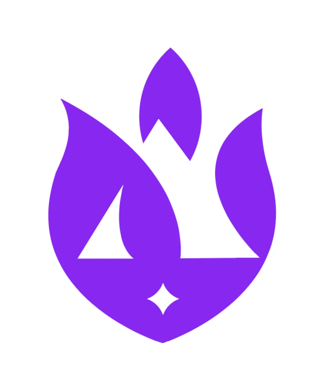
Try it Now!Logo review of Abstract flame with mountain and star shapes integ..
 Logo analysis by AI
Logo type:
Style:
Detected symbol:
Negative space:
Business industry:
Review requested by Graphstorm
**If AI can recognize or misinterpret it, so can people.
Structured logo review
Scalability versatility
![]() Highly simplified, solid shapes retain visual clarity at small sizes
Highly simplified, solid shapes retain visual clarity at small sizes![]() Flat design translates well onto business cards, digital interfaces, and merchandise
Flat design translates well onto business cards, digital interfaces, and merchandise
![]() Fine shapes in the negative space (especially the small star at the base) risk losing detail in tiny applications like favicons or embroidery
Fine shapes in the negative space (especially the small star at the base) risk losing detail in tiny applications like favicons or embroidery
200x250 px
100×125 px
50×62 px
Balance alignment
![]() Symmetrically balanced, equal weight distribution makes the logo stable and professional
Symmetrically balanced, equal weight distribution makes the logo stable and professional![]() All elements are visually aligned along a vertical axis, reinforcing harmony
All elements are visually aligned along a vertical axis, reinforcing harmony

Originality
![]() Combines mountains, flames, and a star in a unique, integrated way
Combines mountains, flames, and a star in a unique, integrated way![]() Uses negative space effectively for multiple visual meanings
Uses negative space effectively for multiple visual meanings
![]() Use of mountains and flames in combination is growing in popularity, so not fully unique within the outdoor/adventure niche
Use of mountains and flames in combination is growing in popularity, so not fully unique within the outdoor/adventure niche
Aesthetic look
![]() Clean edges with attractive geometric curves create a pleasing visual effect
Clean edges with attractive geometric curves create a pleasing visual effect![]() Minimal use of color keeps the look contemporary
Minimal use of color keeps the look contemporary
![]() The sharp contrast and lack of gradients or secondary colors may feel overly stark to some audiences
The sharp contrast and lack of gradients or secondary colors may feel overly stark to some audiences
Dual meaning and misinterpretations
![]() All elements (mountains, flame, star) have positive connotations for the outdoor/recreation industry
All elements (mountains, flame, star) have positive connotations for the outdoor/recreation industry![]() No inappropriate or unintentional imagery present
No inappropriate or unintentional imagery present
Color harmony
![]() Monochromatic palette provides excellent color harmony and reproduces well on any background
Monochromatic palette provides excellent color harmony and reproduces well on any background![]() Strong color choice aids in brand recall
Strong color choice aids in brand recall
Electric Violet
#8714E3
White
#FFFFFF