 View review
Logo score
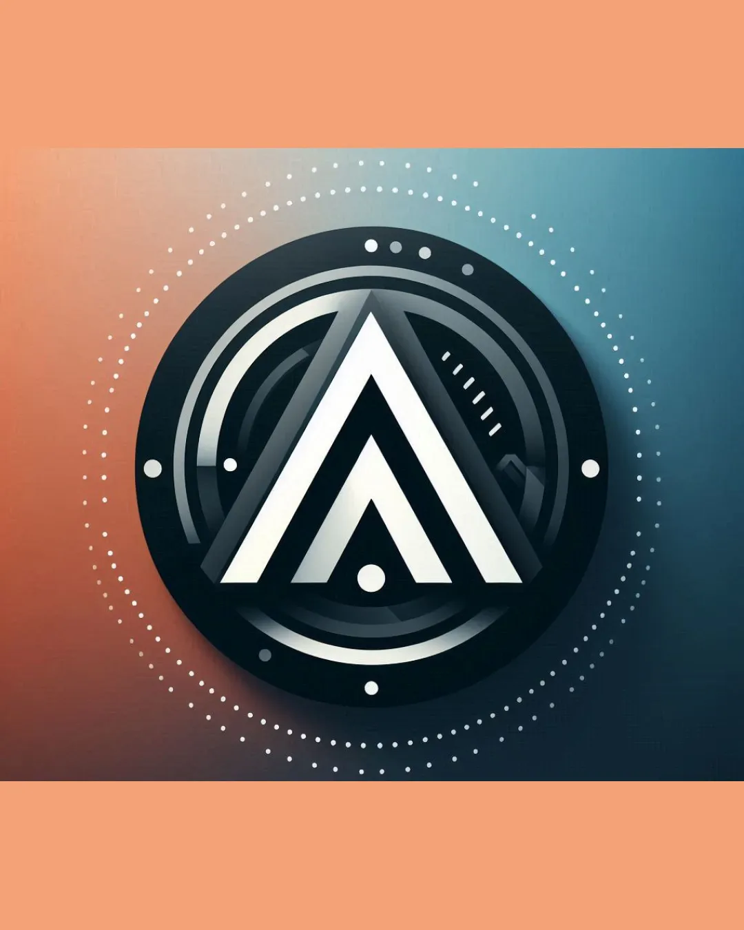
Logo review ofAbstract Geometric Triangle, Possibly Resembling T..
Review the detailed scores below to see what is working and what should be refined first.
Originality
Misread
Balance
Scale
Detailed review
Logo performance breakdown
Originality
![]() Triangle integrated with orbital effects provides some uniqueness.
Triangle integrated with orbital effects provides some uniqueness.![]() Futuristic style is less common among standard logos.
Futuristic style is less common among standard logos.
![]() The triangular 'A' motif is somewhat generic in technology branding.
The triangular 'A' motif is somewhat generic in technology branding.![]() Concentric circle and dot elements are frequently used in tech logo trends.
Concentric circle and dot elements are frequently used in tech logo trends.
Color harmony
![]() Limited palette maintains harmony and modern vibe.
Limited palette maintains harmony and modern vibe.![]() Colors are well-blended, making the logo visually pleasant.
Colors are well-blended, making the logo visually pleasant.
![]() Gradient and background reliance may not print or display accurately in all mediums.
Gradient and background reliance may not print or display accurately in all mediums.
Raven
#181C23
White
#FFFFFF
Jelly Bean
#637C8E
Tan
#ECA785
Your palette is close. Explore sharper color combinations with Colorfly.design before updating the logo.
Explore palettesBalance alignment
![]() Symmetrical composition creates solid visual stability.
Symmetrical composition creates solid visual stability.![]() Centralized triangle and concentric rings feel harmoniously aligned.
Centralized triangle and concentric rings feel harmoniously aligned.

Scalability
![]() 3D effect and high contrast on large digital displays or billboards would look visually striking.
3D effect and high contrast on large digital displays or billboards would look visually striking.![]() Works for tech product packaging where space is ample.
Works for tech product packaging where space is ample.
![]() Complex details, gradients, and fine dotted pattern will become muddled or lost at small sizes (mobile app icons, business cards, favicon, embroidery).
Complex details, gradients, and fine dotted pattern will become muddled or lost at small sizes (mobile app icons, business cards, favicon, embroidery).![]() Depth and shadowing effects do not translate well to single-color or flat versions.
Depth and shadowing effects do not translate well to single-color or flat versions.
200x250 px
100×125 px
50×62 px
Misinterpretations
![]() No inappropriate or accidental visual meanings detected.
No inappropriate or accidental visual meanings detected.![]() Composition avoids suggestive or problematic shapes.
Composition avoids suggestive or problematic shapes.
Try your own review
Review my logo
Wondering how your logo performs?
Get a clear logo score, key risks, and priority fix ideas before your client or audience sees it.
Keep exploring


