Wondering how your logo performs? 🧐
Get professional logo reviews in seconds and catch design issues in time.
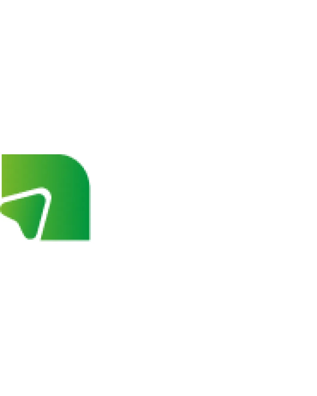
Try it Now!Logo review of abstract green symbol with a white arrow or checkm..
 Logo analysis by AI
Logo type:
Style:
Detected symbol:
Business industry:
Review requested by Dianafoodcom
**If AI can recognize or misinterpret it, so can people.
Structured logo review
Scalability versatility
![]() Simple design ensures clarity at various sizes.
Simple design ensures clarity at various sizes.![]() Works well in digital formats and print media.
Works well in digital formats and print media.
![]() Gradients may not print well on very small scales.
Gradients may not print well on very small scales.
200x250 px
100×125 px
50×62 px
Balance alignment
![]() Properly aligned and visually balanced.
Properly aligned and visually balanced.

Originality
![]() Unique use of gradient and symbol.
Unique use of gradient and symbol.
![]() Arrow or checkmark symbolism is common.
Arrow or checkmark symbolism is common.
Aesthetic look
![]() Modern and clean design.
Modern and clean design.![]() Appealing color gradient.
Appealing color gradient.
![]() Some might find the simplicity too minimal.
Some might find the simplicity too minimal.
Dual meaning and misinterpretations
![]() No inappropriate symbols detected.
No inappropriate symbols detected.
Color harmony
![]() Pleasant gradient from light to dark green.
Pleasant gradient from light to dark green.
![]() Gradients might not be as versatile as flat colors in every application.
Gradients might not be as versatile as flat colors in every application.


