View review
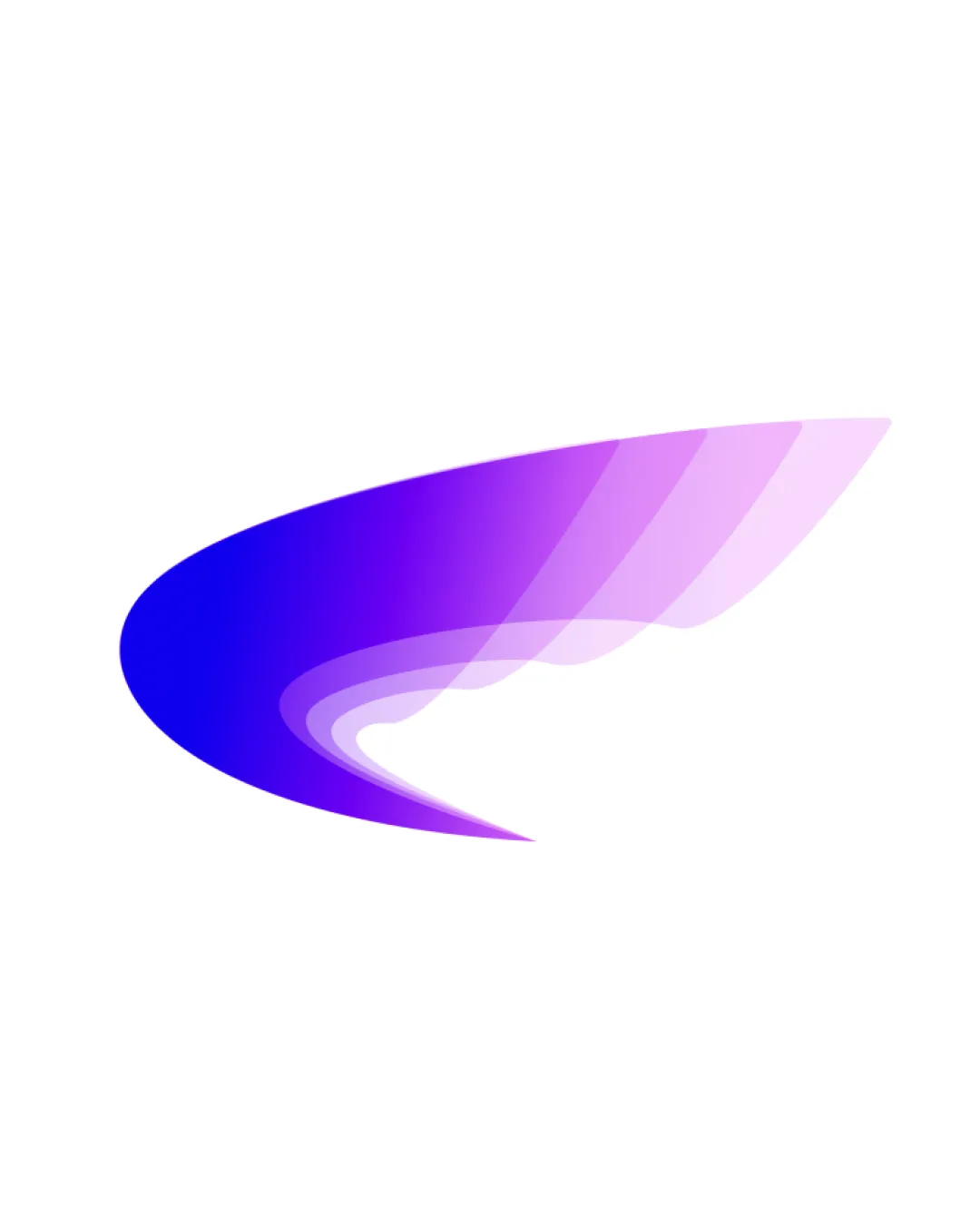
Logo review ofAbstract Swoosh, Wing Like Form
Review the detailed scores below to see what is working and what should be refined first.
Logo performance breakdown
Originality
Abstract swoosh stands out with layered transparency and gradient coloring.
General 'wing' or 'swoosh' motif is widely used in tech, aviation, and communication—lacking strong uniqueness without context or text.
Color harmony
Smooth gradient transitions between blue and purple for a cohesive look.
Limited color palette avoids overwhelming the viewer.
Heavy reliance on gradients could reduce effectiveness across all media, especially single-color applications.
Blue
#2400FF
Purple
#A44CF7
Light Purple
#E1A7FA
White
#FFFFFF
Your palette is close. Explore sharper color combinations with Colorfly.design before updating the logo.
Explore palettesBalance alignment
Symmetrical shape balances visually on the canvas.
Flow and curve direct the viewer's eye fluidly from left to right.
Weight is slightly heavier on the left; lighter, transparent right side feels less grounded, leading to a minor imbalance.
Scalability
Simple abstract shape is easily recognizable at medium to large sizes.
Clean edges enhance clarity for digital and large-format use such as billboards or app splash screens.
Gradient details and fading effect lose clarity at very small sizes, like favicons or embroidery.
Shape may be too ambiguous without supporting text, reducing brand recognition in minimal formats.
200x250 px
100×125 px
50×62 px
Misinterpretations
No inappropriate or misleading shapes detected.
Composition clearly avoids unwanted connotations.
Wondering how your logo performs?
Get a clear logo score, key risks, and priority fix ideas before your client or audience sees it.