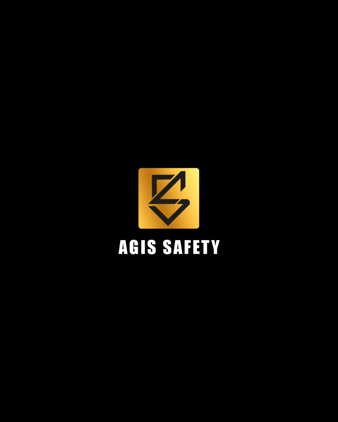
AGIS SAFETY logo review
4/5
Logo score
Logo review of

Agis Safety

The logo is strong, modern and professional, with only minor concerns about mark scalability and distinctiveness to address for optimal use.

Combination Mark Modern Bold Gradient Safety/security
5/5
Legibility
3/5
Originality
5/5
Misread
4/5
Balance
3/5
Scale
Your next steps

What to fix first

Focus on the changes that matter. Keep what makes the logo work.

1

abstract lettermark in gold square

Test the logo at small sizes and ensure the geometric mark stays sharp and recognizable, especially in print and on safety gear.

Worth testing High priority Medium effort
Area to inspectApproximate location

The mark's internal linework contains angular intersections and fine diagonal segments, which may lose clarity at very small display sizes or in single-color reproduction.

How to check

Visually confirm legibility and clarity below 1 cm height and in single-color/embroidered/engraved formats.

See the category review
2

abstract lettermark in gold square

Explore subtle, distinctive tweaks or negative space details to increase unique brand recognition.

Optional refinement Medium priority Medium effort
Area to inspectApproximate location

The angular 'A' and 'S' fusion is well-crafted but echoes common geometric badge trends, possibly blending in with other safety and industrial brands.

How to check

Compare with a set of industry peers for similar geometric/tech-inspired badges.

See the category review
Detailed review

Logo performance breakdown

4/5

Brief & logo match

Based on an inferred industry
Compared with

Likely safety or industrial sector brand needing a modern, professional identity.

Delivers clear authority and modernity appropriate for a safety brand with solid wordmark and mark coherence.

  • Legibility And Authority

    The bold sans-serif wordmark and structured badge strongly convey professionalism and security, fitting a safety-oriented theme.

  • Modernity And Visibility

    Use of a gold gradient and hard-edged mark give a contemporary, high-visibility look for the safety sector.

5/5

Legibility

  • Wordmark is bold, clear and highly readable.
  • Mark is simple enough to remain recognizable at smaller sizes (pending tests).
3/5

Originality

  • Strong 'AS' fusion concept.
  • Modern, angular aesthetic feels current.
  • The angular 'A' and 'S' fusion is well-crafted but echoes common geometric badge trends, possibly blending in with other safety and industrial brands.

    Optional refinement abstract lettermark in gold square

    Try: Explore subtle, distinctive tweaks or negative space details to increase unique brand recognition.

    Check: Compare with a set of industry peers for similar geometric/tech-inspired badges.

    Area to inspectApproximate location
4/5

Color harmony

  • Gold-black creates a premium, attention-grabbing contrast.
Gold#FDB933
Black#000000
White#FFFFFF

Estimated colors. Use the original design file for exact values.

Create a full color palette using these colors

Create new palette
4/5

Balance alignment

  • Centered lockup offers immediate focus.
  • The wordmark appears slightly cramped under the square mark, creating a subtle imbalance and limiting breathing room.

    Optional refinement wordmark alignment below mark

    Try: Increase vertical spacing between the mark and wordmark for improved optical balance.

    Check: Inspect alignment and spacing on digital and print layouts.

Uploaded logoAlignment guide overlay

Inspect spacing with the guide. Optical balance may differ from geometric centering.

3/5

Scalability

  • Bold shapes support multi-format use.
  • The mark's internal linework contains angular intersections and fine diagonal segments, which may lose clarity at very small display sizes or in single-color reproduction.

    Worth testing abstract lettermark in gold square

    Try: Test the logo at small sizes and ensure the geometric mark stays sharp and recognizable, especially in print and on safety gear.

    Check: Visually confirm legibility and clarity below 1 cm height and in single-color/embroidered/engraved formats.
    Area to inspectApproximate location
Uploaded logo at 200 pixels wide
200 × 250 px
Uploaded logo at 100 pixels wide
100 × 125 px
Uploaded logo at 50 pixels wide
50 × 63 px

Compare the detail at different sizes. Labels show the full image dimensions.

5/5

Misinterpretations

  • No unintended or inappropriate secondary readings detected.
4/5

Symbol & text fit

  • Mark and wordmark relate through scale and weight.

Black & white

Does the shape still work without color?

These tests are available only for logos uploaded in vector (SVG) format.

Background contrast

Find the surfaces where your logo stays clear.

These tests are available only for logos uploaded in vector (SVG) format.

Blur & silhouette

A 3px blur softens fine details so you can check whether the overall shape stays recognizable. If key gaps close or elements merge, the logo may rely too heavily on detail.

These tests are available only for logos uploaded in vector (SVG) format.

Try your own review

Wondering how your logo performs?

Get a clear logo score, key risks, and priority fix ideas before your client or audience sees it.

Review my logo