Wondering how your logo performs? 🧐
Get professional logo reviews in seconds and catch design issues in time.
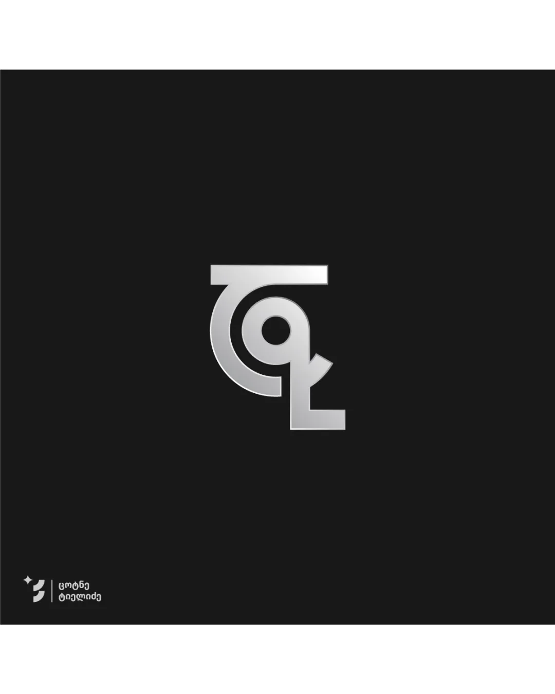
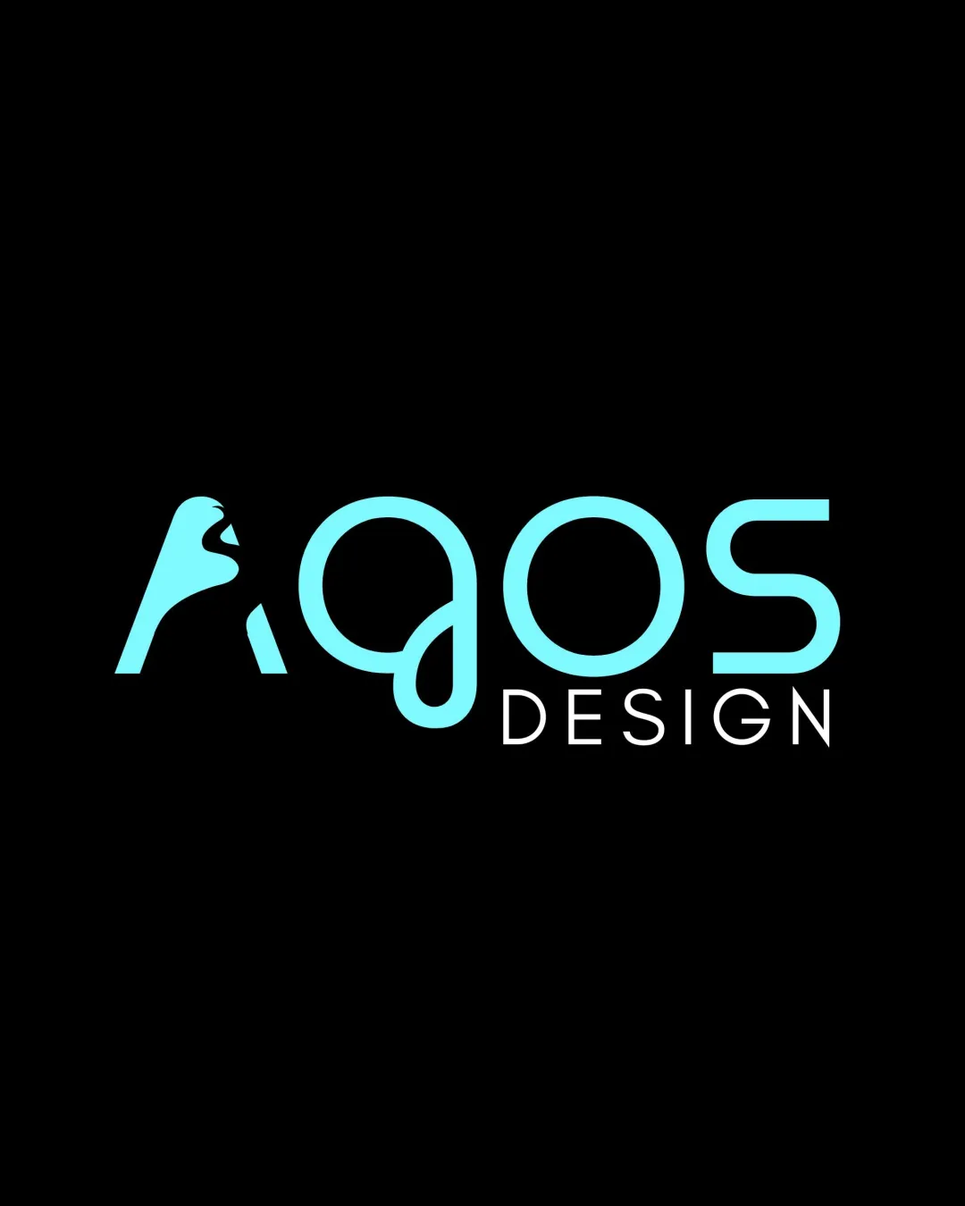
Try it Now!Logo review of Agos DESIGN
 Logo analysis by AI
Logo type:
Style:
Detected symbol:
Negative space:
Detected text:
Business industry:
Review requested by Agosdatcom
**If AI can recognize or misinterpret it, so can people.
Structured logo review
Legibility
![]() Main word 'Agos' is relatively readable for a stylized type.
Main word 'Agos' is relatively readable for a stylized type.![]() Secondary word 'DESIGN' uses a clear, simple font.
Secondary word 'DESIGN' uses a clear, simple font.
![]() The stylized 'A' with the bird shape may lead to misreading or delay in recognition.
The stylized 'A' with the bird shape may lead to misreading or delay in recognition.![]() Swash on 'g' can be interpreted as a 'q', confusing the brand name at first glance.
Swash on 'g' can be interpreted as a 'q', confusing the brand name at first glance.
Scalability versatility
![]() Clean, limited color palette supports scaling to larger formats.
Clean, limited color palette supports scaling to larger formats.![]() Simple lines likely print well on signage and web.
Simple lines likely print well on signage and web.
![]() Thin line weights of the typography risk disappearing at smaller scales (e.g. business cards, app icons).
Thin line weights of the typography risk disappearing at smaller scales (e.g. business cards, app icons).![]() The complex bird shape in 'A' may lose recognizability when reduced.
The complex bird shape in 'A' may lose recognizability when reduced.
200x250 px
100×125 px
50×62 px
Balance alignment
![]() Good overall typographic alignment between 'Agos' and 'DESIGN'.
Good overall typographic alignment between 'Agos' and 'DESIGN'.![]() Visual weight is distributed evenly across the composition.
Visual weight is distributed evenly across the composition.
![]() Slight visual imbalance as the illustrated 'A' is heavier (bolder) than the rest of the text.
Slight visual imbalance as the illustrated 'A' is heavier (bolder) than the rest of the text.![]() The 'g' loop underlines and draws the eye downward, potentially disrupting flow.
The 'g' loop underlines and draws the eye downward, potentially disrupting flow.

Originality
![]() Creative use of negative space to form a bird within the letter 'A'.
Creative use of negative space to form a bird within the letter 'A'.![]() Custom letterforms add a distinctive brand identity.
Custom letterforms add a distinctive brand identity.
![]() Using an animal head silhouette as part of a letter is a somewhat familiar trope in creative industries.
Using an animal head silhouette as part of a letter is a somewhat familiar trope in creative industries.
Logomark wordmark fit
![]() Bird-head 'A' integrates smoothly with the wordmark.
Bird-head 'A' integrates smoothly with the wordmark.![]() Consistent stroke weight ties the logomark and wordmark together.
Consistent stroke weight ties the logomark and wordmark together.
![]() Slight mismatch in visual density between the bold 'A' and lighter remaining letters.
Slight mismatch in visual density between the bold 'A' and lighter remaining letters.
Aesthetic look
![]() Modern aesthetic with creative custom typography.
Modern aesthetic with creative custom typography.![]() Limited color palette gives a sleek, professional feel.
Limited color palette gives a sleek, professional feel.
![]() Typographic quirks (like the 'g' loop) may not appeal to all viewers.
Typographic quirks (like the 'g' loop) may not appeal to all viewers.
Dual meaning and misinterpretations
![]() No inappropriate or confusing alternate shapes detected.
No inappropriate or confusing alternate shapes detected.
Color harmony
![]() Excellent color harmony with minimal palette (aqua and white on black).
Excellent color harmony with minimal palette (aqua and white on black).![]() High contrast improves impact and recognizability.
High contrast improves impact and recognizability.
Aqua
#79F6F6
Black
#000000
White
#FFFFFF