View review
Logo score
Logo review of
Db, Pb
Review the detailed scores below to see what is working and what should be refined first.
Objective AI feedback. Your creative decision.
Originality
Misread
Balance
Scale
Action plan
What to fix first
The most important fixes to handle before polishing the full presentation.
1
Fix possible misinterpretation
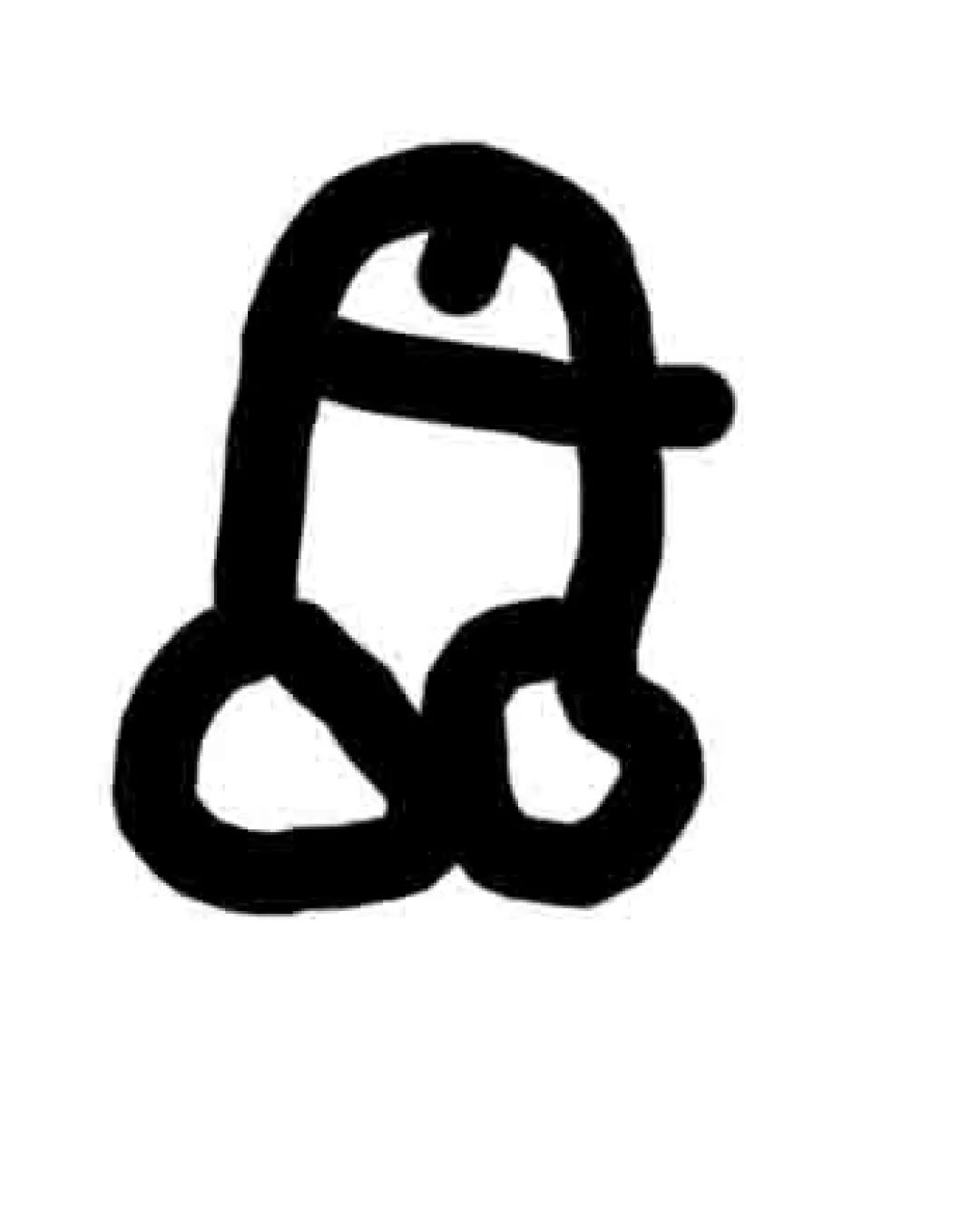
High priorityLogo very clearly resembles intimate male anatomy, making it inappropriate for general branding.
Impact: High · Effort: Medium
Detailed review
Logo performance breakdown
Originality
 Distinct from typical generic symbols due to crude hand-drawn approach.
 Originality undermined by accidental resemblance to inappropriate symbols. No creative twist or clever use of form; interpretation feels accidental rather than intentional.
Color harmony
Simple black-and-white palette avoids color confusion. Single color treatment supports clarity.
Lack of any supplementary color may limit distinction or brand personality.
Black
#000000
White
#FFFFFF
Your palette is close. Refine the color roles and combinations before updating the logo.
Build brand colorsBalance alignment
Composition is extremely unbalanced: shapes are unevenly sized and lack symmetry. No clear alignment; elements do not feel intentionally placed.

Scalability
Bold, thick lines will remain visible even at small sizes.
Hand-drawn style and uneven lines compromise clarity in smaller applications. Logo lacks polish, limiting use across professional or branded materials. Highly problematic shape and interpretation means it is not suitable for most real-world applications.
200x250 px
100×125 px
50×62 px
Misinterpretations
Logo very clearly resembles intimate male anatomy, making it inappropriate for general branding. Design is highly ambiguous and susceptible to negative interpretation.
Try your own review
Review my logo
Wondering how your logo performs?
Get a clear logo score, key risks, and priority fix ideas before your client or audience sees it.
Keep exploring