T, L logo review
3.9 / 5
Logo score

Logo review ofT, L

Review the detailed scores below to see what is working and what should be refined first.

Monogram Modern, Metallic, Geometric Creative
3/5
Legibility
4/5
Originality
4/5
Misread
4/5
Balance
3/5
Scale
Review next
Action plan

What to fix first

The most important fixes to handle before polishing the full presentation.

1

Fix possible misinterpretation

High priority

Ambiguity: geometric intersection may read as a Q, G, or even a circular arrow, causing possible confusion.
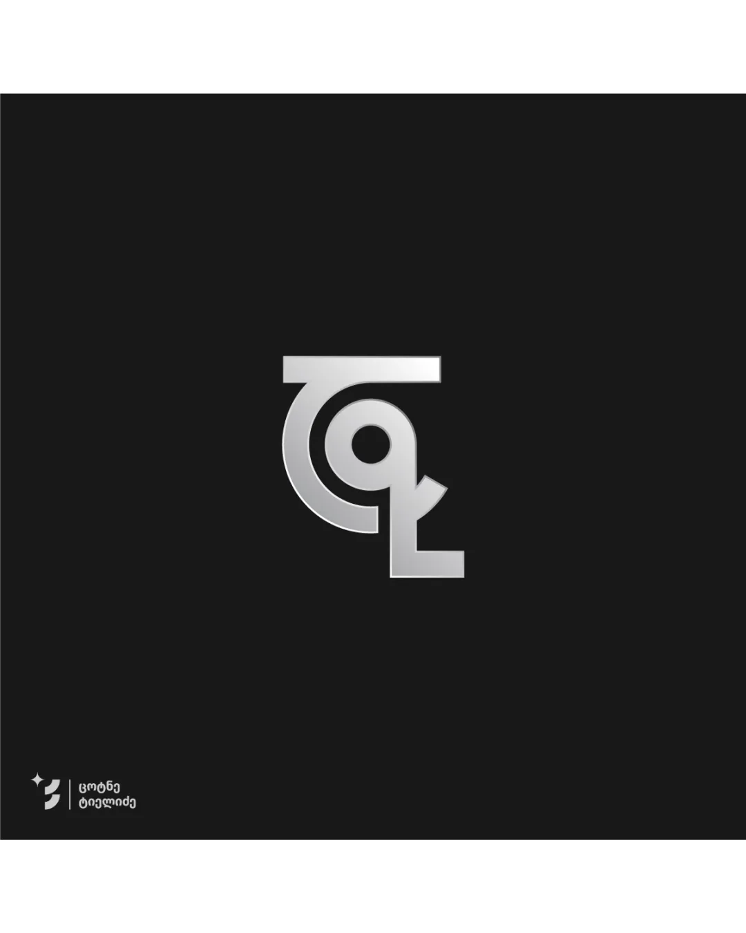
Impact: High · Effort: Medium

Detailed review

Logo performance breakdown

3/5

Legibility

Checkmark icon The 'T' and 'L' are distinguishable on close inspection.
Checkmark icon Monochrome treatment helps with contrast.

Warning icon At small sizes, the letter distinction gets lost and merging lines make it hard to interpret.
Warning icon The overlaid curves can be mistaken for a G, Q, or ambiguous form.

4/5

Originality

Checkmark icon Creative intertwining of TL letters.
Checkmark icon Modern take on monogramming with unique metallic finish.

Warning icon Abstract construction creates ambiguity, moving away from immediate brand recall.
Warning icon Monogram techniques like this are somewhat common in the creative industry.

5/5

Color harmony

Checkmark icon Single metallic color is harmonious and cohesive with the dark background.

Silver
#C0C0C0

Shark
#181818

4/5

Balance alignment

Checkmark icon Symmetrical central placement gives visual balance.
Checkmark icon Logo weight is visually centered and feels stable.

Warning icon Curve thickness and terminal of the L disrupts harmony slightly.

logo 200x250 pixels scalability test alignment grid overlay
3/5

Scalability

Checkmark icon Simple geometric forms are generally scalable.
Checkmark icon Will look decent on large signage or print materials.

Warning icon Metallic gradient will lose effect at small scale or on embroidery.
Warning icon Fine gaps inside the form risk merging at favicon size.

logo 200x250 pixels scalability test

200x250 px

logo 100x125 pixels scalability test

100×125 px

logo 50x62 pixels scalability test

50×62 px

4/5

Misinterpretations

Checkmark icon No obvious inappropriate shapes detected.

Warning icon Ambiguity: geometric intersection may read as a Q, G, or even a circular arrow, causing possible confusion.

Try your own review

Wondering how your logo performs?

Get a clear logo score, key risks, and priority fix ideas before your client or audience sees it.

Review my logo




