AGRO CHILLAN logo review
2.7/5
Logo score Combination mark category

AGRO CHILLAN

creative962323 Advanced logo review

El logo comunica identidad agrícola y local de modo directo pero carece de versatilidad y pulso moderno necesarios para destacar y perdurar visualmente.

Symbols recognized:
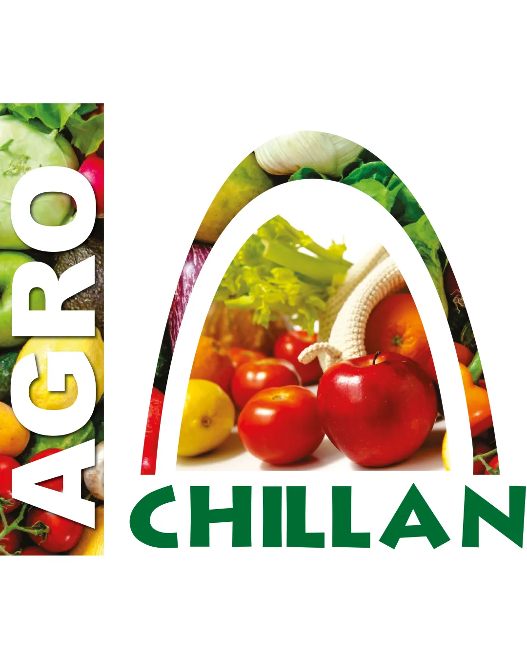
Photos of fruits and vegetables forming an arch plus a vertical block with produce imagery; wordmark in bold geometric font
Legible text:
AGRO CHILLAN
Combination Mark Photographic Collage, Geometric Wordmark Agriculture/horticulture/market
4/5
Legibility
3/5
Originality
2.5/5
Balance
2/5
Scale
Your next steps

What to fix first

Focus on the changes that matter. Keep what makes the logo work.

Concept & direction

The logo leverages direct product photography to underscore the fresh produce focus, matching the agricultural and market context. The geometric wordmark adds a contemporary touch, while the arch visually anchors the composition around the central produce theme.

1

Desarrollar una versión simplificada o vectorial del logotipo sin fotografía para aplicaciones a pequeña escala o monocromáticas.

High priority Medium effort

La sobrecarga visual actual dificulta el reconocimiento desde lejos y en tamaños reducidos.

Mejorará notablemente la legibilidad y versatilidad en señalética, RRSS y merchandising.

2

Optimizar la integración visual entre marca y wordmark, ajustando la composición del arco/fondo para mayor coherencia y equilibrio óptico.

Medium priority Medium effort

La separación estética puede impactar la recordación y transmitir una imagen menos pulida.

Mejorará la percepción de unidad y profesionalismo del logo.

3

Explorar una paleta de colores más controlada o una intervención gráfica que mantenga el espíritu agrícola pero equilibre la saturación y jerarquía visual.

Low priority Medium effort

Los colores variables complican la adaptación sobre fondos variados y dañan consistencia de marca.

Fortalecerá la coherencia visual y hará el logo más atemporal.

Detailed review

Logo performance breakdown

Not scored

Brief & logo match

Las imágenes refuerzan autenticidad campesina y cercanía regional, aunque el uso de fotografía puede restar longevidad o lectura moderna.

4/5

Legibility

  • 'CHILLAN' is clear and easy to read; strong geometric font for visibility
  • 'AGRO' maintains contrast over photographic background
  • Vertical 'AGRO' can be less accessible at a glance than horizontal, especially on small signage
3/5

Originality

  • Photo-based mark offers directness and uniqueness
  • Font choice for 'CHILLAN' is distinctive
  • Photographic collage is literal and can feel dated or generic if not consistently executed
3/5

Color harmony

  • Produce colors stand out and evoke freshness
  • Photographic palette lacks intentional color harmony; transitions can feel abrupt or busy
White#FFFFFF
Red#D32C25
Green#2D7B1B
Yellow#F1D43C

Estimated colors. Use the original design file for exact values.

Create a full color palette using these colors

Create new palette
2.5/5

Balance alignment

  • Main elements form a cohesive block visually
  • Arch cutout and photo backgrounds create uneven spacing and visual weight; integration can appear patchy
Uploaded logoAlignment guide overlay

Inspect spacing with the guide. Optical balance may differ from geometric centering.

2/5

Scalability

  • Distinct arch and solid wordmark at larger sizes
  • Photographic detail will collapse at small sizes or distance; lacks a simplified or single-color version
4/5

Misinterpretations

  • No obvious ambiguity or risky negative space
3/5

Symbol & text fit

  • Arch and wordmark relate through produce theme
  • No strong conceptual connection beyond subject matter; photographic mark feels visually separated from the wordmark
2.1/5
Market fit

Category positioning

El logo encaja en la categoría agro/comercial local, pero no logra destacarse sobre otras ferias o terminales con soluciones gráficas más modernas y flexibles.

1
Category Fit
Good fit

Comunica con claridad el rubro hortofrutícola-local.

2
Differentiation Risk
Some overlap

Riesgo medio por uso de recursos gráficos comunes (fotos de frutas/verduras) y falta de elemento icónico.

From design file to real use

Use-case readiness

See your logo in context, then check what needs attention before production. Settings use the colors detected in your logo where available.

  • 2 look suitable
  • 2 need adjustment
  • 1 not ready

Letrero exterior grande

Ready

Redes sociales (perfil/foto pequeña)

Adjust first

Impresión en blanco y negro

Not ready

Merchandising (bolsas, gorros, etc.)

Adjust first

Papelería institucional

Ready
Delivery checklist

Logo delivery checklist

Format templates · Included versions and delivery checklist
Uploaded logo
Reviewed upload

Primary logo lockup

Included

A mark and wordmark are both visible in the uploaded asset.

Standalone wordmark

High priority Recommended

Export the wordmark separately, without the symbol or tagline, for narrow placements and smaller sizes.

Standalone logomark or monogram

High priority Recommended

Export the existing symbol, mascot, or monogram on its own for avatars, favicons, and compact placements. Check its clarity at small sizes.

Wordmark with tagline

Low priority Optional

Only if the brand uses a tagline: prepare a wordmark with it for larger placements, alongside the tagline-free version.

One-color logo version

High priority Recommended

Prepare a monochrome version for restricted print and production methods.

Reversed light logo version

Medium priority Recommended

Prepare a light version for dark brand backgrounds.

Simplified small-size version

Medium priority Recommended

Use a responsive variant where fine details become fragile at small sizes.

Presentation kit

Logo presentation copy and mockup ideas

Logo presentation ideas

Hover over or select a slide to highlight its notes.

Slide 1

Positioning statement

Refleja directamente la riqueza y diversidad agrícola regional, entregando una imagen reconocible para la comunidad local y visitantes.

Slide 2

Lockup principal

Combinación de fotografías de productos agrícolas en un arco central y bloque vertical, acompañados de la palabra 'CHILLAN' en tipografía geométrica verde.

Slide 3 · Application idea

Mockup idea 1

Aplicación en señalética de acceso y portada de galpón con versión fotográfica a gran escala.

Slide 4

Paleta de colores

Colores reales saturados de hortalizas y frutas, con base blanca y la palabra 'CHILLAN' en verde intenso.

Slide 5 · Application idea

Mockup idea 2

Creación de versión minimalista estampada para bolsas de feria y delantales de locatarios.

Slide 6 · Application idea

Mockup idea 3

Adaptación para favicon y avatar digital usando solo una silueta o inicial.

Slide 7

Design rationale

El uso de fotografía real de productos aporta autenticidad y refuerza el espíritu comunitario-campesino.
La tipografía geométrica sólida asegura reconocimiento de la localidad 'CHILLAN'.

Try your own review

Wondering how your logo performs?

Get a clear logo score, key risks, and priority fix ideas before your client or audience sees it.

Review my logo