Concept & direction
An elegant emblem with a gold ornamental symbol and serif wordmark conveys tradition and premium quality for a jewellery manufacturer.
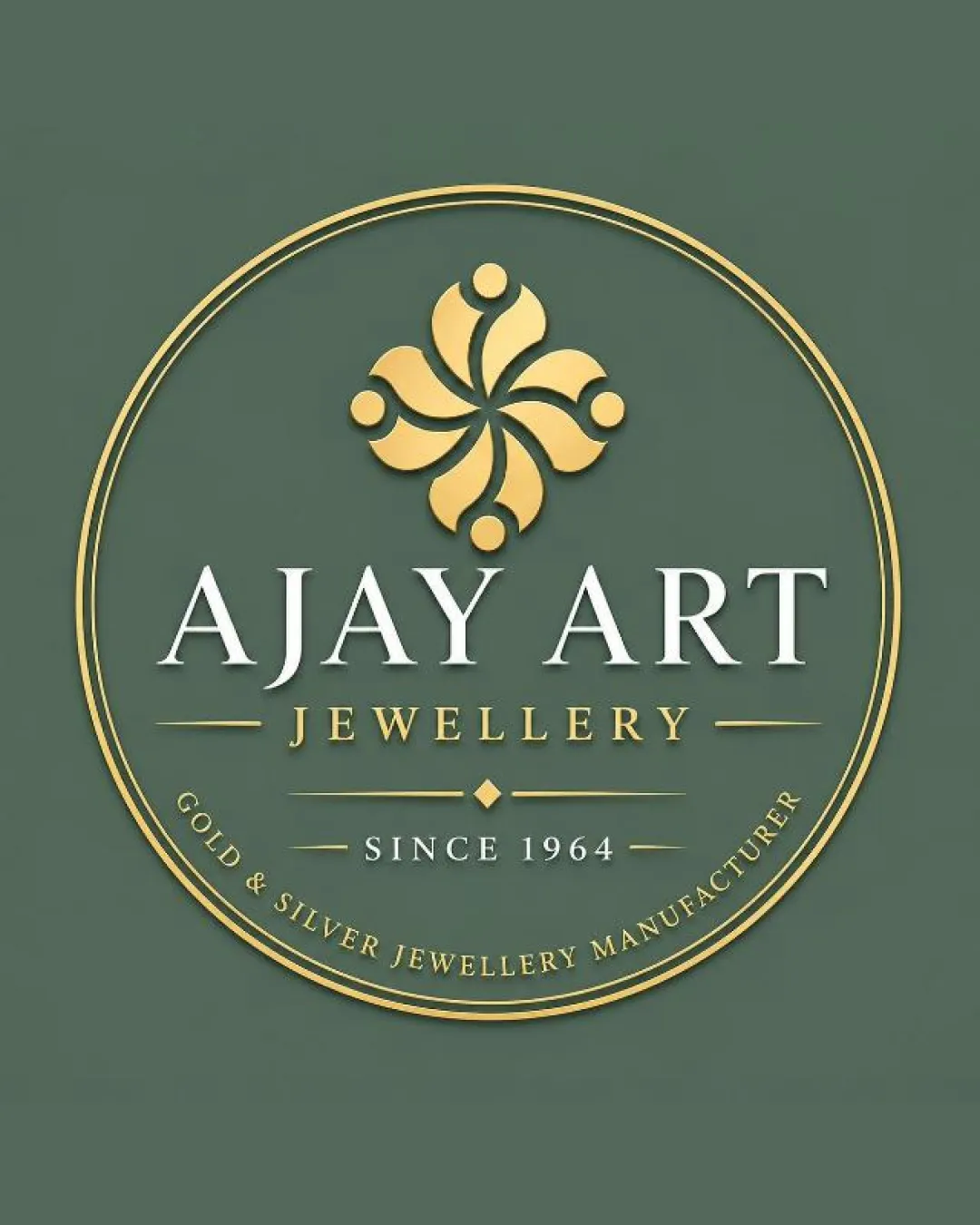
A visually appealing, appropriate emblem for jewellery with classic luxury cues, with minor scalability and originality opportunities.
Focus on the changes that matter. Keep what makes the logo work.
An elegant emblem with a gold ornamental symbol and serif wordmark conveys tradition and premium quality for a jewellery manufacturer.
Peripheral text may become unreadable at small logo sizes.
Improves practical usability and brand communication
The ornamental emblem, serif typography, and gold coloring are well-suited for a jewellery manufacturer.
Estimated colors. Use the original design file for exact values.
Create a full color palette using these colors
Create new palette
Inspect spacing with the guide. Optical balance may differ from geometric centering.
Get a clear logo score, key risks, and priority fix ideas before your client or audience sees it.
More credits needed
Add credits to continue without losing your work.
Then $7/month. Cancel anytime.
Essential logo review with AI
Estimated progress