 View review
Logo score
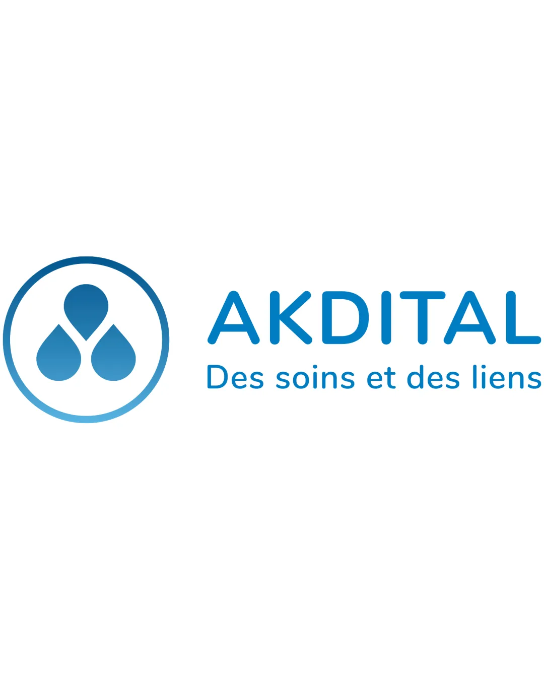
Logo review ofAkdital Des Soins Et Des Liens
Review the detailed scores below to see what is working and what should be refined first.
Legibility
Originality
Misread
Balance
Scale
Detailed review
Logo performance breakdown
Legibility
![]() Text is clear, readable, and well spaced.
Text is clear, readable, and well spaced.![]() Font selection supports clarity both in print and digital.
Font selection supports clarity both in print and digital.
Originality
![]() Abstract combination of droplets forming a subtle heart suggests care and unity.
Abstract combination of droplets forming a subtle heart suggests care and unity.![]() Decent use of negative space which enhances memorability.
Decent use of negative space which enhances memorability.
![]() Water droplet and heart motifs are not unique to healthcare—commonplace but executed with subtlety.
Water droplet and heart motifs are not unique to healthcare—commonplace but executed with subtlety.
Color harmony
![]() Color palette is restrained to one strong shade of blue and white, projecting reliability and cleanliness.
Color palette is restrained to one strong shade of blue and white, projecting reliability and cleanliness.![]() Good contrast guarantees readability.
Good contrast guarantees readability.
Curious Blue
#1487C9
White
#FFFFFF
Balance alignment
![]() Great balance between logomark and wordmark.
Great balance between logomark and wordmark.![]() Excellent vertical & horizontal alignment; elements neither overcrowded nor floating.
Excellent vertical & horizontal alignment; elements neither overcrowded nor floating.

Scalability
![]() Simple icon and clean font ensure adaptability across sizes.
Simple icon and clean font ensure adaptability across sizes.![]() Would work well on letterheads, hospital signs, and business cards.
Would work well on letterheads, hospital signs, and business cards.
![]() Thin lines in the symbol border may lose clarity at extremely small scales such as favicons or embroidery.
Thin lines in the symbol border may lose clarity at extremely small scales such as favicons or embroidery.
200x250 px
100×125 px
50×62 px
Misinterpretations
![]() No inappropriate or confusing secondary meanings detected.
No inappropriate or confusing secondary meanings detected.
Symbol & text fit
![]() Cohesive style: icon and typeface share a similar rounded, modern character.
Cohesive style: icon and typeface share a similar rounded, modern character.
![]() Sizing between logomark and wordmark is well-proportioned.
Sizing between logomark and wordmark is well-proportioned.
Try your own review
Review my logo
Wondering how your logo performs?
Get a clear logo score, key risks, and priority fix ideas before your client or audience sees it.
Keep exploring


