Wondering how your logo performs? 🧐
Get professional logo reviews in seconds and catch design issues in time.
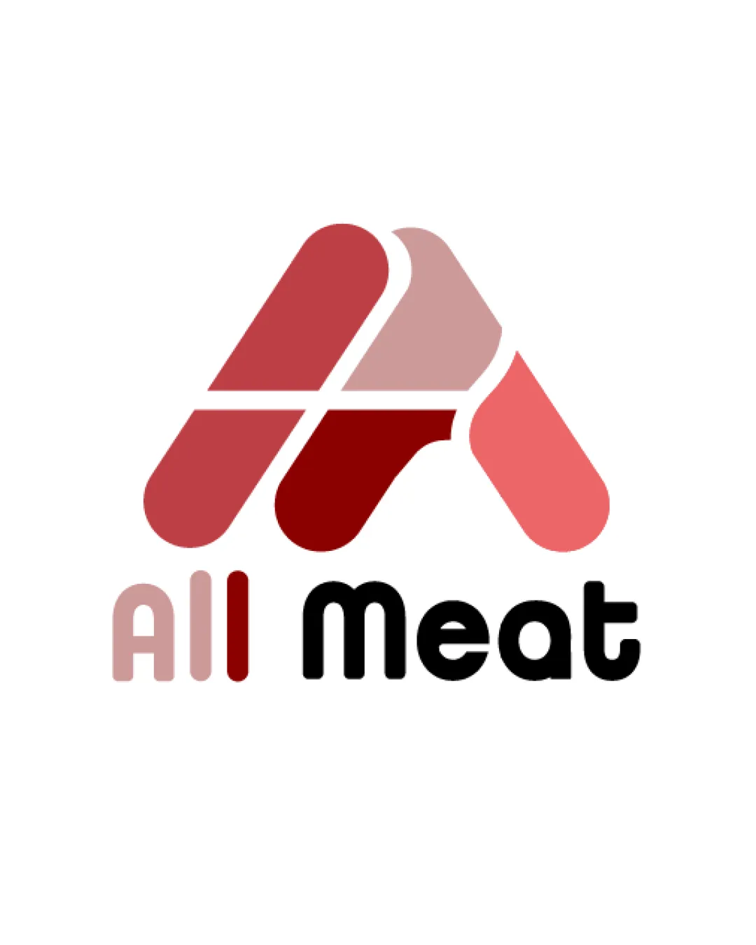
Try it Now!Logo review of All Meat
 Logo analysis by AI
Logo type:
Style:
Detected symbol:
Detected text:
Business industry:
Review requested by DBO
**If AI can recognize or misinterpret it, so can people.
Structured logo review
Legibility
![]() ‘Meat’ is rendered in a bold, clean, highly readable sans-serif typeface.
‘Meat’ is rendered in a bold, clean, highly readable sans-serif typeface.![]() Letter spacing and shape are appropriate for quick recognition.
Letter spacing and shape are appropriate for quick recognition.
![]() ‘All’ is lighter and colored similarly to the background, reducing contrast and making it less readable, especially at a distance or small size.
‘All’ is lighter and colored similarly to the background, reducing contrast and making it less readable, especially at a distance or small size.
Scalability versatility
![]() Geometric shapes allow for good scalability.
Geometric shapes allow for good scalability.![]() Simple color blocking keeps detail minimal for smaller applications.
Simple color blocking keeps detail minimal for smaller applications.![]() Would print well for signage, product packaging, and most digital uses.
Would print well for signage, product packaging, and most digital uses.
![]() Lighter hues in the logomark and 'All' could lose contrast or detail against some backgrounds.
Lighter hues in the logomark and 'All' could lose contrast or detail against some backgrounds.![]() Fine line separating shapes may blur in small-scale uses like favicons or embroidery.
Fine line separating shapes may blur in small-scale uses like favicons or embroidery.
200x250 px
100×125 px
50×62 px
Balance alignment
![]() Overall composition is mostly centered and feels cohesive.
Overall composition is mostly centered and feels cohesive.![]() Logomark sits comfortably above the text.
Logomark sits comfortably above the text.
![]() The weight of the logomark is much heavier than the word 'All', making the lower left feel visually lighter.
The weight of the logomark is much heavier than the word 'All', making the lower left feel visually lighter.![]() ‘Meat’ feels dominant in the overall wordmark, disrupting balance and hierarchy.
‘Meat’ feels dominant in the overall wordmark, disrupting balance and hierarchy.

Originality
![]() Abstract symbol conveys both an 'A' and the idea of meat cuts, relevant and not overtly generic.
Abstract symbol conveys both an 'A' and the idea of meat cuts, relevant and not overtly generic.![]() Some creativity in blending the geometric abstraction for the industry.
Some creativity in blending the geometric abstraction for the industry.
![]() Geometric abstractions of a letter 'A' are somewhat common, though industry-relevant here.
Geometric abstractions of a letter 'A' are somewhat common, though industry-relevant here.![]() No truly unique twist with negative space or custom treatment.
No truly unique twist with negative space or custom treatment.
Logomark wordmark fit
![]() Letter 'A' in the logomark links to ‘All’.
Letter 'A' in the logomark links to ‘All’.![]() Color segmentation in the symbol echoes the palette of the text.
Color segmentation in the symbol echoes the palette of the text.
![]() Weight mismatch between the lighter logomark colors and the heavier 'Meat' text.
Weight mismatch between the lighter logomark colors and the heavier 'Meat' text.![]() ‘All’ seems disconnected stylistically from the boldness of the logomark and ‘Meat’.
‘All’ seems disconnected stylistically from the boldness of the logomark and ‘Meat’.
Aesthetic look
![]() Strong, modern visual impact.
Strong, modern visual impact.![]() Color blocking builds a visually pleasing theme relevant to meat and food.
Color blocking builds a visually pleasing theme relevant to meat and food.
![]() Discrepancy between the muted tones of ‘All’ and the bolder choices elsewhere lowers visual cohesion.
Discrepancy between the muted tones of ‘All’ and the bolder choices elsewhere lowers visual cohesion.![]() Color gradients (subtle) may not translate to all media.
Color gradients (subtle) may not translate to all media.
Dual meaning and misinterpretations
![]() No inappropriate or suggestive imagery present.
No inappropriate or suggestive imagery present.![]() Abstraction is clear and industry-appropriate.
Abstraction is clear and industry-appropriate.
Color harmony
![]() Monochrome red palette is well chosen for the food/meat industry.
Monochrome red palette is well chosen for the food/meat industry.![]() Black contrast with reds grounds the logo, giving it readability and authority.
Black contrast with reds grounds the logo, giving it readability and authority.
![]() The pink and lighter reds risk looking washed out depending on substrate.
The pink and lighter reds risk looking washed out depending on substrate.![]() Contrast between ‘All’ and background is low, which can be a legibility issue.
Contrast between ‘All’ and background is low, which can be a legibility issue.
Copper Red
#B04A4A
Light Red
#E58E8E
Dark Red
#891B1B
Pink
#F97B7B
Black
#000000


