LuxuryAwarded by mylogo.reviewAwarded on 16 October 2026Beautiful typography work! The combination of classic serif and elegant script lettering feels so natural, while the ornamental monogram adds a thoughtful finishing touch. Well done!
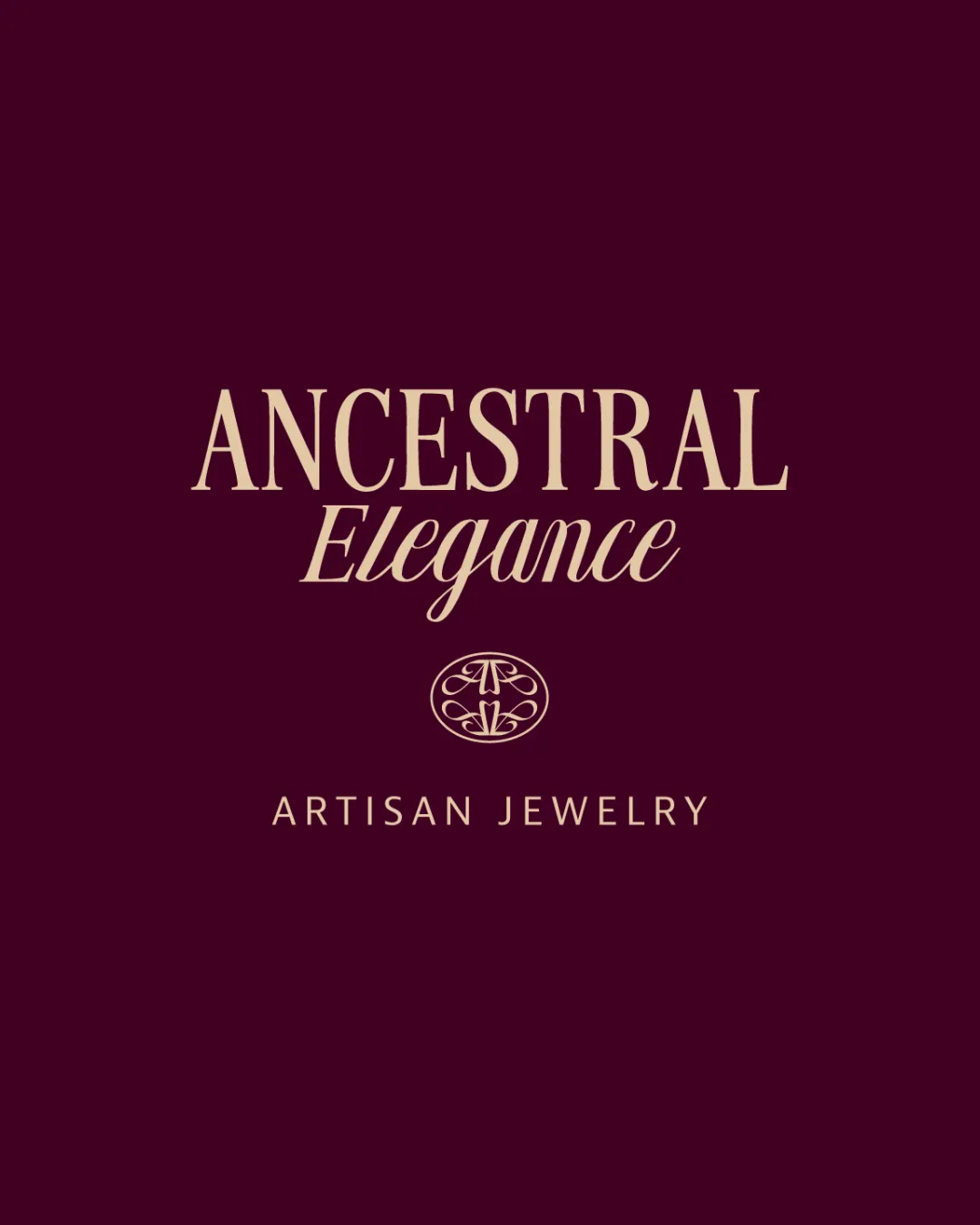
ANCESTRAL Elegance logo logo review
4.2/5
Logo score Combination mark (wordmark + monogram) category

ANCESTRAL Elegance logo

creative753880 Essential logo review

Sophisticated and elegant combination mark well-suited for artisan jewelry, with strong typographic cohesion and rich color, but the monogram's detail warrants testing at very small scales.

This logo lockup shows strong execution, supported by distinctive construction and visual balance; improving clarity at smaller sizes is the clearest next step.

Symbols recognized:
Ornamental circular monogram with stylized A and E
Legible text:
ANCESTRAL Elegance ARTISAN JEWELRY
Combination Mark (wordmark + Monogram) Classic, Elegant, Minimalistic Jewelry
4.6/5
Legibility
4/5
Originality
4/5
Balance
4/5
Scale
4/5
Color
5/5
Style consistency
Your next steps

What to fix first

Focus on the changes that matter. Keep what makes the logo work.

What to preserve

An elegant combination mark featuring a refined wordmark and a circular ornamental monogram, effectively emphasizing sophistication and heritage suitable for an artisan jewelry context.

Spelling & grammar

No obvious issue found

All visible text is clearly legible with no errors.

1

monogram (horizontal band 2)

Test monogram legibility at reduced sizes.

High priority Worth testing Medium effort

Fine lines and ornamental detail in the monogram may merge or lose clarity at very small sizes, especially in print or on small jewelry tags.

See the category review
Detailed review

Logo performance breakdown

5/5

Brief & logo match

The logo convincingly aligns with the artisan jewelry context through elegant typography and a refined ornamental monogram, enhancing perceived craftsmanship and exclusivity.

5/5

Misinterpretations

  • No dual meaning or unintended misinterpretation present.
5/5

Style consistency

  • The monogram and wordmark share a unified classic style and color treatment.
4.6/5

Legibility

Monogram 3/5 · Wordmark 5/5 · Layout 5/5

  • All text is highly legible and well spaced, supporting quick brand recognition.
4/5

Originality

Monogram 4/5 · Wordmark 4/5

  • Custom monogram adds unique flair and reinforces heritage theme.
4/5

Color harmony

Monogram 4/5 · Wordmark 4/5

  • The warm bisque against maroon gives a sense of luxury and classic elegance.
Bisque#EAD0B5
Dark Maroon#45142B

Estimated colors. Use the original design file for exact values.

Create a full color palette using these colors

Create new palette
4/5

Balance alignment

Monogram 4/5 · Wordmark 4/5 · Layout 4/5

  • Lockup is visually balanced; typography and monogram feel harmonious.
  • Good vertical spacing and alignment across all elements, though minor tweaks to the gap between 'Elegance' and the monogram may enhance overall harmony.

    Optional refinement primary lockup
Uploaded logoAlignment guide overlay

Inspect spacing with the guide. Optical balance may differ from geometric centering.

4/5

Scalability

Monogram 3/5 · Wordmark 5/5 · Layout 4/5

  • Fine lines and ornamental detail in the monogram may merge or lose clarity at very small sizes, especially in print or on small jewelry tags.

    Worth testing monogram (horizontal band 2)

    Try: Test monogram legibility at reduced sizes.

Try your own review

Wondering how your logo performs?

Get a clear logo score, key risks, and priority fix ideas before your client or audience sees it.

Review my logo