Wondering how your logo performs? 🧐
Get professional logo reviews in seconds and catch design issues in time.
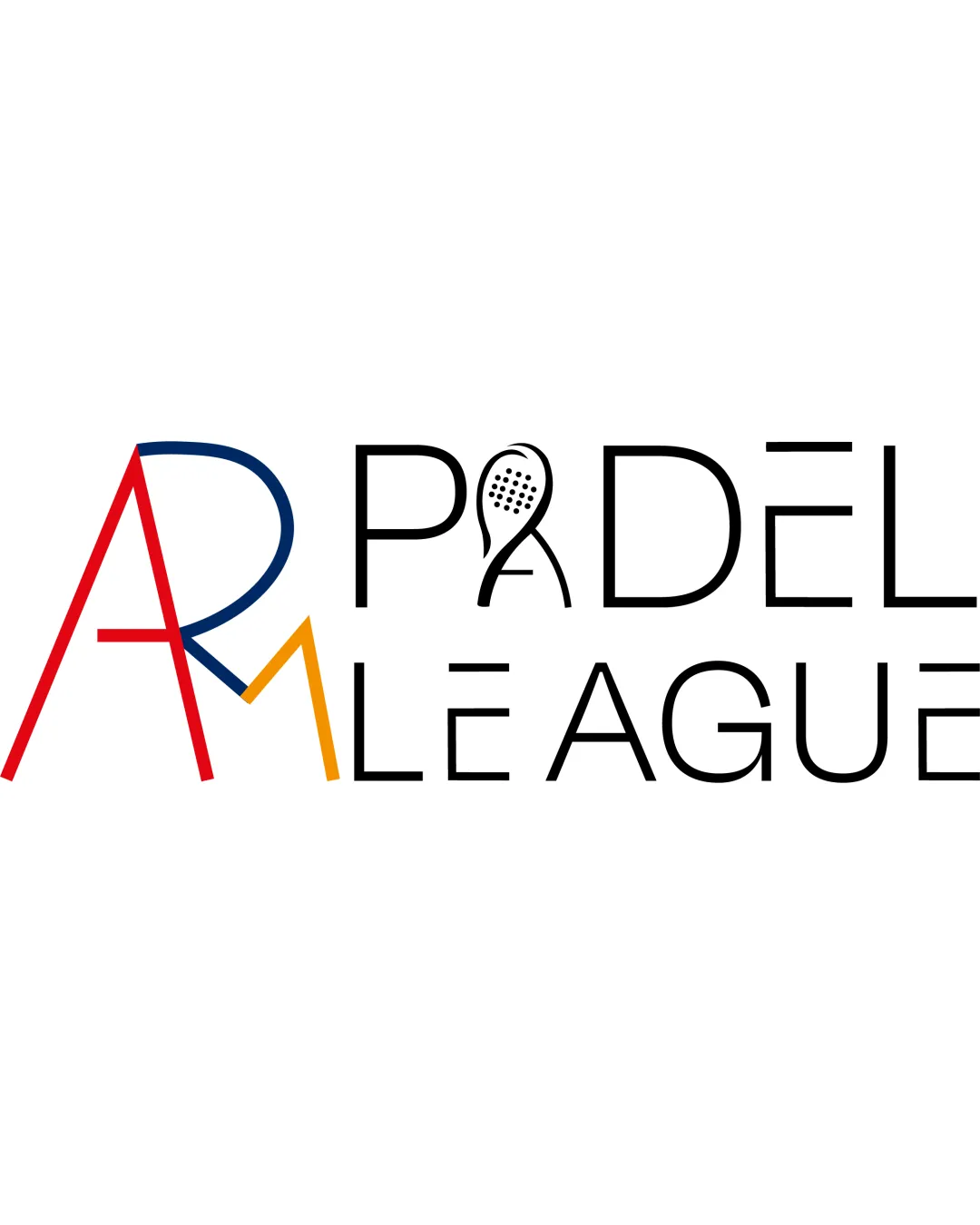
Try it Now!Logo review of AR PADEL LEAGUE
 Logo analysis by AI
Logo type:
Style:
Detected symbol:
Negative space:
Detected text:
Business industry:
Review requested by ELENICH
**If AI can recognize or misinterpret it, so can people.
Structured logo review
Legibility
![]() Main text 'PADEL LEAGUE' is fairly readable due to a clean sans-serif font.
Main text 'PADEL LEAGUE' is fairly readable due to a clean sans-serif font.![]() Good contrast on white background.
Good contrast on white background.
![]() AR monogram is difficult to interpret at first glance, especially with varying stroke weights and overlapping lines.
AR monogram is difficult to interpret at first glance, especially with varying stroke weights and overlapping lines.![]() The racket integration in the 'A' of 'PADEL' slightly complicates recognition.
The racket integration in the 'A' of 'PADEL' slightly complicates recognition.![]() Varying line weights and colors can distract quick reading.
Varying line weights and colors can distract quick reading.
Scalability versatility
![]() Simple font style should work in larger formats like billboards or banners.
Simple font style should work in larger formats like billboards or banners.
![]() Complexity in the 'AR' monogram and racket detail will be lost at small sizes, making the logo less effective as a favicon or app icon.
Complexity in the 'AR' monogram and racket detail will be lost at small sizes, making the logo less effective as a favicon or app icon.![]() Thin lines and color shifts may not reproduce well in embroidery or small merchandise.
Thin lines and color shifts may not reproduce well in embroidery or small merchandise.![]() Too many color changes can create printing inconsistencies across formats.
Too many color changes can create printing inconsistencies across formats.
200x250 px
100×125 px
50×62 px
Balance alignment
![]() Horizontal alignment is consistent in the 'PADEL LEAGUE' section.
Horizontal alignment is consistent in the 'PADEL LEAGUE' section.
![]() 'AR' monogram and the rest of the wordmark feel disjointed and lack cohesive balance.
'AR' monogram and the rest of the wordmark feel disjointed and lack cohesive balance.![]() Height and weight of 'AR' monogram do not match the rest of the text, creating a visual imbalance.
Height and weight of 'AR' monogram do not match the rest of the text, creating a visual imbalance.![]() Color segmentation further fragments the visual flow.
Color segmentation further fragments the visual flow.

Originality
![]() Creative use of a racket in the letter 'A' connects with the sport.
Creative use of a racket in the letter 'A' connects with the sport.![]() Custom monogram for brand differentiation.
Custom monogram for brand differentiation.
![]() 'AR' monogram is overcomplicated and not highly original in execution.
'AR' monogram is overcomplicated and not highly original in execution.![]() Racket in the 'A' is a common sports logo trope lacking a unique twist.
Racket in the 'A' is a common sports logo trope lacking a unique twist.
Logomark wordmark fit
![]() Both elements are geometric in nature.
Both elements are geometric in nature.
![]() 'AR' monogram is overly bold and colorful versus the sleek, simple wordmark.
'AR' monogram is overly bold and colorful versus the sleek, simple wordmark.![]() Lack of style harmony; the two parts feel like separate pieces forced together.
Lack of style harmony; the two parts feel like separate pieces forced together.
Aesthetic look
![]() Modern sans-serif font and symbolism are visually contemporary.
Modern sans-serif font and symbolism are visually contemporary.
![]() Too many disconnected visual elements make the logo look busy.
Too many disconnected visual elements make the logo look busy.![]() Color scheme feels overdone and disrupts the overall flow.
Color scheme feels overdone and disrupts the overall flow.![]() Lack of a unified design language.
Lack of a unified design language.
Dual meaning and misinterpretations
![]() No inappropriate dual meanings or accidental suggestive imagery found in the composition.
No inappropriate dual meanings or accidental suggestive imagery found in the composition.
Color harmony
![]() Colors work individually and provide energy.
Colors work individually and provide energy.
![]() Four strong, contrasting colors create visual noise rather than harmony.
Four strong, contrasting colors create visual noise rather than harmony.![]() Monogram coloring distracts instead of unifying the design.
Monogram coloring distracts instead of unifying the design.![]() Will be hard to ensure versatility across different media.
Will be hard to ensure versatility across different media.
Red
#D91414
Dark Blue
#1C3561
Orange
#F2A21B
Black
#000000
White
#FFFFFF