Wondering how your logo performs? 🧐
Get professional logo reviews in seconds and catch design issues in time.
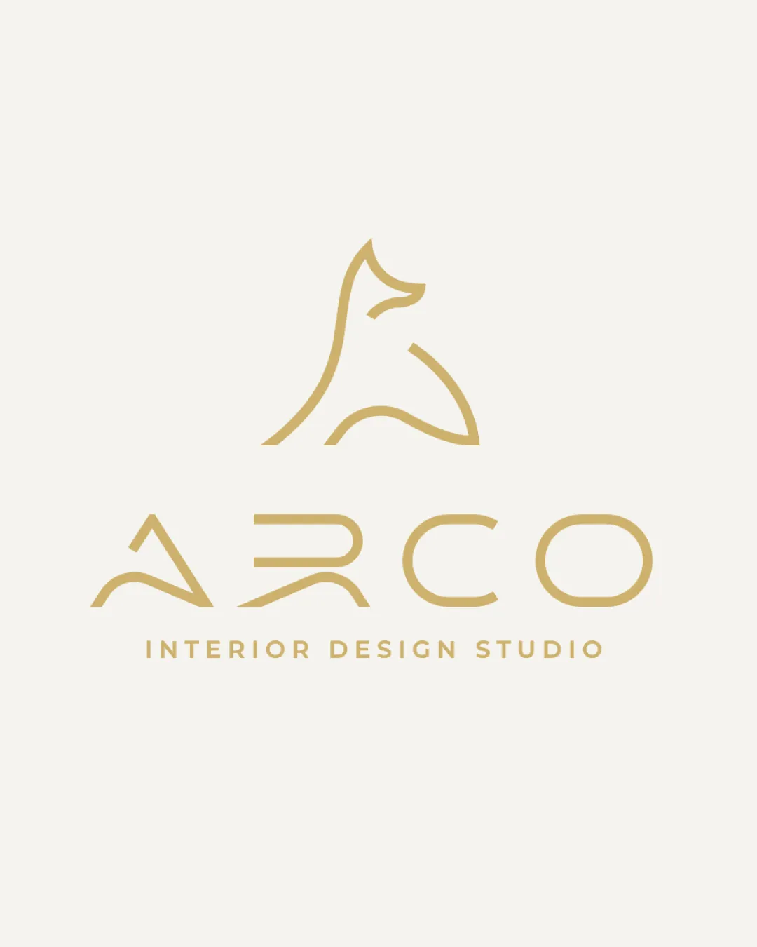
Try it Now!Logo review of ARCO
 Logo analysis by AI
Logo type:
Style:
Detected symbol:
Detected text:
Business industry:
Review requested by Graphstorm
**If AI can recognize or misinterpret it, so can people.
Structured logo review
Legibility
![]() Main wordmark 'ARCO' is generally readable.
Main wordmark 'ARCO' is generally readable.![]() Supporting text 'INTERIOR DESIGN STUDIO' uses a clear sans-serif font.
Supporting text 'INTERIOR DESIGN STUDIO' uses a clear sans-serif font.
![]() Geometric styling of 'R' and 'A' in ARCO could cause some confusion, particularly at smaller sizes or for quick reading.
Geometric styling of 'R' and 'A' in ARCO could cause some confusion, particularly at smaller sizes or for quick reading.![]() The custom letterforms sacrifice a bit of instant recognition for style.
The custom letterforms sacrifice a bit of instant recognition for style.
Scalability versatility
![]() Minimalist line work ensures clarity at larger sizes such as signage and posters.
Minimalist line work ensures clarity at larger sizes such as signage and posters.![]() Single-color palette favors printing versatility.
Single-color palette favors printing versatility.
![]() The thin, delicate lines of the logomark may lose detail and appear faint when scaled down to business card size or embroidered material.
The thin, delicate lines of the logomark may lose detail and appear faint when scaled down to business card size or embroidered material.![]() The tagline will become illegible at small scales, limiting its use for favicons or app icons.
The tagline will become illegible at small scales, limiting its use for favicons or app icons.
200x250 px
100×125 px
50×62 px
Balance alignment
![]() The whole composition achieves solid visual balance between the logomark and the wordmark.
The whole composition achieves solid visual balance between the logomark and the wordmark.![]() Spacious margins and tight vertical alignment deliver an elegant aesthetic.
Spacious margins and tight vertical alignment deliver an elegant aesthetic.![]() Letter spacing is consistent and appropriate.
Letter spacing is consistent and appropriate.

Originality
![]() Logomark is a unique, abstract representation—using a stylized dog, which is uncommon in the interior design industry.
Logomark is a unique, abstract representation—using a stylized dog, which is uncommon in the interior design industry.![]() Custom letterforms in the main wordmark add character.
Custom letterforms in the main wordmark add character.
![]() Abstract animal line art is a trend in premium branding, so the symbol, while elegant, is not entirely groundbreaking.
Abstract animal line art is a trend in premium branding, so the symbol, while elegant, is not entirely groundbreaking.![]() No clever use of negative space or hidden shapes is immediately apparent.
No clever use of negative space or hidden shapes is immediately apparent.
Logomark wordmark fit
![]() The minimalist style unites both the logomark and the wordmark.
The minimalist style unites both the logomark and the wordmark.![]() Color, line weight, and spacing are consistent between elements, resulting in a cohesive look.
Color, line weight, and spacing are consistent between elements, resulting in a cohesive look.
Aesthetic look
![]() Refined, modern, and appealing, with emphasis on elegance and simplicity.
Refined, modern, and appealing, with emphasis on elegance and simplicity.![]() Harmonious color palette delivers a sense of luxury.
Harmonious color palette delivers a sense of luxury.
Dual meaning and misinterpretations
![]() No inappropriate or confusing dual meanings detected.
No inappropriate or confusing dual meanings detected.
Color harmony
![]() Monochrome color palette offers excellent harmony with the background.
Monochrome color palette offers excellent harmony with the background.![]() Gold tone evokes sophistication and warmth, fitting for an interior design studio.
Gold tone evokes sophistication and warmth, fitting for an interior design studio.
Teak
#C9B078
Alabaster
#F4F2ED


