Wondering how your logo performs? 🧐
Get professional logo reviews in seconds and catch design issues in time.
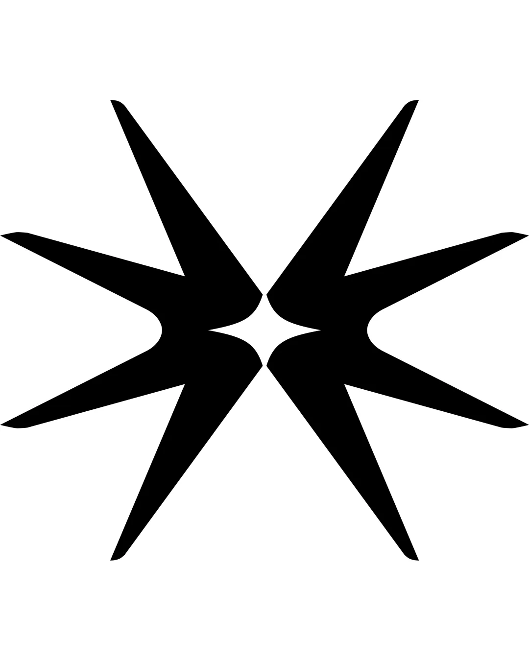
Try it Now!Logo review of two mirrored abstract starburst shapes forming a c..
 Logo analysis by AI
Logo type:
Style:
Detected symbol:
Negative space:
Business industry:
Review requested by Kozmik
**If AI can recognize or misinterpret it, so can people.
Structured logo review
Scalability versatility
![]() Simple silhouette preserves clarity at various sizes.
Simple silhouette preserves clarity at various sizes.![]() No internal details, making it ideal for embroidery, small icons, signage, and packaging.
No internal details, making it ideal for embroidery, small icons, signage, and packaging.
200x250 px
100×125 px
50×62 px
Balance alignment
![]() Strong mirrored symmetry creates a sense of equilibrium.
Strong mirrored symmetry creates a sense of equilibrium.![]() Equal distribution of visual weight.
Equal distribution of visual weight.
![]() Central meeting point could create visual tension, feeling almost disconnected rather than unified.
Central meeting point could create visual tension, feeling almost disconnected rather than unified.

Originality
![]() Custom abstract form is not commonly seen.
Custom abstract form is not commonly seen.![]() Interesting use of mirrored elements.
Interesting use of mirrored elements.
![]() Starburst or asterisk-like forms are relatively generic in abstract logo work.
Starburst or asterisk-like forms are relatively generic in abstract logo work.![]() Central effect is visually familiar and doesn't immediately suggest a unique brand story.
Central effect is visually familiar and doesn't immediately suggest a unique brand story.
Aesthetic look
![]() Bold, minimalist, and iconic look.
Bold, minimalist, and iconic look.![]() Black and white palette is visually striking and modern.
Black and white palette is visually striking and modern.
![]() Sharp points may look aggressive and less inviting in some contexts.
Sharp points may look aggressive and less inviting in some contexts.
Dual meaning and misinterpretations
![]() Central hourglass shape in negative space could convey multiple interpretations, such as time or focus.
Central hourglass shape in negative space could convey multiple interpretations, such as time or focus.
![]() The mirrored shapes might be interpreted as sharp objects or even insect legs, leading to unintended associations depending on audience.
The mirrored shapes might be interpreted as sharp objects or even insect legs, leading to unintended associations depending on audience.
Color harmony
![]() Uses a single color, ensuring strong harmony.
Uses a single color, ensuring strong harmony.![]() High contrast guarantees standout visibility.
High contrast guarantees standout visibility.
Black
#000000
White
#FFFFFF


