 View review
Logo score
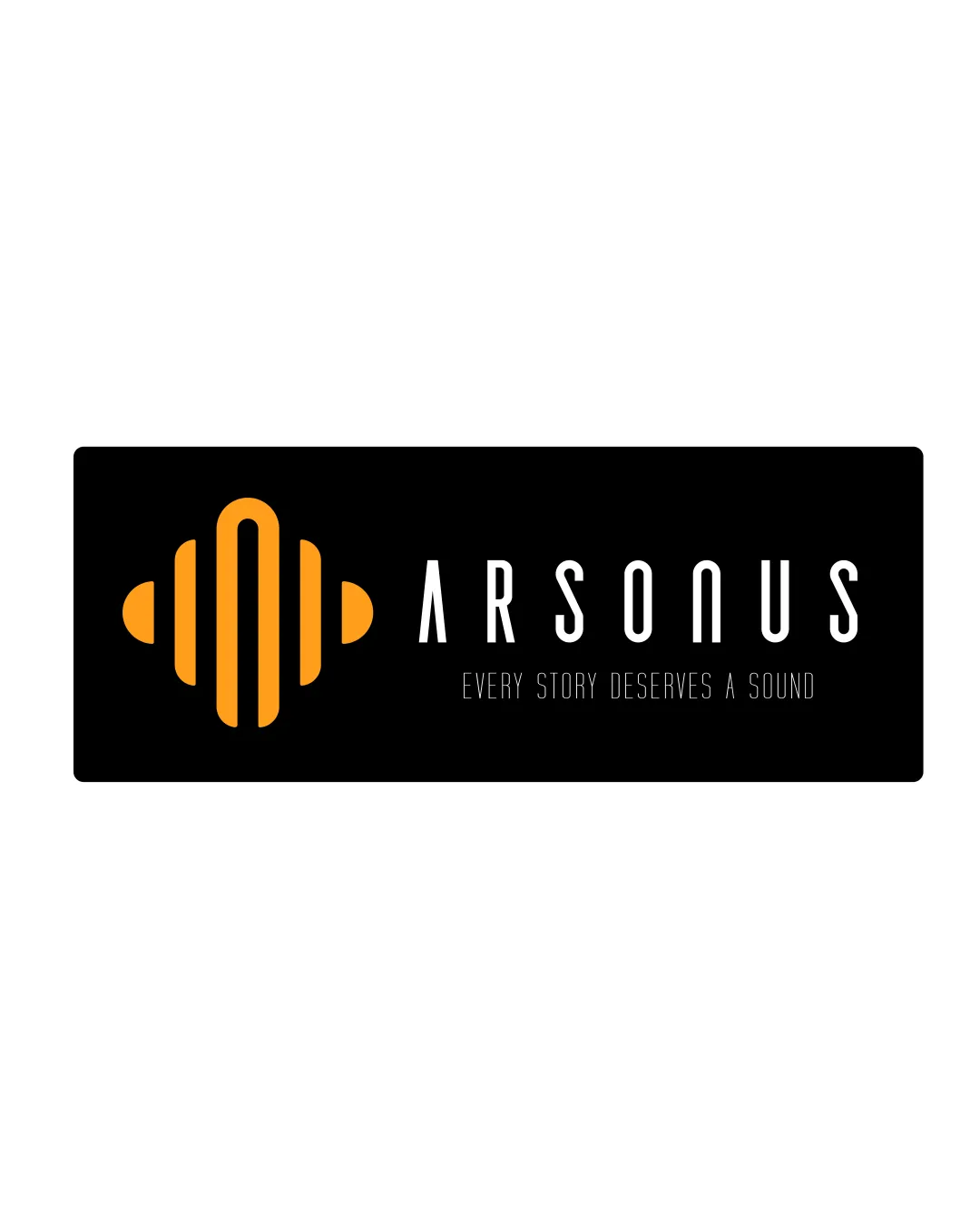
Logo review ofArsonus, Every Story Deserves A Sound
Review the detailed scores below to see what is working and what should be refined first.
Legibility
Originality
Misread
Balance
Scale
Detailed review
Logo performance breakdown
Legibility
![]() Primary wordmark 'ARSONUS' is clear and easily readable.
Primary wordmark 'ARSONUS' is clear and easily readable.![]() High contrast between text and background.
High contrast between text and background.
![]() Tagline text 'EVERY STORY DESERVES A SOUND' is thin and small, reducing readability, especially at small sizes.
Tagline text 'EVERY STORY DESERVES A SOUND' is thin and small, reducing readability, especially at small sizes.
Originality
![]() Abstract soundwave symbol fits the audio industry and stands out more than clichéd icons like microphones or headphones.
Abstract soundwave symbol fits the audio industry and stands out more than clichéd icons like microphones or headphones.
![]() Soundwave icons are quite common in the audio industry; this execution is clean but not highly original.
Soundwave icons are quite common in the audio industry; this execution is clean but not highly original.![]() No inventive use of negative space or letter integration observed.
No inventive use of negative space or letter integration observed.
Color harmony
![]() Simple and effective palette with strong contrast for emphasis.
Simple and effective palette with strong contrast for emphasis.![]() Color scheme is appropriate for modern tech or audio brands.
Color scheme is appropriate for modern tech or audio brands.
Orange
#FFA726
Black
#000000
White
#FFFFFF
Balance alignment
![]() Good horizontal balance between symbol and wordmark.
Good horizontal balance between symbol and wordmark.![]() Elements aligned within the rectangle, maintaining clean structure.
Elements aligned within the rectangle, maintaining clean structure.
![]() Tagline placement could feel slightly disconnected due to its small size and light weight compared to the main wordmark.
Tagline placement could feel slightly disconnected due to its small size and light weight compared to the main wordmark.

Scalability
![]() Symbol is bold and simple enough to retain clarity at small sizes.
Symbol is bold and simple enough to retain clarity at small sizes.![]() Wordmark remains legible in larger formats such as banners and billboards.
Wordmark remains legible in larger formats such as banners and billboards.
![]() Tagline will become illegible at smaller applications like business cards, social media icons, or mobile favicons.
Tagline will become illegible at smaller applications like business cards, social media icons, or mobile favicons.![]() Potential loss of visual impact if applied as embroidery due to thin lines in tagline.
Potential loss of visual impact if applied as embroidery due to thin lines in tagline.
200x250 px
100×125 px
50×62 px
Misinterpretations
![]() No inappropriate or confusing imagery detected.
No inappropriate or confusing imagery detected.![]() Symbol clearly communicates the audio theme.
Symbol clearly communicates the audio theme.
Symbol & text fit
![]() Symbol and wordmark styles match well with both being modern and geometric.
Symbol and wordmark styles match well with both being modern and geometric.
![]() Sizing ratio allows both elements to coexist without one overpowering the other.
Sizing ratio allows both elements to coexist without one overpowering the other.
Try your own review
Review my logo
Wondering how your logo performs?
Get a clear logo score, key risks, and priority fix ideas before your client or audience sees it.
Keep exploring


