Artes wayúu logo review
4.3/5
Logo score

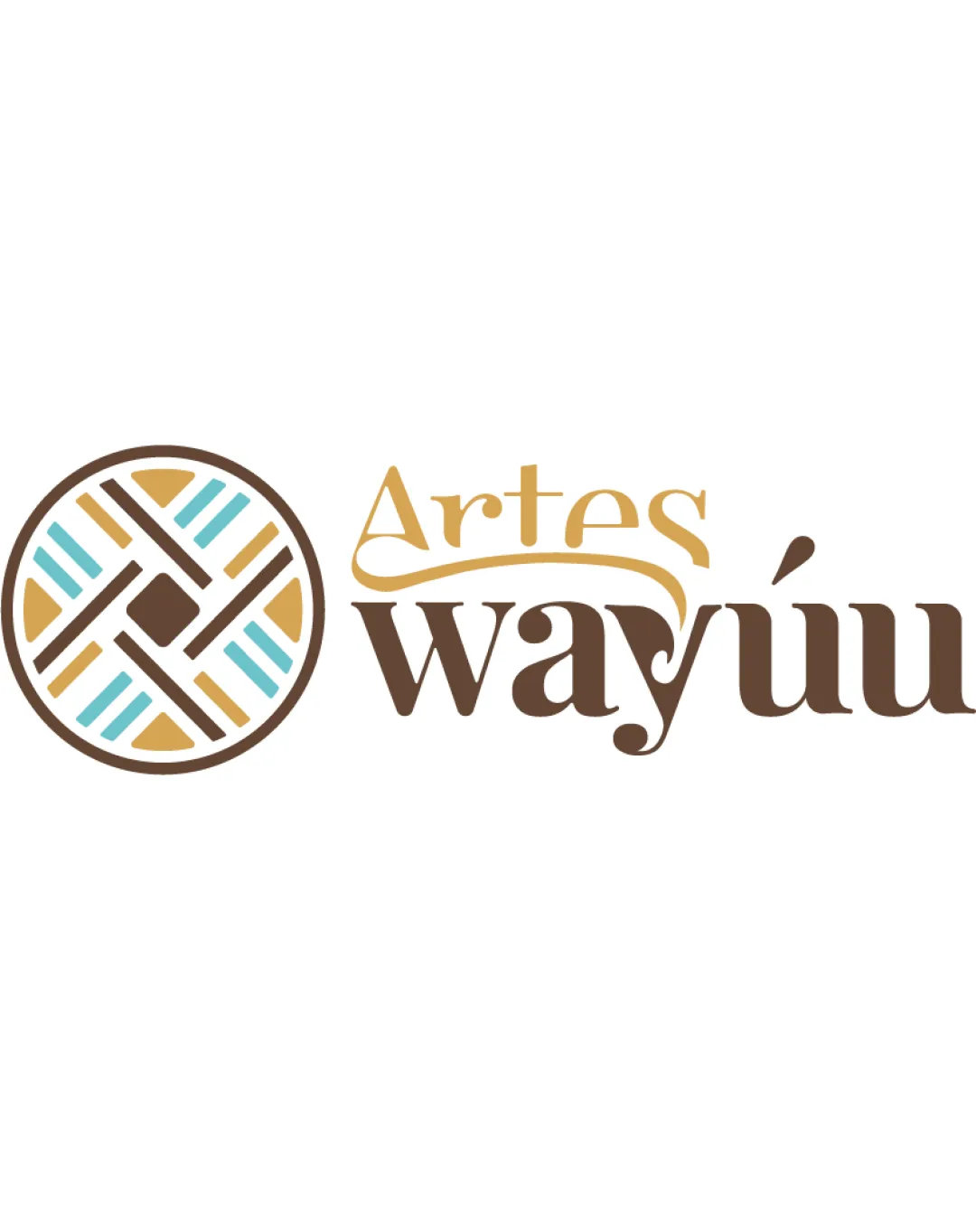
Artes wayúu

Distinctive, relevant, and visually inviting; strong foundation for artisan and Indigenous craft branding.

Combination Mark Artisan, Ethnic, Handcraft-inspired Handmade Craft Goods
4.5/5
Legibility
4.5/5
Originality
4/5
Balance
4/5
Scale
Your next steps

What to fix first

Focus on the changes that matter. Keep what makes the logo work.

1

Subtly refine the woven symbol for smallest size clarity.

Medium priority Medium effort

Minor stroke simplification can avoid detail loss at reduced sizes.

Ensures the logo reproduces well even on small packaging and digital thumbnails.
2

Harmonize the wordmark's script and serif portions.

Medium priority Medium effort

A more cohesive typography pairing or slight scaling tweaks may solve the weight difference.

Increases polish and unity across branding touchpoints.

Detailed review

Logo performance breakdown

Not scored

Brief & logo match

Woven mark and Indigenous style express authenticity in craft.

4.5/5

Legibility

  • Wordmark is clear and easy to read.
  • Accent on 'ú' is distinct.
  • The script 'Artes' is slightly stylized and may reduce instant recognition at small sizes.
4.5/5

Originality

  • Distinctive, culturally rooted pattern.
  • Original interlock between symbol and wordmark.
  • The woven motif, while authentic, could resemble other craft brands.
4.5/5

Color harmony

  • Earth tones and teal support artisanal, Indigenous associations.
  • Excellent contrast and warmth.
  • Gold/yellow shade could be slightly muted for versatility.
Brown#A77A2B
Dark Brown#6B4A25
Light Blue#B9E1DF
White#FFFFFF

Estimated colors. Use the original design file for exact values.

Create a full color palette using these colors

Create new palette

4/5

Balance alignment

  • Good relationship between symbol and wordmark.
  • Negative space is well used.
  • Slight disconnect in visual weight between 'Artes' and 'wayúu' due to differing fonts and sizes.
Uploaded logoAlignment guide overlay

Inspect spacing with the guide. Optical balance may differ from geometric centering.

4/5

Scalability

  • Mark and text remain legible at moderate sizes.
  • Simple shapes in the icon support scalability.
  • The weaving detail in the symbol could congest at very small sizes; minor simplification could help.
5/5

Misinterpretations

  • No confusing or inappropriate alternate readings.
4.5/5

Symbol & text fit

  • Pattern style ties visually to brand name and theme.
  • Shared color palette between mark and wordmark enhances unity.
  • Font contrast creates a subtle style clash.

Black & white

Does the shape still work without color?

These tests are available only for logos uploaded in vector (SVG) format.

Background contrast

Find the surfaces where your logo stays clear.

These tests are available only for logos uploaded in vector (SVG) format.

Blur & silhouette

A 3px blur softens fine details so you can check whether the overall shape stays recognizable. If key gaps close or elements merge, the logo may rely too heavily on detail.

These tests are available only for logos uploaded in vector (SVG) format.

Try your own review

Wondering how your logo performs?

Get a clear logo score, key risks, and priority fix ideas before your client or audience sees it.

Review my logo