Remove the clear visual misinterpretation
Seated figure in lingerie, lipstick, and pose could be misinterpreted as overly sexualized or not professional, depending on audience.
Prevents an embarrassing or inappropriate audience reaction.
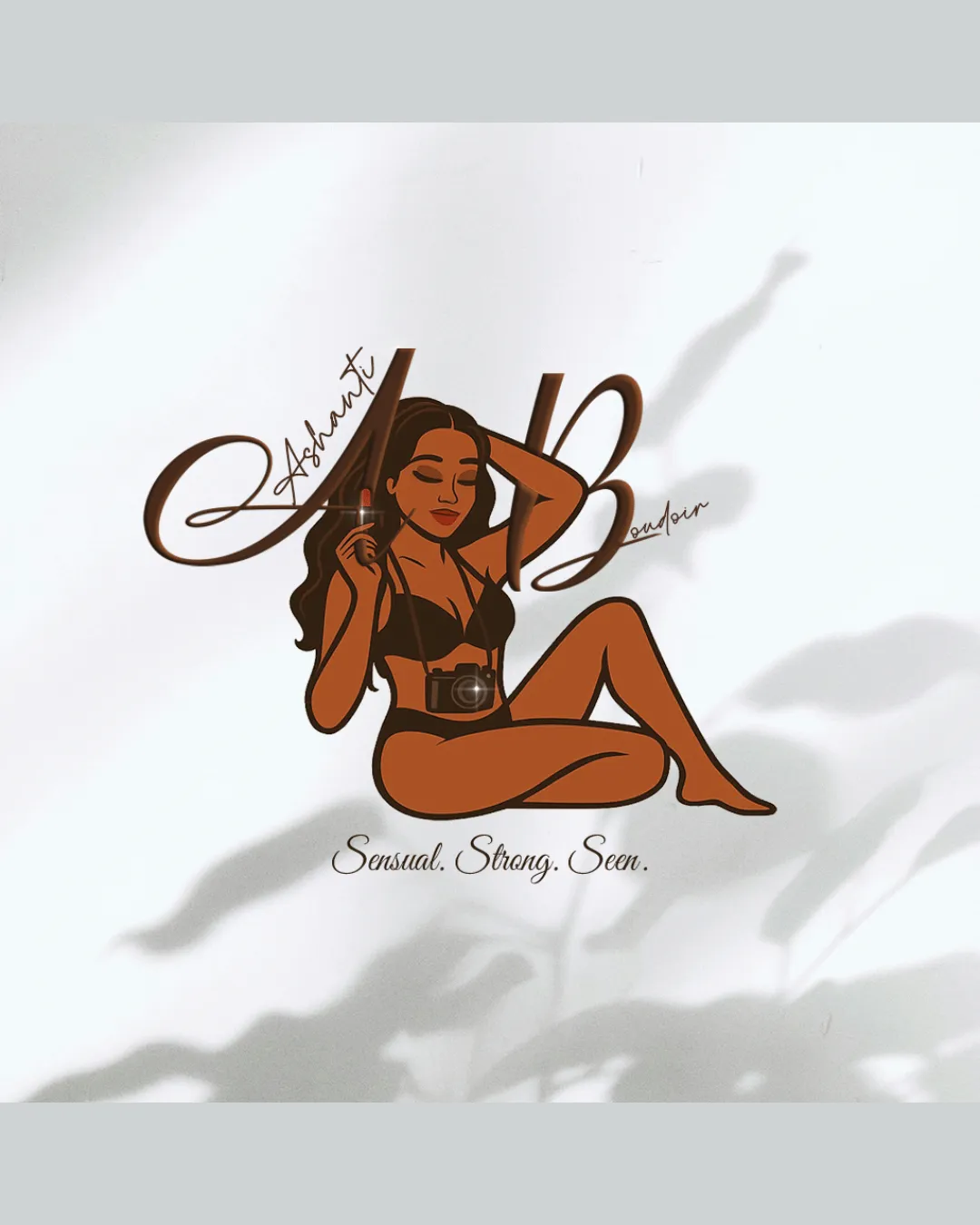
A clear sexual or intimate visual misinterpretation must be resolved before presenting this logo.
Focus on the changes that matter. Keep what makes the logo work.
Seated figure in lingerie, lipstick, and pose could be misinterpreted as overly sexualized or not professional, depending on audience.
Prevents an embarrassing or inappropriate audience reaction.
Current wordmark is difficult to read and unbalanced.
Improves readability and cohesiveness.
High detail risks being lost or cluttered at small scale.
Preserves recognizability at smaller sizes.
Reflects boudoir and photography themes with camera, makeup, and feminine illustration.
Estimated colors. Use the original design file for exact values.
Create a full color palette using these colors
Create new palette
Inspect spacing with the guide. Optical balance may differ from geometric centering.
Get a clear logo score, key risks, and priority fix ideas before your client or audience sees it.
More credits needed
Add credits to continue without losing your work.
Then $7/month. Cancel anytime.
Essential logo review with AI
Estimated progress