Wondering how your logo performs? 🧐
Get professional logo reviews in seconds and catch design issues in time.
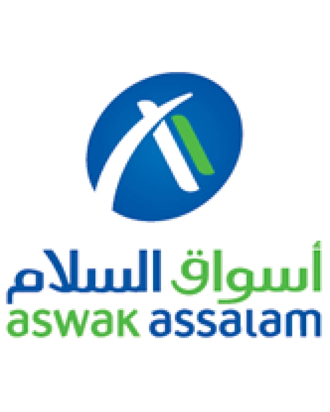
Try it Now!Logo review of أسواق السلام aswak assalam
 Logo analysis by AI
Logo type:
Style:
Detected symbol:
Negative space:
Detected text:
Business industry:
Review requested by Gatora7
**If AI can recognize or misinterpret it, so can people.
Structured logo review
Legibility
![]() Both Arabic and Latin text are highly clear and readable.
Both Arabic and Latin text are highly clear and readable.![]() Typeface is legible with appropriate size and spacing.
Typeface is legible with appropriate size and spacing.
Scalability versatility
![]() Simple, clean icon likely to reproduce well in various sizes.
Simple, clean icon likely to reproduce well in various sizes.![]() Can be effective on signage and digital media.
Can be effective on signage and digital media.
![]() Multicolored elements may present challenges in certain small scale or monochrome applications.
Multicolored elements may present challenges in certain small scale or monochrome applications.![]() The thin lines in the symbol could lose clarity at micro sizes, such as favicons or embroidery.
The thin lines in the symbol could lose clarity at micro sizes, such as favicons or embroidery.
200x250 px
100×125 px
50×62 px
Balance alignment
![]() Balanced composition between symbol and bilingual text.
Balanced composition between symbol and bilingual text.![]() The circular icon sits well above the text elements.
The circular icon sits well above the text elements.
![]() Slight weight imbalance between the icon and the relatively light wordmark; icon is visually heavier.
Slight weight imbalance between the icon and the relatively light wordmark; icon is visually heavier.

Originality
![]() Swoosh is integrated to form an 'A', giving some custom character.
Swoosh is integrated to form an 'A', giving some custom character.![]() Bilingual presentation is distinctive in branding.
Bilingual presentation is distinctive in branding.
![]() The swoosh-in-ellipse motif is a very common and overused corporate style.
The swoosh-in-ellipse motif is a very common and overused corporate style.![]() Does not strongly differentiate from other retail or supermarket logos.
Does not strongly differentiate from other retail or supermarket logos.
Logomark wordmark fit
![]() The rounded, friendly font complements the soft, dynamic icon.
The rounded, friendly font complements the soft, dynamic icon.![]() Color palette is consistent across logomark and wordmark.
Color palette is consistent across logomark and wordmark.
![]() Minor mismatch in weight; logomark commands more visual attention than the wordmark.
Minor mismatch in weight; logomark commands more visual attention than the wordmark.
Aesthetic look
![]() Visually appealing, fresh use of blue and green for an inviting look.
Visually appealing, fresh use of blue and green for an inviting look.![]() Clean, uncluttered design.
Clean, uncluttered design.
![]() Leans toward generic corporate iconography; lacks memorable distinctiveness.
Leans toward generic corporate iconography; lacks memorable distinctiveness.
Dual meaning and misinterpretations
![]() No accidental inappropriate or ambiguous symbolism detected.
No accidental inappropriate or ambiguous symbolism detected.
Color harmony
![]() Harmonious combination of blue and green, with good contrast against white.
Harmonious combination of blue and green, with good contrast against white.![]() Color scheme is fresh and inviting.
Color scheme is fresh and inviting.
Blue
#0072BC
Green
#6CC04A
White
#FFFFFF