Wondering how your logo performs? 🧐
Get professional logo reviews in seconds and catch design issues in time.
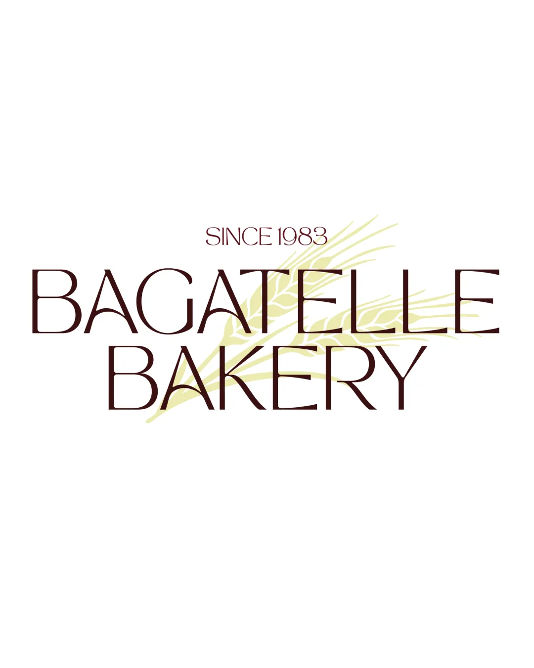
Try it Now!Logo review of BAGATELLE BAKERY, SINCE 1983

 Logo analysis by AI
Logo type:
Style:
Detected symbol:
Detected text:
Business industry:
Review requested by Joe2BA
**If AI can recognize or misinterpret it, so can people.
Structured logo review
Legibility
Font is clean and distinct, allowing the business name to be read at first glance.
Text size is sufficiently large.
Wheat symbol behind the text causes some visual interference, especially with thinner letterforms.
Very thin font strokes reduce legibility at small sizes or poor reproduction.
Scalability versatility
Simple wheat graphic and clean typography work well on medium-large print materials or web banners.
Fine lines in both wheat and type become illegible at small scales (business cards, mobile favicons, embroidery).
Logo loses impact and clarity when reduced, particularly the subtle pale yellow wheat graphic.
Lack of a standalone icon reduces flexibility for square or social media avatars.

200x250 px

100×125 px

50×62 px
Balance alignment
Central alignment creates an organized and symmetry-driven composition.
Overlapping wheat stalk visually disrupts the clean geometry of the lettering.
Text stack ('BAGATELLE' over 'BAKERY') lacks strong hierarchy due to equal width and similar font weight.


Originality
Wheat stalk relates directly to the bakery theme, introducing a custom illustrative element.
Wheat graphics are very common for bakery logos, resulting in only moderate originality.
Font style lacks unique attributes—feels generic for the food industry.
Aesthetic look
Minimalist color palette and linear forms evoke a modern, elegant feel.
Pale yellow on white is weak in contrast, making the wheat difficult to notice.
Visual effect is rather flat—logo lacks punch or memorability.
Dual meaning and misinterpretations
No inappropriate or unintended visual associations present.
Color harmony
Warm dark brown pairs well with pale yellow for a natural, bakery-appropriate palette.
Low contrast between wheat and background reduces effectiveness of the secondary color.
Dark Brown
#381C19
Pale Yellow
#D9D5A7
White
#FFFFFF


