Wondering how your logo performs? 🧐
Get professional logo reviews in seconds and catch design issues in time.
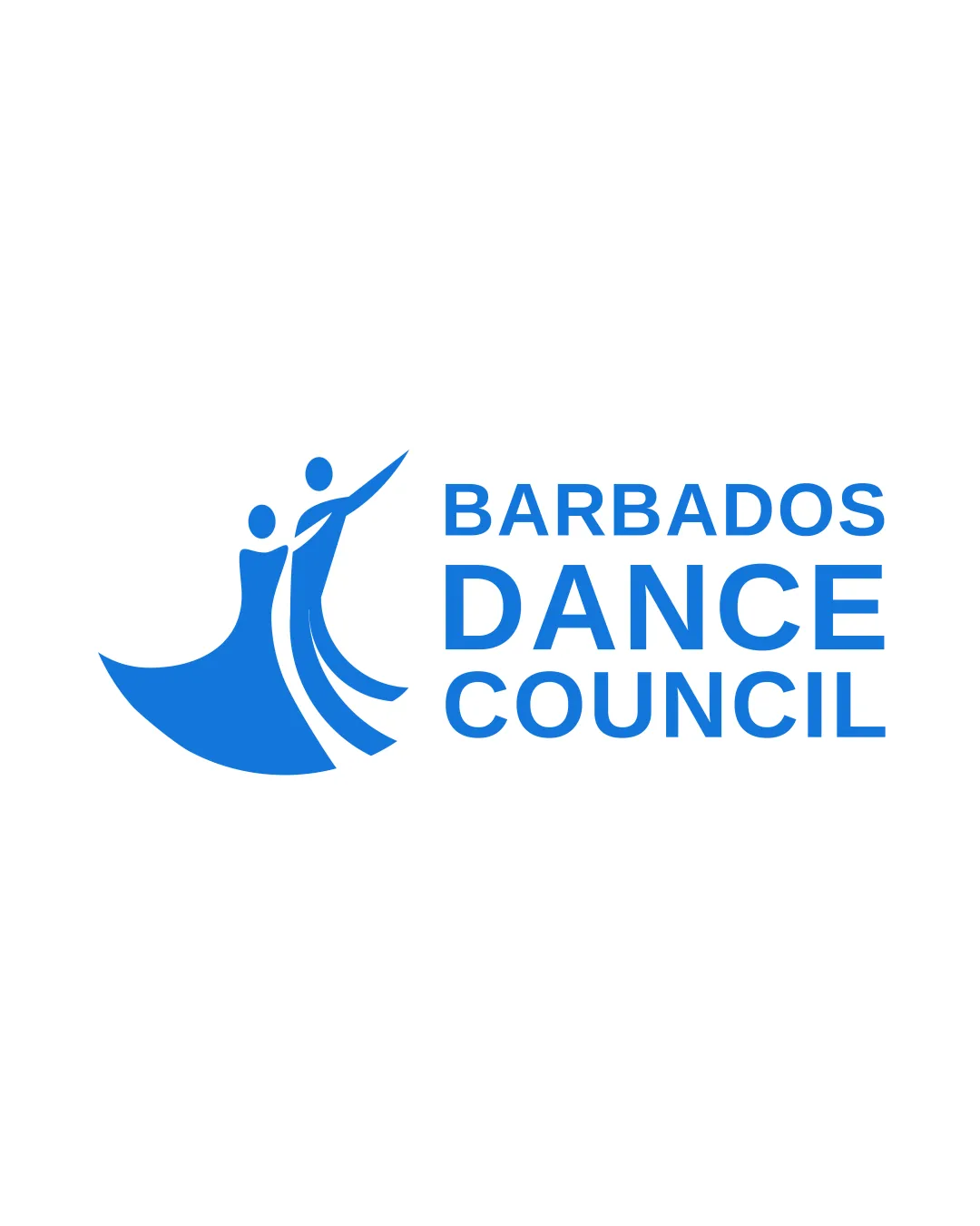
Try it Now!Logo review of BARBADOS DANCE COUNCIL
 Logo analysis by AI
Logo type:
Style:
Detected symbol:
Detected text:
Business industry:
Review requested by MarkBur
**If AI can recognize or misinterpret it, so can people.
Structured logo review
Legibility
![]() Text is clear and easy to read at all sizes.
Text is clear and easy to read at all sizes.![]() Font choice complements the modern visual style.
Font choice complements the modern visual style.
Scalability versatility
![]() Simple shapes and a single-color design aid easy reproduction on various mediums.
Simple shapes and a single-color design aid easy reproduction on various mediums.![]() Will work well on business cards, signage, and digital assets.
Will work well on business cards, signage, and digital assets.
![]() Fine line details in the dress curve may become less clear at very small sizes, such as embroidery or favicons.
Fine line details in the dress curve may become less clear at very small sizes, such as embroidery or favicons.
200x250 px
100×125 px
50×62 px
Balance alignment
![]() Good visual flow between the symbol and wordmark.
Good visual flow between the symbol and wordmark.![]() Proximity and alignment create a cohesive feel.
Proximity and alignment create a cohesive feel.
![]() The left-heavy symbol can feel slightly disconnected from the text at smaller scales.
The left-heavy symbol can feel slightly disconnected from the text at smaller scales.

Originality
![]() Distinctly conveys dance with stylized figures and flowing lines.
Distinctly conveys dance with stylized figures and flowing lines.![]() Abstract design is somewhat unique in its depiction.
Abstract design is somewhat unique in its depiction.
![]() Dancing couple silhouettes are somewhat common in arts and dance logos; the design is strong but not entirely groundbreaking.
Dancing couple silhouettes are somewhat common in arts and dance logos; the design is strong but not entirely groundbreaking.
Logomark wordmark fit
![]() Both elements share a modern, geometric style.
Both elements share a modern, geometric style.![]() Visual proportions are well considered—the logomark does not overpower the text.
Visual proportions are well considered—the logomark does not overpower the text.
Aesthetic look
![]() Clean, energetic look with effective use of sweeping lines.
Clean, energetic look with effective use of sweeping lines.![]() Minimalist, uncluttered approach communicates professionalism.
Minimalist, uncluttered approach communicates professionalism.
![]() Could benefit from more negative space or subtle refinements in line weight for elegance.
Could benefit from more negative space or subtle refinements in line weight for elegance.
Dual meaning and misinterpretations
![]() No inappropriate or confusing symbolism detected.
No inappropriate or confusing symbolism detected.
Color harmony
![]() Single color palette creates a strong, memorable appearance.
Single color palette creates a strong, memorable appearance.![]() Blue adds a sense of trust and vibrancy without overwhelming the design.
Blue adds a sense of trust and vibrancy without overwhelming the design.
Science Blue
#1886EC
White
#FFFFFF