Wondering how your logo performs? 🧐
Get professional logo reviews in seconds and catch design issues in time.
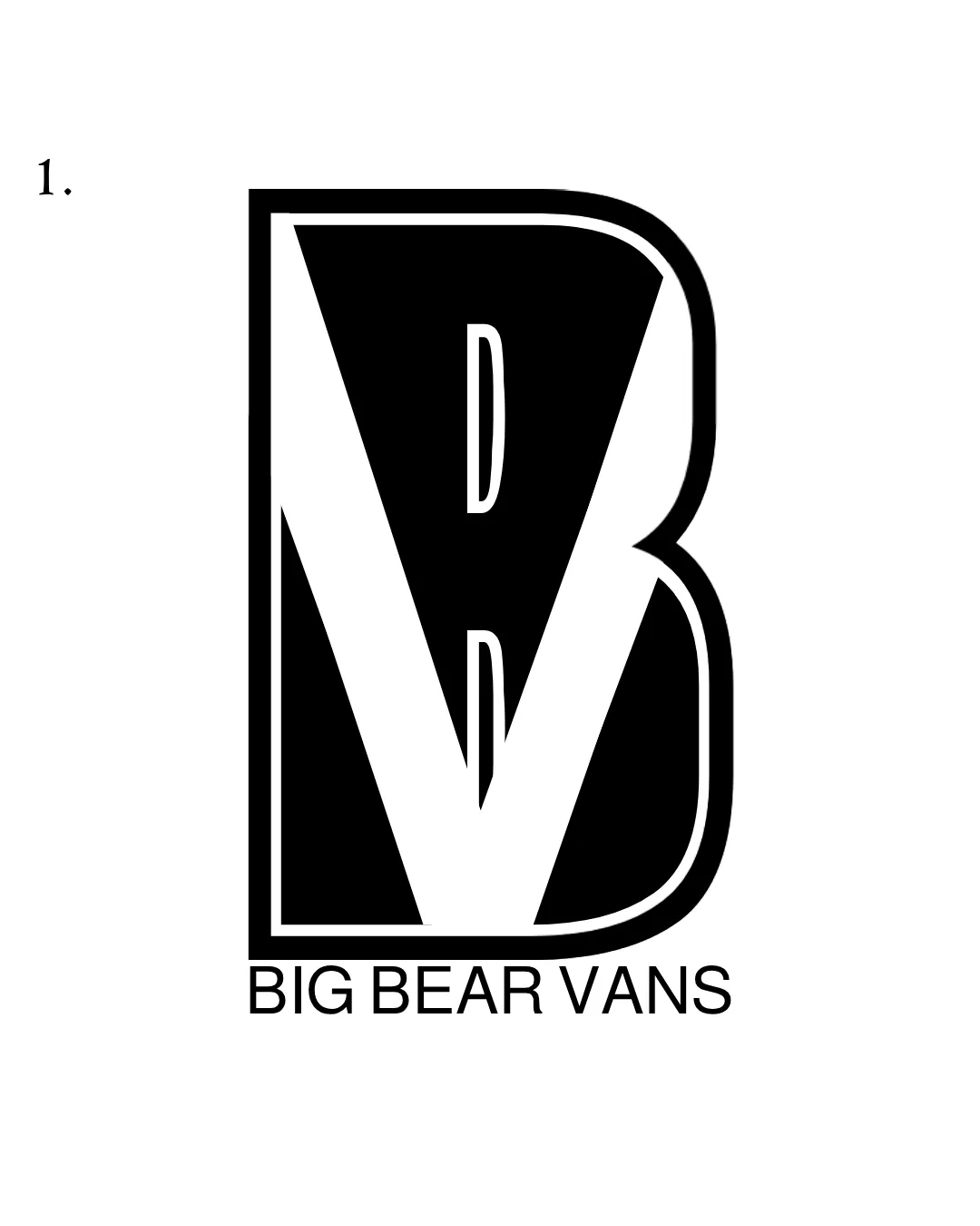
Try it Now!Logo review of BIG BEAR VANS
 Logo analysis by AI
Logo type:
Style:
Detected symbol:
Negative space:
Detected text:
Business industry:
Review requested by Ajaj011
**If AI can recognize or misinterpret it, so can people.
Structured logo review
Legibility
![]() The wordmark 'BIG BEAR VANS' is clear and highly readable in a modern sans serif font.
The wordmark 'BIG BEAR VANS' is clear and highly readable in a modern sans serif font.![]() High contrast between black and white aids readability.
High contrast between black and white aids readability.
![]() The B/V monogram can cause slight confusion at first glance due to letter overlap and integration.
The B/V monogram can cause slight confusion at first glance due to letter overlap and integration.![]() The thin outline on the inner V may be less legible at very small sizes.
The thin outline on the inner V may be less legible at very small sizes.
Scalability versatility
![]() Bold forms allow solid reproduction on large formats like signage or vehicle graphics.
Bold forms allow solid reproduction on large formats like signage or vehicle graphics.![]() Monochrome palette increases versatility.
Monochrome palette increases versatility.
![]() Complex overlap of B and V with thin lines may lose clarity at smaller sizes—especially in favicons or embroidery.
Complex overlap of B and V with thin lines may lose clarity at smaller sizes—especially in favicons or embroidery.![]() Inner details of the monogram may disappear when scaled down for business cards or merchandise tags.
Inner details of the monogram may disappear when scaled down for business cards or merchandise tags.
200x250 px
100×125 px
50×62 px
Balance alignment
![]() Overall monogram is visually centered and the wordmark placement aligns well beneath the symbol.
Overall monogram is visually centered and the wordmark placement aligns well beneath the symbol.![]() Good use of negative space to form the V within the B.
Good use of negative space to form the V within the B.
![]() The weight of the large black B can feel slightly overpowering versus the thinner wordmark beneath.
The weight of the large black B can feel slightly overpowering versus the thinner wordmark beneath.

Originality
![]() Creative use of negative space to combine B and V into a single monogram.
Creative use of negative space to combine B and V into a single monogram.![]() Monogram approach feels moderately unique for the sector.
Monogram approach feels moderately unique for the sector.
![]() Monogram-style logos with bold outlines are relatively common and risk feeling generic without additional unique touches.
Monogram-style logos with bold outlines are relatively common and risk feeling generic without additional unique touches.
Logomark wordmark fit
![]() Both components use bold, strong geometric forms, somewhat cohesive visually.
Both components use bold, strong geometric forms, somewhat cohesive visually.
![]() The stark thickness contrast between the massive monogram and the thin wordmark below creates a slight disconnect.
The stark thickness contrast between the massive monogram and the thin wordmark below creates a slight disconnect.![]() Styles could be unified—either by weight, spacing, or proportion—to enhance cohesion.
Styles could be unified—either by weight, spacing, or proportion—to enhance cohesion.
Aesthetic look
![]() Minimal monochrome palette creates a clean, contemporary feel.
Minimal monochrome palette creates a clean, contemporary feel.![]() Strong graphic impact grabs attention.
Strong graphic impact grabs attention.
![]() Large solid forms risk looking heavy or dated if not executed with slight refinement.
Large solid forms risk looking heavy or dated if not executed with slight refinement.
Dual meaning and misinterpretations
![]() No obvious inappropriate or unintended dual meanings.
No obvious inappropriate or unintended dual meanings.
Color harmony
![]() Classic black-and-white color scheme is harmonious and suitable for diverse media.
Classic black-and-white color scheme is harmonious and suitable for diverse media.
Black
#000000
White
#FFFFFF


