Wondering how your logo performs? 🧐
Get professional logo reviews in seconds and catch design issues in time.
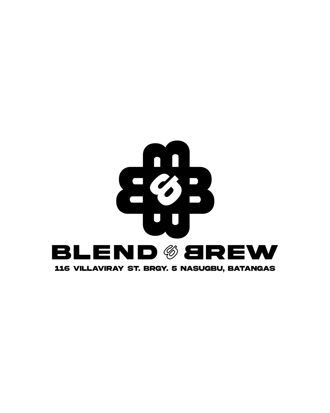
Try it Now!Logo review of BLEND & BREW
 Logo analysis by AI
Logo type:
Style:
Detected symbol:
Detected text:
Business industry:
Review requested by Agosdatcom
**If AI can recognize or misinterpret it, so can people.
Structured logo review
Legibility
Main text 'BLEND & BREW' is bold, uppercase, and very easy to read at a glance.
Address text is clear and in a simple sans-serif font.
The ampersand between BLEND and BREW is overly stylized; it may be mistaken for a symbol or cause momentary confusion, especially at small sizes.
Scalability versatility
Bold geometry ensures the main mark is visible at most sizes.
Simple black and white colorway adapts well across backgrounds.
The small interior details of the symbol and address text will lose clarity at favicon or pin sizes.
The ampersand symbol may blur and lose recognition in very small applications, such as embroidery or small merchandise.

200x250 px

100×125 px

50×62 px
Balance alignment
Good vertical alignment of symbol and wordmark.
Addresses are cleanly stacked and spaced.
Symbol feels slightly heavier compared to the text, drawing the eye upward.
The ampersand creates a small visual gap between key words, disrupting horizontal flow.


Originality
Central abstract symbol with integrated lowercase 'b' is unique.
Geometric style gives a contemporary impression.
Abstract symbols with interwoven patterns and embedded initials are common in café/food branding.
No strong connection to coffee/brewing, missing an opportunity to visually tie to the industry.
Logomark wordmark fit
Symbol and wordmark share the same geometric, heavy feel.
Black and white consistency keeps the design unified.
Slight disproportion as the logomark is visually heavier, especially at larger scales.
Aesthetic look
Modern, clean, and striking appearance.
Symmetry adds professionalism and structure.
Visual complexity of the symbol may not appeal to all audiences.
Overly bold and abstract style can feel generic without clear brand connection.
Dual meaning and misinterpretations
No inappropriate or unintended imagery detected.
Symbol avoids obvious negative connotations.
Color harmony
Monochrome palette is classic, professional, and extremely versatile.
Strong contrast ensures universal visibility.
Black
#000000
White
#FFFFFF

