 View review
Logo score
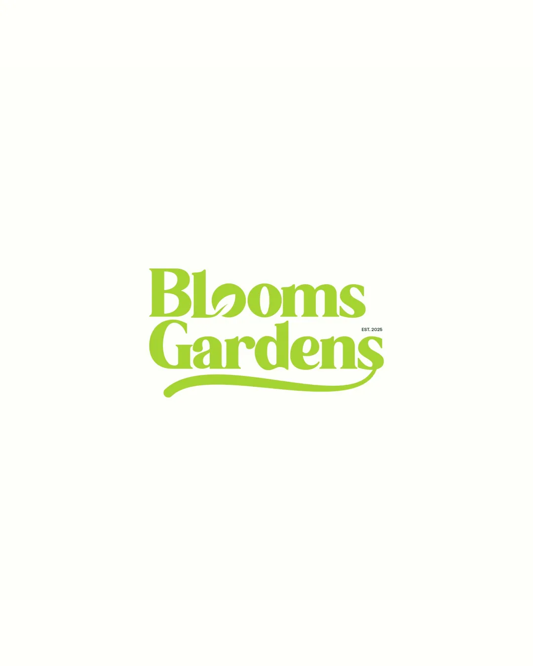
Logo review ofBlooms Gardens
Review the detailed scores below to see what is working and what should be refined first.
Legibility
Originality
Misread
Balance
Scale
Detailed review
Logo performance breakdown
Legibility
![]() Main words are readable and clear.
Main words are readable and clear.![]() Typeface is bold enough for most applications.
Typeface is bold enough for most applications.
![]() Custom 'o' leaf integration may cause a very brief pause in readability.
Custom 'o' leaf integration may cause a very brief pause in readability.![]() Small 'EST. 2025' text is lost at small sizes.
Small 'EST. 2025' text is lost at small sizes.
Originality
![]() Leaf-in-'o' offers a unique and relevant twist to the typography.
Leaf-in-'o' offers a unique and relevant twist to the typography.![]() Organic curve reinforces brand tone.
Organic curve reinforces brand tone.
![]() Leaf-in-letter concept is becoming more common in gardening-related logos.
Leaf-in-letter concept is becoming more common in gardening-related logos.![]() No distinct logomark or emblem, relies solely on type manipulations.
No distinct logomark or emblem, relies solely on type manipulations.
Color harmony
![]() Green is both relevant and visually pleasing.
Green is both relevant and visually pleasing.![]() Simple two-tone design delivers strong contrast and impact.
Simple two-tone design delivers strong contrast and impact.
Algae Green
#A4DE29
White
#FFFFF9
Balance alignment
![]() General weight distribution between both lines is visually pleasant.
General weight distribution between both lines is visually pleasant.![]() Curved underline anchors the bottom word.
Curved underline anchors the bottom word.
![]() The large flourish may add a slight visual heaviness on the lower half.
The large flourish may add a slight visual heaviness on the lower half.![]() Small 'EST. 2025' appears awkwardly aligned with the rest of the design.
Small 'EST. 2025' appears awkwardly aligned with the rest of the design.

Scalability
![]() Simple color scheme aids versatility.
Simple color scheme aids versatility.![]() Bold lines work well at larger sizes such as signage and packaging.
Bold lines work well at larger sizes such as signage and packaging.
![]() Leaf-detailed 'o' and small text may lose clarity at favicon or embroidery scale.
Leaf-detailed 'o' and small text may lose clarity at favicon or embroidery scale.![]() Curved underline could be challenging on tightly constrained horizontal spaces.
Curved underline could be challenging on tightly constrained horizontal spaces.
200x250 px
100×125 px
50×62 px
Misinterpretations
![]() No inappropriate or confusing visual elements present.
No inappropriate or confusing visual elements present.![]() Leaf integration and flourish remain industry-appropriate.
Leaf integration and flourish remain industry-appropriate.
Try your own review
Review my logo
Wondering how your logo performs?
Get a clear logo score, key risks, and priority fix ideas before your client or audience sees it.
Keep exploring