 View review
Logo score
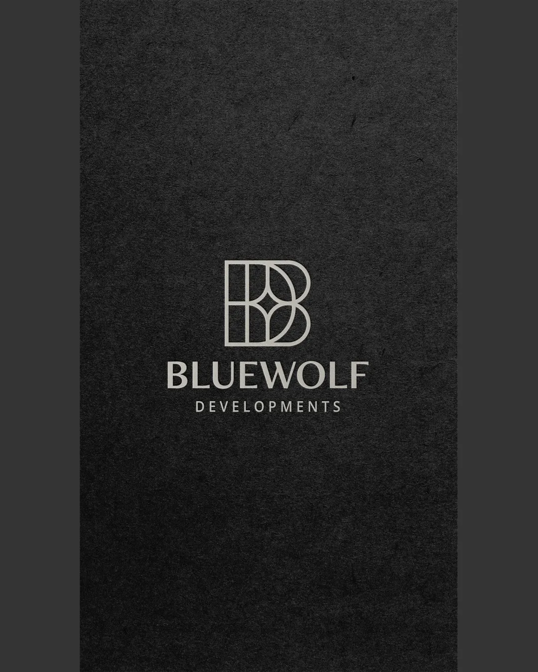
Logo review ofBluewolf Developments
Review the detailed scores below to see what is working and what should be refined first.
Legibility
Originality
Balance
Scale
Detailed review
Logo performance breakdown
Legibility
![]() The business name BLUEWOLF DEVELOPMENTS is clear and readable.
The business name BLUEWOLF DEVELOPMENTS is clear and readable.
Originality
![]() The geometric monogram is distinctive and adds originality.
The geometric monogram is distinctive and adds originality.
![]() Geometric patterns can be somewhat common, reducing uniqueness slightly.
Geometric patterns can be somewhat common, reducing uniqueness slightly.
Color harmony
![]() The monochrome color scheme enhances sophistication and adaptability.
The monochrome color scheme enhances sophistication and adaptability.
Balance alignment
![]() The symbol and text are well-aligned, creating a harmonious look.
The symbol and text are well-aligned, creating a harmonious look.

Scalability
![]() The geometric design is versatile for different sizes and mediums.
The geometric design is versatile for different sizes and mediums.
![]() The intricate lines in the symbol might lose clarity at very small scales.
The intricate lines in the symbol might lose clarity at very small scales.
200x250 px
100×125 px
50×62 px
Symbol & text fit
![]() The monogram and text fit well together, maintaining a cohesive look.
The monogram and text fit well together, maintaining a cohesive look.
Try your own review
Review my logo
Wondering how your logo performs?
Get a clear logo score, key risks, and priority fix ideas before your client or audience sees it.
Keep exploring