Wondering how your logo performs? 🧐
Get professional logo reviews in seconds and catch design issues in time.
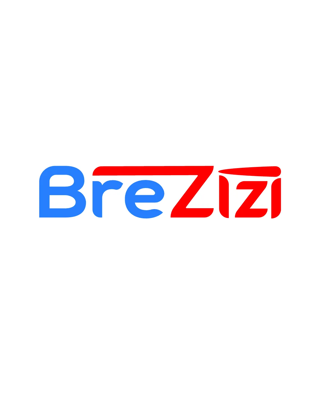
Try it Now!Logo review of Brezizi
 Logo analysis by AI
Recognized style:
Logo type:
Detected symbol:
Detected text:
Business industry:
Review requested by Brezizi
**If AI can recognize or misinterpret it, so can people.
Structured logo review
Legibility
![]() I assume the business name is Brezizi.
I assume the business name is Brezizi.
![]() The overlapping style of the Z could slightly confuse readability.
The overlapping style of the Z could slightly confuse readability.
Scalability versatility
![]() The design's simplicity aids its versatility across mediums.
The design's simplicity aids its versatility across mediums.
![]() The intricate detailing on the Z might lose clarity when scaled down substantially.
The intricate detailing on the Z might lose clarity when scaled down substantially.
200x250 px
100×125 px
50×62 px
Balance alignment
![]() The balance of colors and alignment of text is well-executed.
The balance of colors and alignment of text is well-executed.

Originality
![]() The unique Z shape contributes to originality.
The unique Z shape contributes to originality.
![]() The rest of the letters are fairly standard.
The rest of the letters are fairly standard.
Aesthetic look
![]() The logo looks modern and professional.
The logo looks modern and professional.
Cultural sensitivity dual meaning
![]() No cultural sensitivity issues detected.
No cultural sensitivity issues detected.
Color harmony
![]() The use of blue and red is vivid and attention-grabbing.
The use of blue and red is vivid and attention-grabbing.
![]() The stark contrast might not suit more subdued brand personalities.
The stark contrast might not suit more subdued brand personalities.