 View review
Logo score
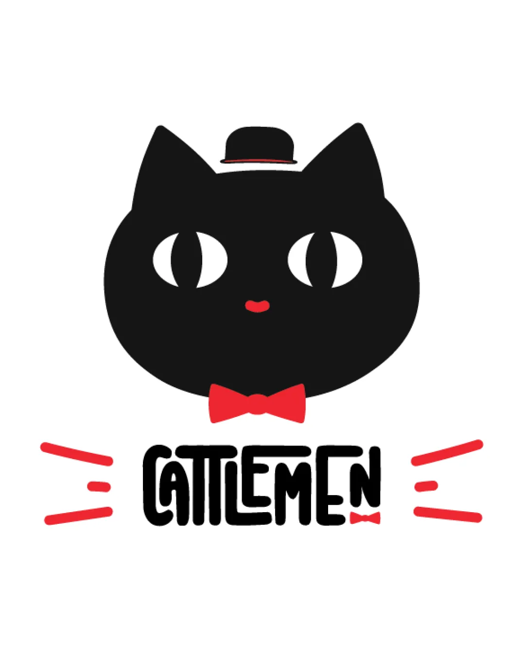
Logo review ofCattlemen
Review the detailed scores below to see what is working and what should be refined first.
Legibility
Originality
Misread
Balance
Scale
Detailed review
Logo performance breakdown
Legibility
![]() Text is generally readable at medium to large sizes.
Text is generally readable at medium to large sizes.![]() Playful typography fits the whimsical character of the logo.
Playful typography fits the whimsical character of the logo.
![]() Letter spacing and heavy stylization in 'CATTLEMEN' compromise clarity, especially for quick reads or at small sizes.
Letter spacing and heavy stylization in 'CATTLEMEN' compromise clarity, especially for quick reads or at small sizes.![]() Lowercase and uppercase mix, plus line interruptions, may wear on legibility.
Lowercase and uppercase mix, plus line interruptions, may wear on legibility.
Originality
![]() Creative pun with a cat as the visual for 'CATTLEMEN' stands out.
Creative pun with a cat as the visual for 'CATTLEMEN' stands out.![]() Cartoonish cat, bowler hat, and bow tie create a distinct personality.
Cartoonish cat, bowler hat, and bow tie create a distinct personality.
![]() The concept of an illustrated animal mascot is somewhat common in the food and beverage sector.
The concept of an illustrated animal mascot is somewhat common in the food and beverage sector.![]() Style borrows from established feline-themed branding, so not 100% unique.
Style borrows from established feline-themed branding, so not 100% unique.
Color harmony
![]() Color palette is tight and high contrast for strong visibility.
Color palette is tight and high contrast for strong visibility.![]() Red accents provide energy and emphasis without overwhelming the main icon.
Red accents provide energy and emphasis without overwhelming the main icon.
Black
#000000
Red
#FF232A
White
#FFFFFF
Balance alignment
![]() Main icon is well-centered above the text.
Main icon is well-centered above the text.![]() Symmetry of the cat face provides visual stability.
Symmetry of the cat face provides visual stability.
![]() Red accent lines feel disconnected, making the layout slightly busier and detracting from harmony.
Red accent lines feel disconnected, making the layout slightly busier and detracting from harmony.![]() Bow tie under the cat and the minimal bow in the wordmark create some redundancy.
Bow tie under the cat and the minimal bow in the wordmark create some redundancy.

Scalability
![]() Logo is distinct and recognizable at larger scales like signage or packaging.
Logo is distinct and recognizable at larger scales like signage or packaging.![]() Bold shapes are clear at a glance.
Bold shapes are clear at a glance.
![]() Small details such as the facial features, bow tie, and hat might be lost at smaller sizes, diminishing impact in favicons or on product labels.
Small details such as the facial features, bow tie, and hat might be lost at smaller sizes, diminishing impact in favicons or on product labels.![]() Thin parts in the typography could blur when scaled down or embroidered on apparel.
Thin parts in the typography could blur when scaled down or embroidered on apparel.
200x250 px
100×125 px
50×62 px
Misinterpretations
![]() Visuals clearly communicate a whimsical cat without inappropriate or unintended imagery.
Visuals clearly communicate a whimsical cat without inappropriate or unintended imagery.
Symbol & text fit
![]() Typography and icon have consistent playfulness.
Typography and icon have consistent playfulness.
![]() Visual motifs like the bow tie are echoed in both the icon and text.
Visual motifs like the bow tie are echoed in both the icon and text.
![]() Wordmark feels visually lighter than the logomark, making the composition slightly top-heavy.
Wordmark feels visually lighter than the logomark, making the composition slightly top-heavy.
![]() Typographic style is playful but may lack the refinement of the clean, bold icon.
Typographic style is playful but may lack the refinement of the clean, bold icon.
Try your own review
Review my logo
Wondering how your logo performs?
Get a clear logo score, key risks, and priority fix ideas before your client or audience sees it.
Keep exploring