CE logo review
3.9 / 5
Logo score

Logo review ofCe

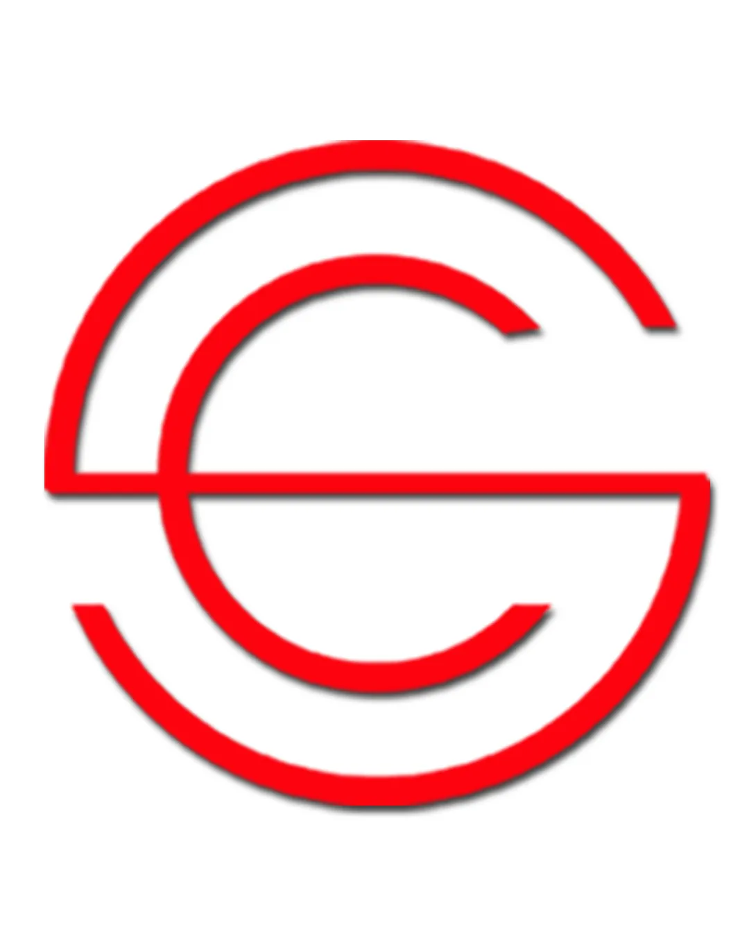
Strong, recognizable geometric monogram with clean execution and minimal risk; minor refinement will elevate to a luxury standard.

Monogram Minimalist Geometric Design/creative
4/5
Legibility
3/5
Originality
5/5
Misread
4/5
Balance
4/5
Scale
Review next
Action plan

What to fix first

The most important fixes to handle before polishing the full presentation.

1

Slightly thicken linework to improve clarity and impact on all print sizes

Medium priority

Thicker strokes help avoid visual loss when reducing logo size.

Impact: Improves Legibility And Print Versatility For Small-scale Usage · Effort: Low

2

Refine inner spacing and endpoint finishing for a more premium, intentional visual finish

Medium priority

Crisper geometry and closed optical forms will reinforce a luxury impression.

Impact: Elevates Premium Perception And Addresses Minor Optical Imbalance · Effort: Medium

Detailed review

Logo performance breakdown

4/5

Legibility

Checkmark icon 'C' and 'E' letterforms are identifiable

Warning icon Line intersection could slightly obscure the 'E' for some viewers

3/5

Originality

Checkmark icon Clean and distinctive use of line to form monogram

Warning icon Circular monograms are a common approach in creative fields

4/5

Color harmony

Checkmark icon Bold red stands out against white, providing strong contrast

Warning icon Single color limits brand flexibility if broader palette is needed

Red
#FF0000

White
#FFFFFF

Your palette is close. Explore sharper color combinations with Colorfly.design before updating the logo.

Explore palettes
4/5

Balance alignment

Checkmark icon Mark displays visual centering and consistent stroke weight

Warning icon Slight weight imbalance due to open ends; could feel slightly off for precision-focused contexts

logo 200x250 pixels scalability test alignment grid overlay
4/5

Scalability

Checkmark icon Simple lines enable good scalability
Checkmark icon One-color mark is versatile

Warning icon Thin lines may lose impact below a certain size

logo 200x250 pixels scalability test

200x250 px

logo 100x125 pixels scalability test

100×125 px

logo 50x62 pixels scalability test

50×62 px

5/5

Misinterpretations

Checkmark icon No inappropriate or confusing secondary imagery detected

Brief match

Checkmark icon Marque De Graphiste-sérigraphe Haut Gamme: Minimal, geometric monogram fits high-end creative/serigraphy context; suggests precision and artistry

Try your own review

Wondering how your logo performs?

Get a clear logo score, key risks, and priority fix ideas before your client or audience sees it.

Review my logo