Wondering how your logo performs? 🧐
Get professional logo reviews in seconds and catch design issues in time.
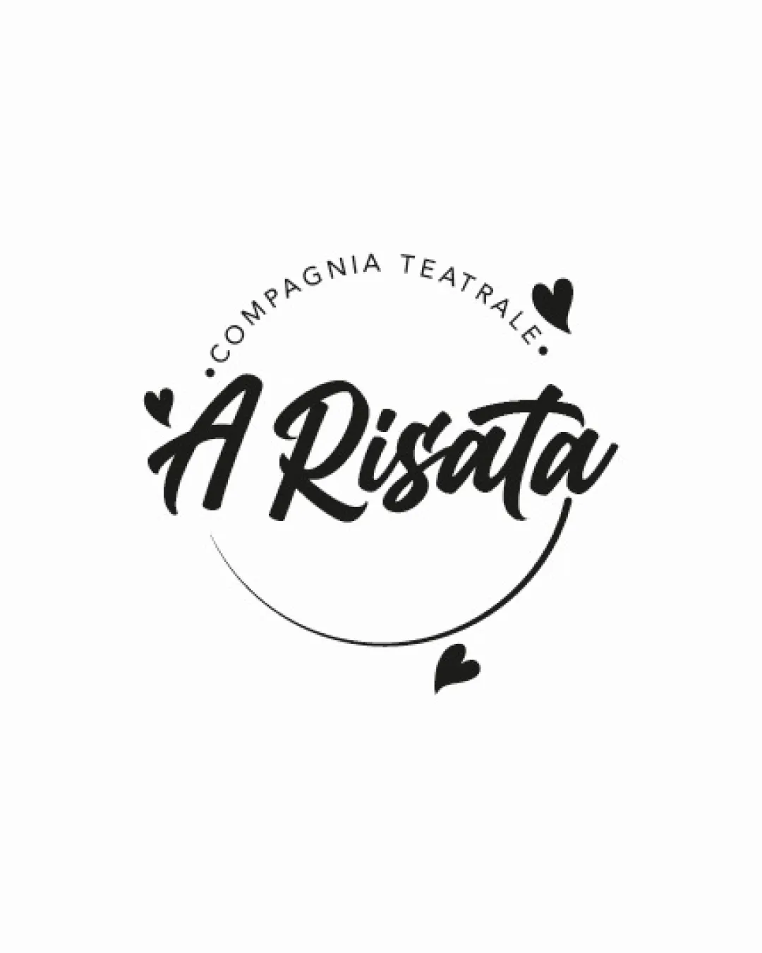
Try it Now!Logo review of Compagnia Teatrale A Risata
 Logo analysis by AI
Logo type:
Style:
Detected symbol:
Detected text:
Business industry:
Review requested by Adamo_3v4
**If AI can recognize or misinterpret it, so can people.
Structured logo review
Legibility
![]() The main script 'A Risata' is generally readable and clear.
The main script 'A Risata' is generally readable and clear.![]() High-contrast black-on-white color scheme supports legibility.
High-contrast black-on-white color scheme supports legibility.
![]() The decorative script font may present minor readability issues at smaller sizes or from a distance.
The decorative script font may present minor readability issues at smaller sizes or from a distance.![]() The circular text 'COMPAGNIA TEATRALE' could become harder to read at small scales.
The circular text 'COMPAGNIA TEATRALE' could become harder to read at small scales.
Scalability versatility
![]() Simple black-and-white palette enhances adaptability for most backgrounds.
Simple black-and-white palette enhances adaptability for most backgrounds.![]() No excessive detail, overall composition should hold up at moderate sizes.
No excessive detail, overall composition should hold up at moderate sizes.
![]() Fine script lines and circular text could lose clarity at favicon or embroidery sizes.
Fine script lines and circular text could lose clarity at favicon or embroidery sizes.![]() Heart details may become indistinct or unnecessary at small scales.
Heart details may become indistinct or unnecessary at small scales.
200x250 px
100×125 px
50×62 px
Balance alignment
![]() The circular layout and placement of hearts create visual harmony.
The circular layout and placement of hearts create visual harmony.![]() The swoosh element balances the handwritten wordmark and supports the playful mood.
The swoosh element balances the handwritten wordmark and supports the playful mood.
![]() The placement of the hearts leans toward decorative and slightly unbalanced asymmetry.
The placement of the hearts leans toward decorative and slightly unbalanced asymmetry.

Originality
![]() Handwritten script adds a personal, friendly touch.
Handwritten script adds a personal, friendly touch.![]() Use of heart icons adds some character to the mark.
Use of heart icons adds some character to the mark.
![]() Hearts and handwritten scripts are common decorative elements and lack strong originality.
Hearts and handwritten scripts are common decorative elements and lack strong originality.![]() The curved swoosh is also a frequent motif and offers limited uniqueness.
The curved swoosh is also a frequent motif and offers limited uniqueness.
Logomark wordmark fit
![]() The whimsical hearts and curve integrate well with the playful script style.
The whimsical hearts and curve integrate well with the playful script style.![]() No major disconnect between the elements.
No major disconnect between the elements.
![]() The decorative icons around the script may feel like add-ons rather than fully integrated features.
The decorative icons around the script may feel like add-ons rather than fully integrated features.
Aesthetic look
![]() Cohesive black-and-white design appears clean and stylish.
Cohesive black-and-white design appears clean and stylish.![]() Curved composition and playful accents are visually engaging.
Curved composition and playful accents are visually engaging.
![]() Slightly crowded with combined script, hearts, circular text, and swoosh.
Slightly crowded with combined script, hearts, circular text, and swoosh.
Dual meaning and misinterpretations
![]() No inappropriate or confusing double meanings detected.
No inappropriate or confusing double meanings detected.![]() Heart symbols and expressive script are universally recognized in a positive context.
Heart symbols and expressive script are universally recognized in a positive context.
Color harmony
![]() Strict black-and-white palette ensures maximum contrast and clarity.
Strict black-and-white palette ensures maximum contrast and clarity.![]() No unnecessary or overwhelming color variety.
No unnecessary or overwhelming color variety.
Black
#000000
White
#FFFFFF


