Concept & direction
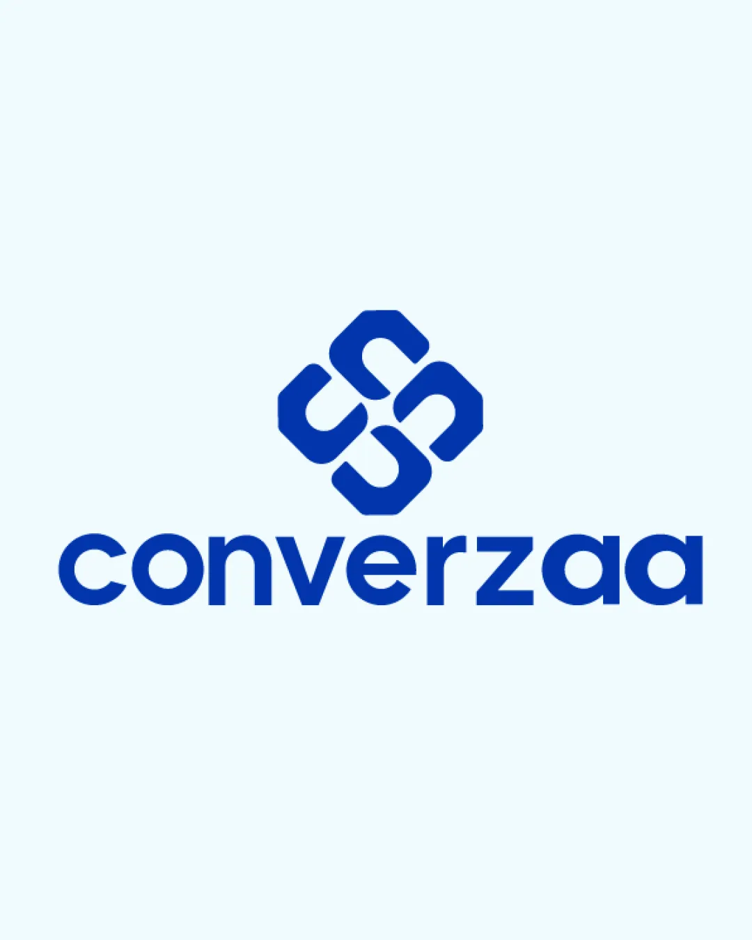
The design uses an abstract geometric symbol that suggests unity, convergence, or collaboration, paired with a clean sans-serif wordmark.
A balanced and legible logo with a clean unified look, but the abstract symbol's generic nature could limit brand distinctiveness.
This logo lockup shows strong execution, supported by visual balance and text readability; improving distinctiveness is the clearest next step.
Focus on the changes that matter. Keep what makes the logo work.
The design uses an abstract geometric symbol that suggests unity, convergence, or collaboration, paired with a clean sans-serif wordmark.
Logo preview unavailable. The written feedback is still available on this card.
Standalone mark
The abstract mark consists of four identical boomerang-like elements creating a symmetrical shape that is fairly common among generic 'unity' logos.
Check competitor logos and consider subtle custom patterns or unique connections.
There isn't enough brand context to assess the match.
Wordmark 5/5 · Layout 5/5
Symbol 5/5 · Wordmark 5/5 · Layout 5/5

Inspect spacing with the guide. Optical balance may differ from geometric centering.
Symbol 4/5 · Wordmark 5/5 · Layout 4/5
The mark's line thickness is good, but the central negative space could visually collapse at very small sizes, making the intricate pattern less recognizable.
Symbol 3/5 · Wordmark 3/5
The abstract mark consists of four identical boomerang-like elements creating a symmetrical shape that is fairly common among generic 'unity' logos.
Try: Refine to increase distinctiveness or integrate more brand-specific cues.
Check: Check competitor logos and consider subtle custom patterns or unique connections.
Logo preview unavailable. The written feedback is still available on this card.
Get a clear logo score, key risks, and priority fix ideas before your client or audience sees it.
More credits needed
Add credits to continue without losing your work.
Then $7/month. Cancel anytime.
Essential logo review with AI
Estimated progress