Wondering how your logo performs? 🧐
Get professional logo reviews in seconds and catch design issues in time.
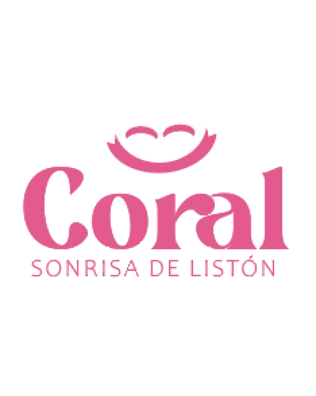
Try it Now!Logo review of Coral, SONRISA DE LISTÓN
 Logo analysis by AI
Logo type:
Style:
Detected symbol:
Negative space:
Detected text:
Business industry:
Review requested by Nannu
**If AI can recognize or misinterpret it, so can people.
Structured logo review
Legibility
![]() Main wordmark 'Coral' is highly readable with a distinctive serif typeface.
Main wordmark 'Coral' is highly readable with a distinctive serif typeface.![]() Supporting tagline 'SONRISA DE LISTÓN' is legible and well-spaced.
Supporting tagline 'SONRISA DE LISTÓN' is legible and well-spaced.
![]() Slight variation in font style between primary and secondary text may reduce cohesive feel.
Slight variation in font style between primary and secondary text may reduce cohesive feel.![]() Difference in boldness between lines could hinder small-scale legibility.
Difference in boldness between lines could hinder small-scale legibility.
Scalability versatility
![]() Simple, bold shapes ensure the logo remains recognizable at medium to large sizes.
Simple, bold shapes ensure the logo remains recognizable at medium to large sizes.![]() Good contrast with white background aids visibility.
Good contrast with white background aids visibility.
![]() Thin lines in the tagline and facial features may be lost in very small applications such as embroidery or favicons.
Thin lines in the tagline and facial features may be lost in very small applications such as embroidery or favicons.![]() Logo may not be as effective on dark backgrounds or in monochrome formats.
Logo may not be as effective on dark backgrounds or in monochrome formats.
200x250 px
100×125 px
50×62 px
Balance alignment
![]() The smiley symbol is well-aligned above the wordmark, creating a visually appealing focal point.
The smiley symbol is well-aligned above the wordmark, creating a visually appealing focal point.![]() Left-to-right balance of the wordmark is strong.
Left-to-right balance of the wordmark is strong.
![]() Slight asymmetry: the smile is not perfectly aligned with letter centering, which could affect visual flow.
Slight asymmetry: the smile is not perfectly aligned with letter centering, which could affect visual flow.![]() The tagline feels loosely attached and could be better anchored.
The tagline feels loosely attached and could be better anchored.

Originality
![]() Creative integration of a smile/mechanism above the wordmark, linking visuals with the brand message.
Creative integration of a smile/mechanism above the wordmark, linking visuals with the brand message.![]() Typeface choice is not overly generic and provides presence.
Typeface choice is not overly generic and provides presence.
![]() Smiley concepts are fairly common in beauty/wellness logos, justifying a small originality deduction.
Smiley concepts are fairly common in beauty/wellness logos, justifying a small originality deduction.![]() No major innovative twist beyond the smiling motif.
No major innovative twist beyond the smiling motif.
Logomark wordmark fit
![]() Playful symbol complements the wordmark's style and tone.
Playful symbol complements the wordmark's style and tone.![]() Sizes between symbol and wordmark are well-proportioned.
Sizes between symbol and wordmark are well-proportioned.
![]() Smiley motif is more playful than the fairly formal serif wordmark, creating slight stylistic tension.
Smiley motif is more playful than the fairly formal serif wordmark, creating slight stylistic tension.![]() Could integrate the smile symbol more seamlessly with the text for unity.
Could integrate the smile symbol more seamlessly with the text for unity.
Aesthetic look
![]() Color palette is harmonious and appealing.
Color palette is harmonious and appealing.![]() Visual hierarchy is clear, with a dominant focal symbol and strong wordmark.
Visual hierarchy is clear, with a dominant focal symbol and strong wordmark.
![]() Design feels somewhat generic due to common smile symbol.
Design feels somewhat generic due to common smile symbol.![]() Overall appearance is attractive but lacks a unique edge.
Overall appearance is attractive but lacks a unique edge.
Dual meaning and misinterpretations
![]() No inappropriate or ambiguous forms detected.
No inappropriate or ambiguous forms detected.![]() Symbol clearly communicates a smile and positivity.
Symbol clearly communicates a smile and positivity.
Color harmony
![]() Consistent use of rosy pink tones establishes brand character.
Consistent use of rosy pink tones establishes brand character.![]() Color application is well controlled and not excessive.
Color application is well controlled and not excessive.
Carissma
#ED72A0
White
#FFFFFF


