Wondering how your logo performs? 🧐
Get professional logo reviews in seconds and catch design issues in time.
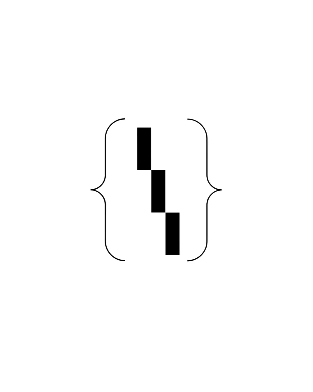
Try it Now!Logo review of Curly brackets with vertical bars forming a centra..
 Logo analysis by AI
Logo type:
Style:
Detected symbol:
Negative space:
Business industry:
Review requested by Todo
**If AI can recognize or misinterpret it, so can people.
Structured logo review
Scalability versatility
![]() Extremely simple with bold lines ensures it scales well from large applications like billboards to small ones like favicons.
Extremely simple with bold lines ensures it scales well from large applications like billboards to small ones like favicons.![]() Minimal detail will hold up clearly on various digital and print substrates, such as business cards and merchandise.
Minimal detail will hold up clearly on various digital and print substrates, such as business cards and merchandise.
200x250 px
100×125 px
50×62 px
Balance alignment
![]() Symmetrical placement of curly brackets and center bars creates an overall balanced and cohesive look.
Symmetrical placement of curly brackets and center bars creates an overall balanced and cohesive look.
![]() The central vertical bar segments feel slightly rigid and disconnected, which could make the center feel less unified.
The central vertical bar segments feel slightly rigid and disconnected, which could make the center feel less unified.

Originality
![]() Combination of curly brackets with abstract vertical bars is a creative nod to coding and digital environments.
Combination of curly brackets with abstract vertical bars is a creative nod to coding and digital environments.![]() Minimalist abstract approach stands out versus typical literal industry icons.
Minimalist abstract approach stands out versus typical literal industry icons.
![]() Curly brackets are regularly used in coding-themed branding, making the general motif somewhat familiar.
Curly brackets are regularly used in coding-themed branding, making the general motif somewhat familiar.
Aesthetic look
![]() Very clean and intentional use of minimalistic elements.
Very clean and intentional use of minimalistic elements.![]() Strong visual clarity and modernist appeal.
Strong visual clarity and modernist appeal.
![]() Some may find the abstraction too esoteric or lacking in warmth and approachability.
Some may find the abstraction too esoteric or lacking in warmth and approachability.
Dual meaning and misinterpretations
![]() No inappropriate shapes or unintended negative symbolism.
No inappropriate shapes or unintended negative symbolism.
![]() Central column could be mistaken for an unrelated abstract shape, lacking immediate context for non-technical audiences.
Central column could be mistaken for an unrelated abstract shape, lacking immediate context for non-technical audiences.
Color harmony
![]() Simple black on white achieves high contrast and clarity.
Simple black on white achieves high contrast and clarity.![]() Monochrome palette is timeless and flexible.
Monochrome palette is timeless and flexible.
Black
#000000
White
#FFFFFF


