Wondering how your logo performs? 🧐
Get professional logo reviews in seconds and catch design issues in time.
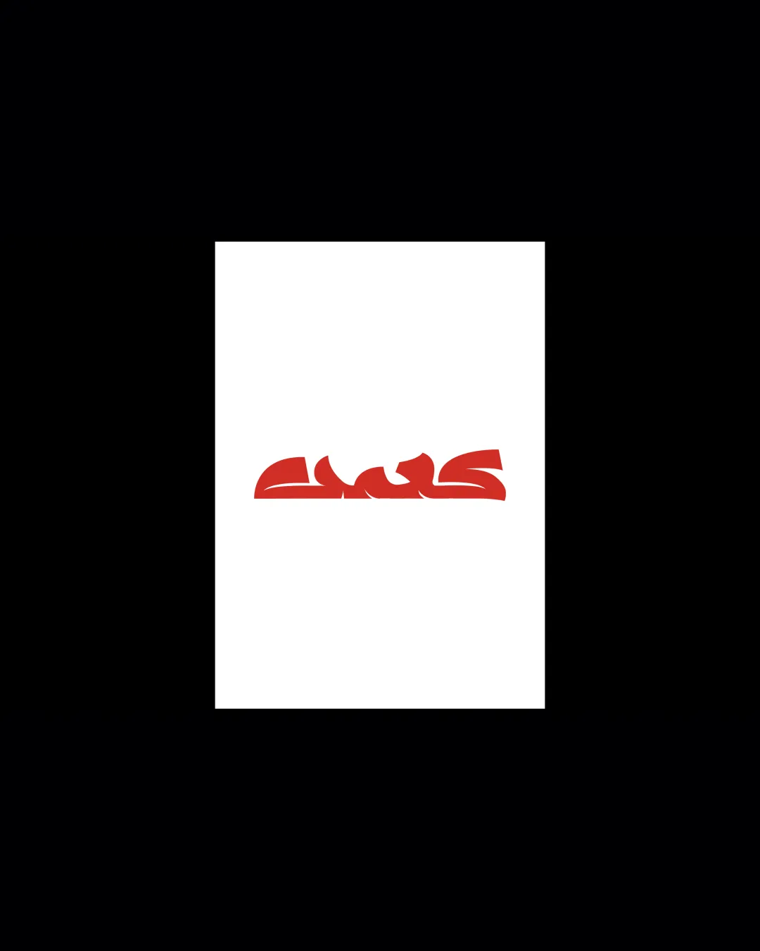
Try it Now!Logo review of cws
 Logo analysis by AI
Logo type:
Style:
Detected text:
Business industry:
Review requested by Camil
**If AI can recognize or misinterpret it, so can people.
Structured logo review
Legibility
![]() Strong, confident line work lends a clear visual impact at large sizes.
Strong, confident line work lends a clear visual impact at large sizes.
![]() Letterforms are highly stylized and abstract, making it difficult to read the text at first glance.
Letterforms are highly stylized and abstract, making it difficult to read the text at first glance.![]() Excessive merging and overlapping of letters severely reduce readability, especially at smaller scales.
Excessive merging and overlapping of letters severely reduce readability, especially at smaller scales.![]() Unconventional letter shapes do not immediately communicate the intended characters.
Unconventional letter shapes do not immediately communicate the intended characters.
Scalability versatility
![]() Bold, simple color palette enhances scalability on banners, posters, and digital screens.
Bold, simple color palette enhances scalability on banners, posters, and digital screens.![]() Logo maintains visual weight and presence at large sizes (e.g., mural, billboard).
Logo maintains visual weight and presence at large sizes (e.g., mural, billboard).
![]() Fine details and abstract letter connections risk losing clarity at small sizes such as business cards, social media icons, or embroidery.
Fine details and abstract letter connections risk losing clarity at small sizes such as business cards, social media icons, or embroidery.![]() Heavy stylization limits versatility across clean, formal applications like letterheads or invoices.
Heavy stylization limits versatility across clean, formal applications like letterheads or invoices.
200x250 px
100×125 px
50×62 px
Balance alignment
![]() Visual weight is distributed reasonably evenly across the wordmark, with symmetrical and consistent baseline alignment creating a unified form.
Visual weight is distributed reasonably evenly across the wordmark, with symmetrical and consistent baseline alignment creating a unified form.![]() Overall shape is balanced horizontally.
Overall shape is balanced horizontally.
![]() Letter connections and spacing can create awkward tensions between some glyphs, subtly affecting optical balance.
Letter connections and spacing can create awkward tensions between some glyphs, subtly affecting optical balance.

Originality
![]() Distinct graffiti/artistic rendering is uncommon in mainstream wordmarks, offering a unique, expressive feel.
Distinct graffiti/artistic rendering is uncommon in mainstream wordmarks, offering a unique, expressive feel.![]() Cohesive stylization across all letterforms indicates custom craftsmanship.
Cohesive stylization across all letterforms indicates custom craftsmanship.
![]() Although original, the abstraction may sacrifice function for form, and similar approaches can be found in other street-art or graffiti brands.
Although original, the abstraction may sacrifice function for form, and similar approaches can be found in other street-art or graffiti brands.
Aesthetic look
![]() Bold, contemporary red color enhances presence and energy.
Bold, contemporary red color enhances presence and energy.![]() Unified style creates a memorable, impactful aesthetic.
Unified style creates a memorable, impactful aesthetic.
![]() Highly stylized approach may not appeal to all audiences or fit with broader corporate or minimalist aesthetics.
Highly stylized approach may not appeal to all audiences or fit with broader corporate or minimalist aesthetics.![]() Visual busyness and dense shapes can detract from overall elegance.
Visual busyness and dense shapes can detract from overall elegance.
Dual meaning and misinterpretations
![]() No immediately apparent inappropriate or ambiguous secondary symbols.
No immediately apparent inappropriate or ambiguous secondary symbols.
Color harmony
![]() Monochromatic red color usage creates strong contrast on a white background.
Monochromatic red color usage creates strong contrast on a white background.![]() Color application is consistent and not overwhelming.
Color application is consistent and not overwhelming.
Tall Poppy
#D32F2F
White
#FFFFFF
Black
#000000


